AERIE
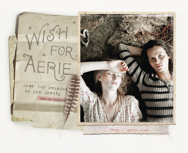
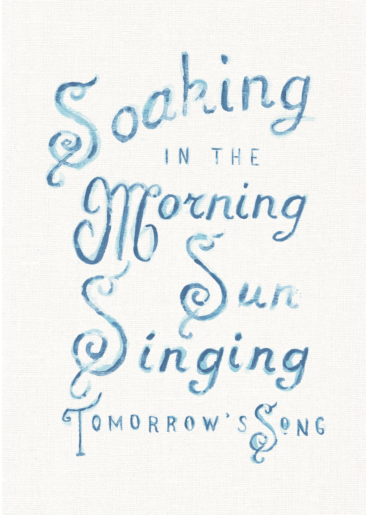
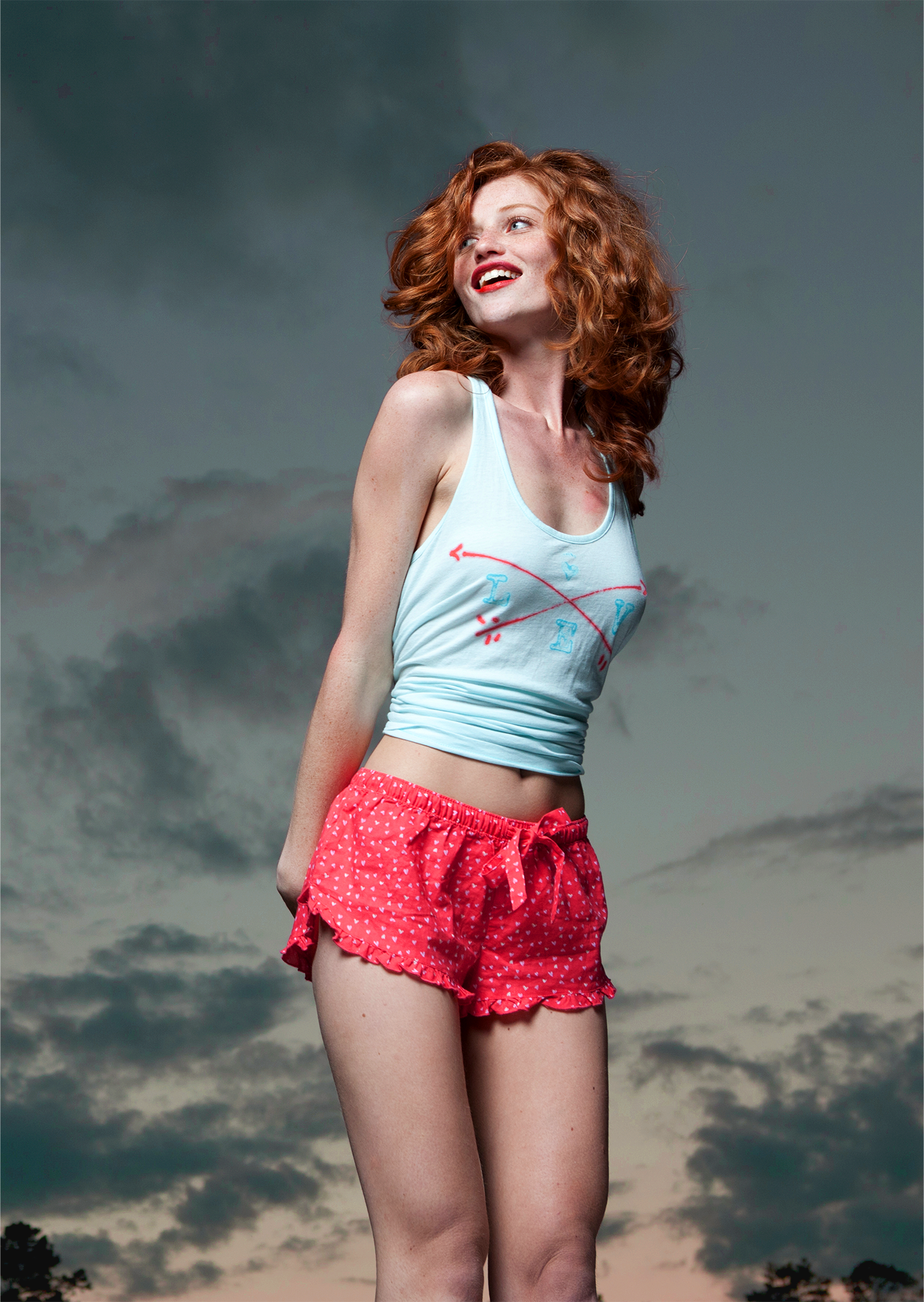
For Aerie, the graphic direction was built around softness, femininity, individuality, and a more personal hand. Each season began with a mood and visual point of view that guided the team across artwork, color, technique, placement, and finish.
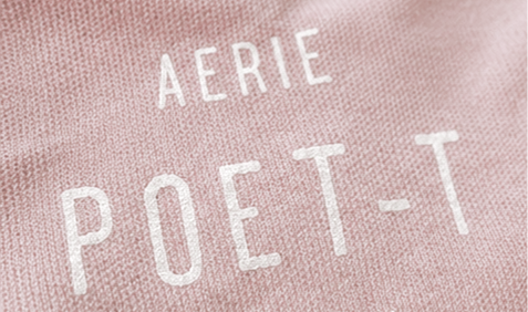
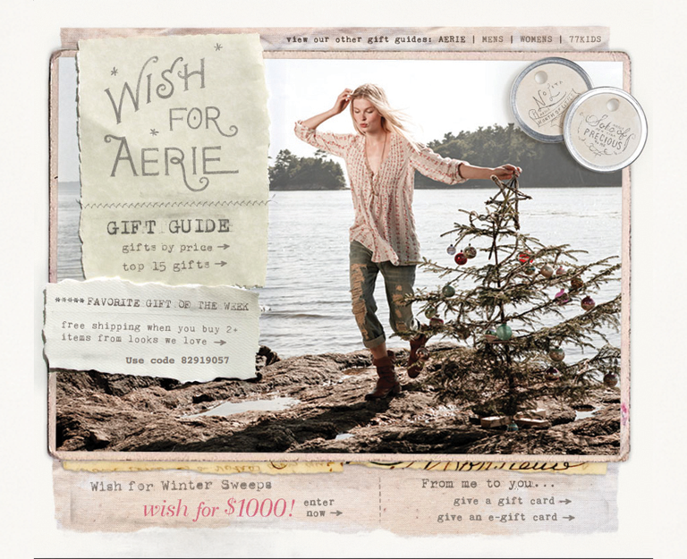
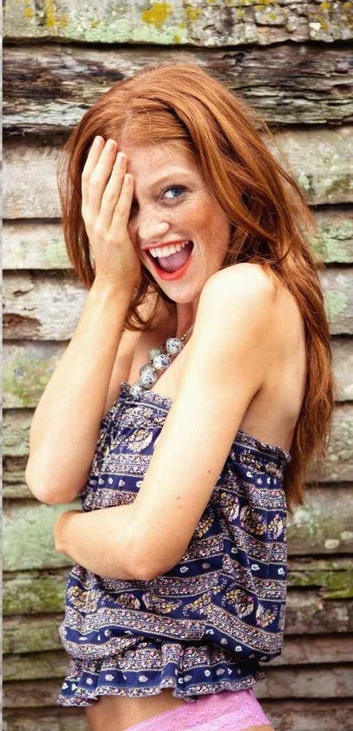
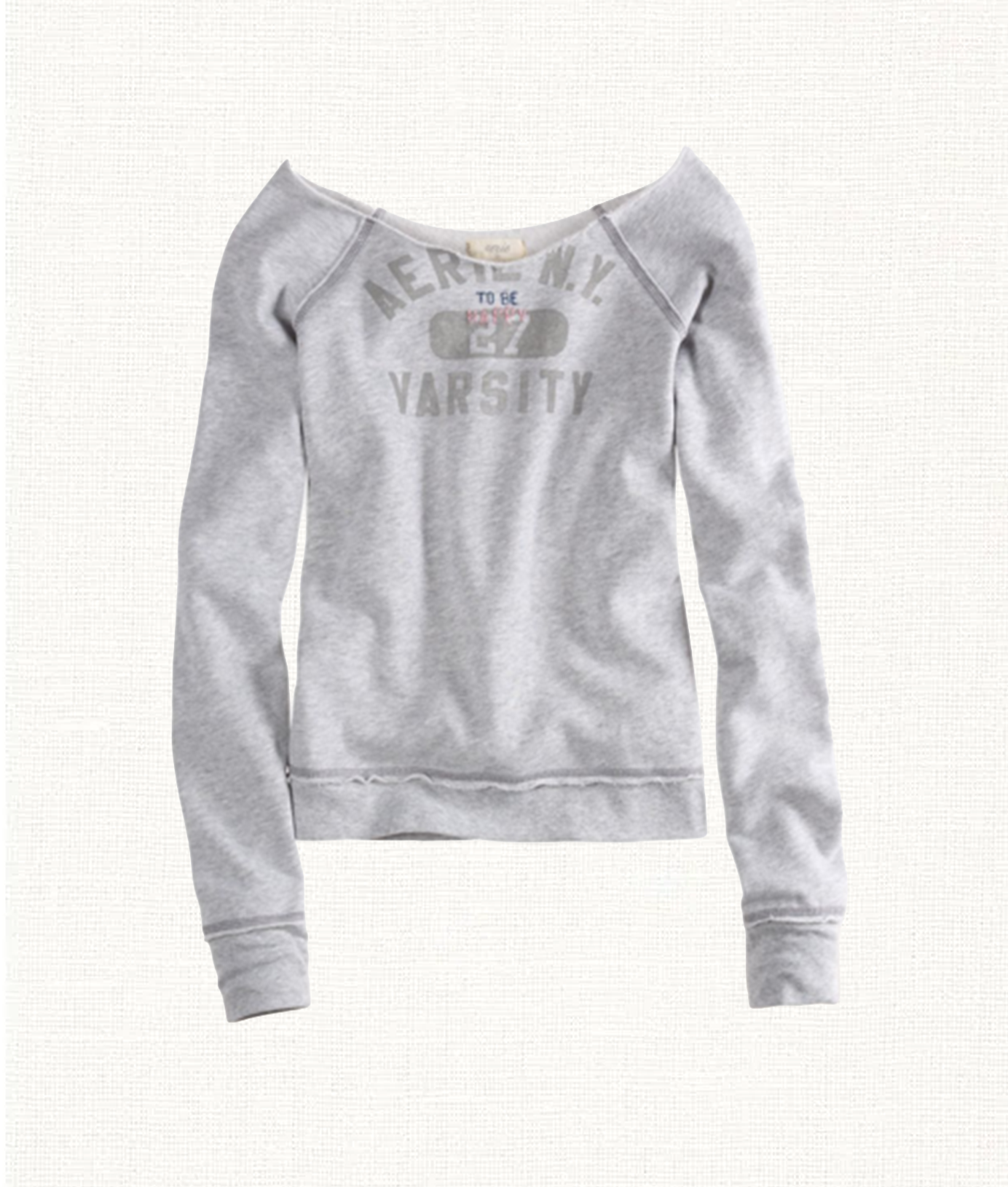
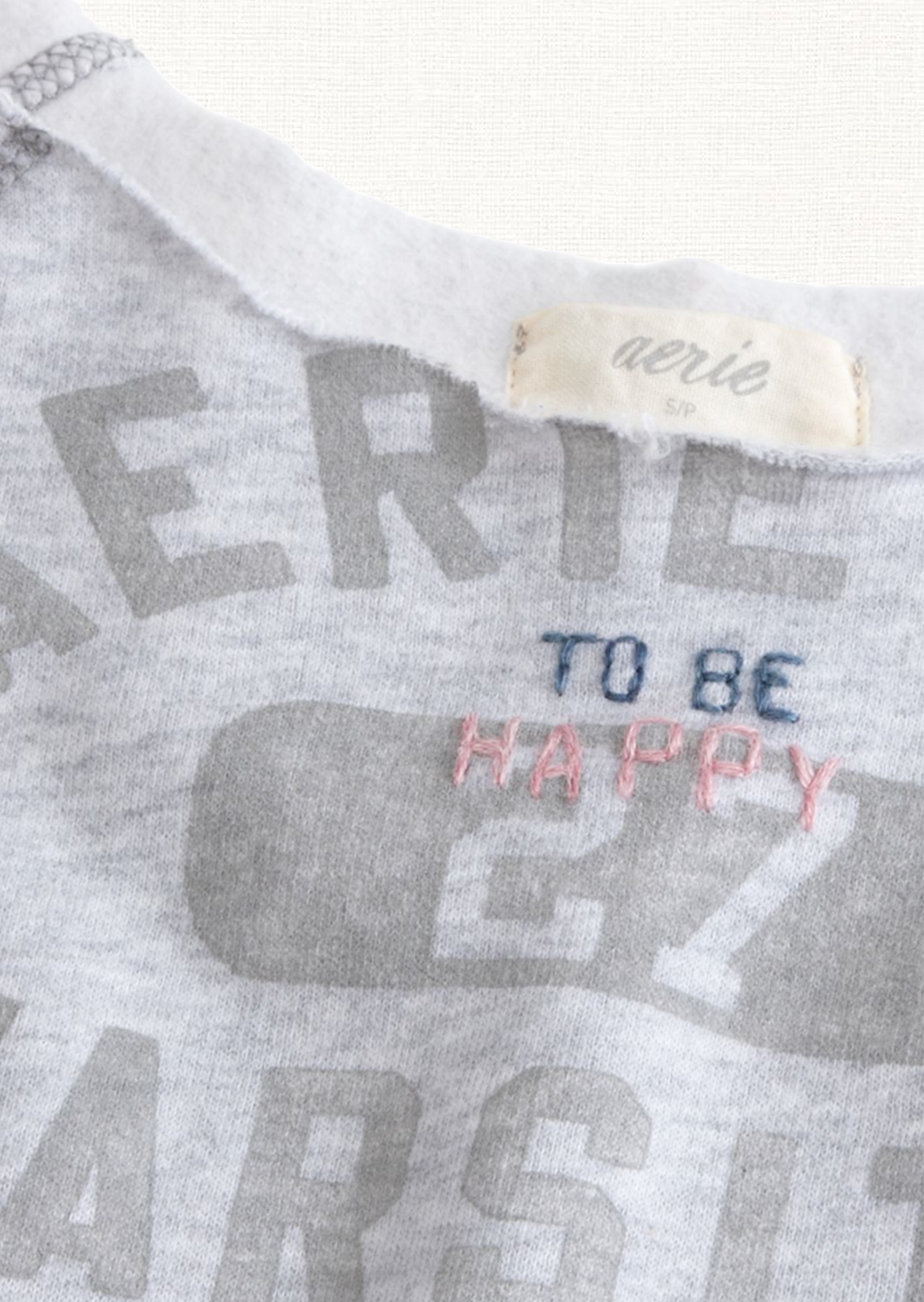
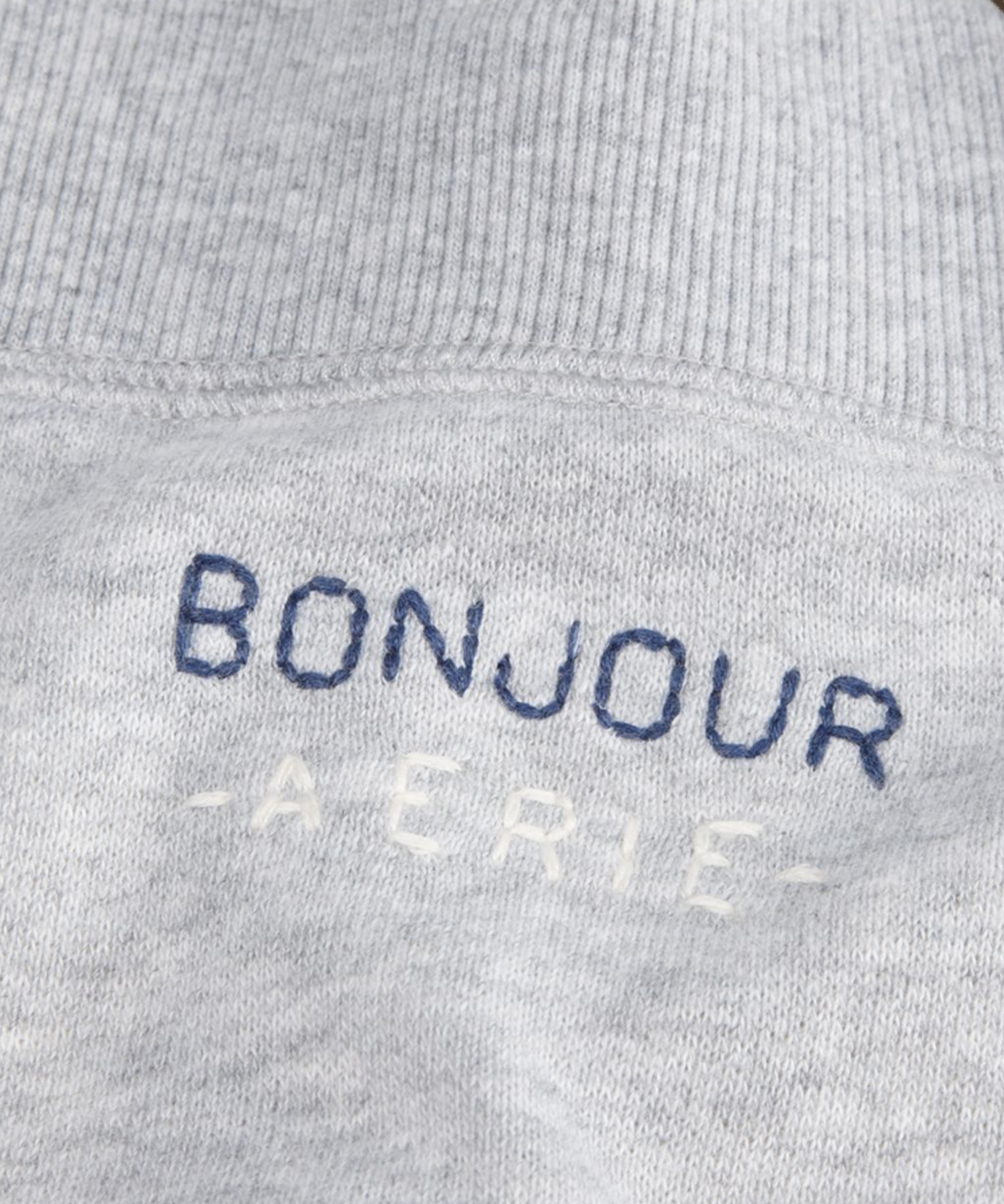
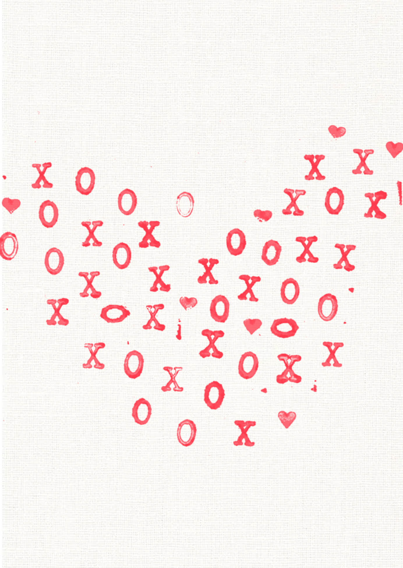
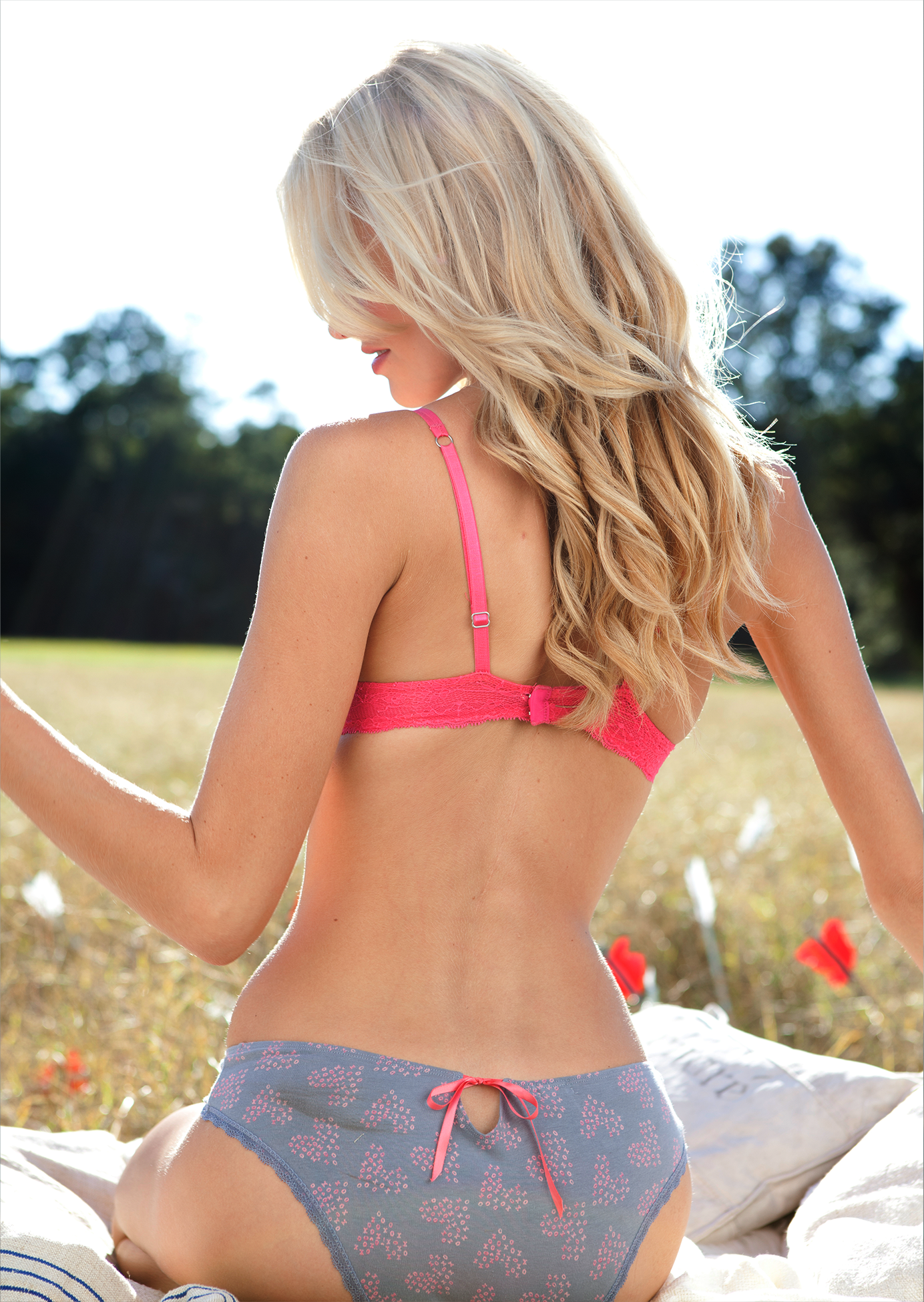
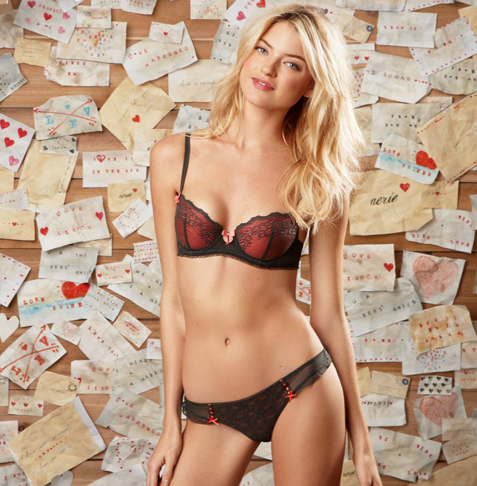
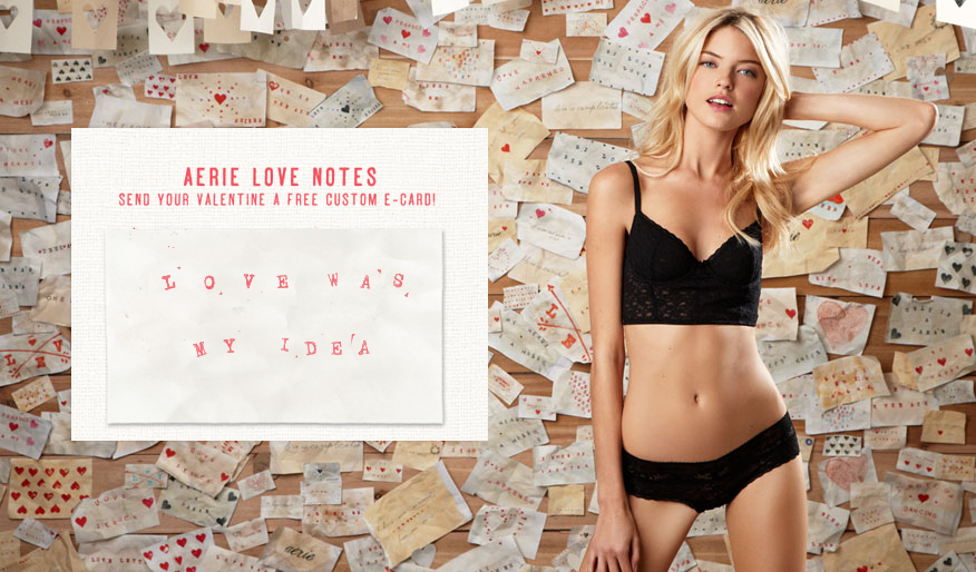
The apparel graphics were part of that same expression, using hand-drawn lettering, watercolor marks, embroidery-inspired details, washed-down prints, tonal graphics, and imperfect one-of-one treatments. That aesthetic also carried into the launch of the Maddie bra, where apparel graphics, PRINT & PATTERN, handwritten artwork, props, and set details helped shape a campaign language that extended across photography, store signage, digital assets, web interaction, and the Times Square video billboard.

AERIE
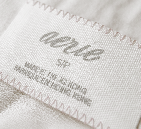
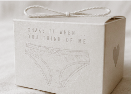
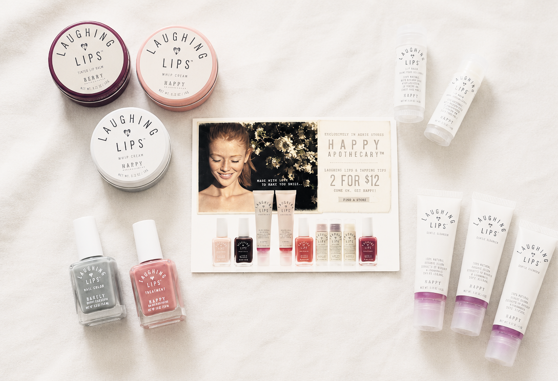
Aerie was an opportunity to help define a softer, more ownable visual world across the brand. The work focused on establishing a clearer baseline across graphics, branding, packaging, labels, trims, hangtags, on-product messaging, fragrance, beauty, and product marketing.
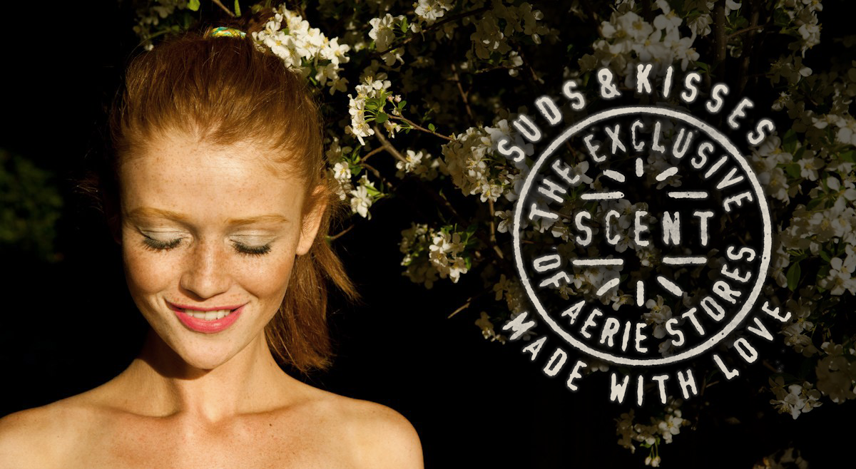
A hand-made visual language became central to the direction, using handwritten type, stamped marks, soft paper textures, imperfect print techniques, fabric labels, stitched details, and personal messages. Those same visual cues carried into marketing, photo shoots, props, store signage, digital moments, fragrance launches, and new product expressions like Suds & Kisses, helping create a consistent brand world that connected product, packaging, campaign, and customer experience through one shared aesthetic.