AMERICAN EAGLE FALL
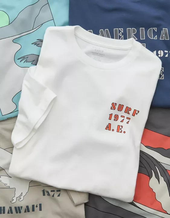
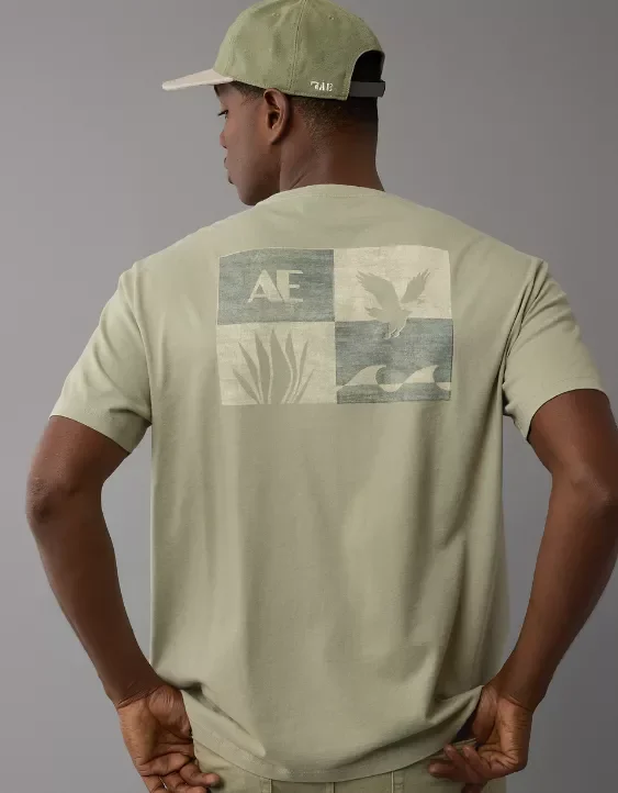
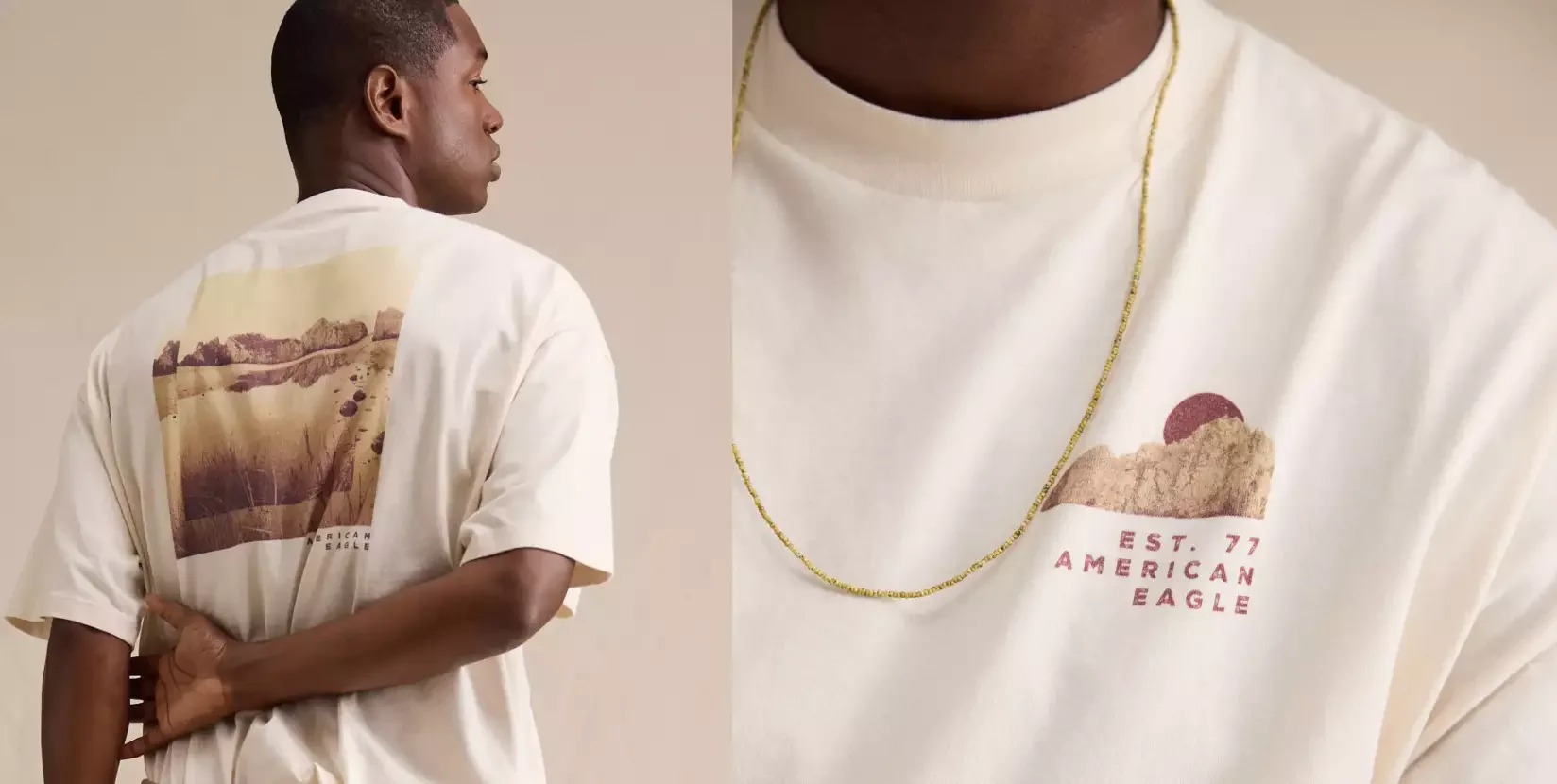
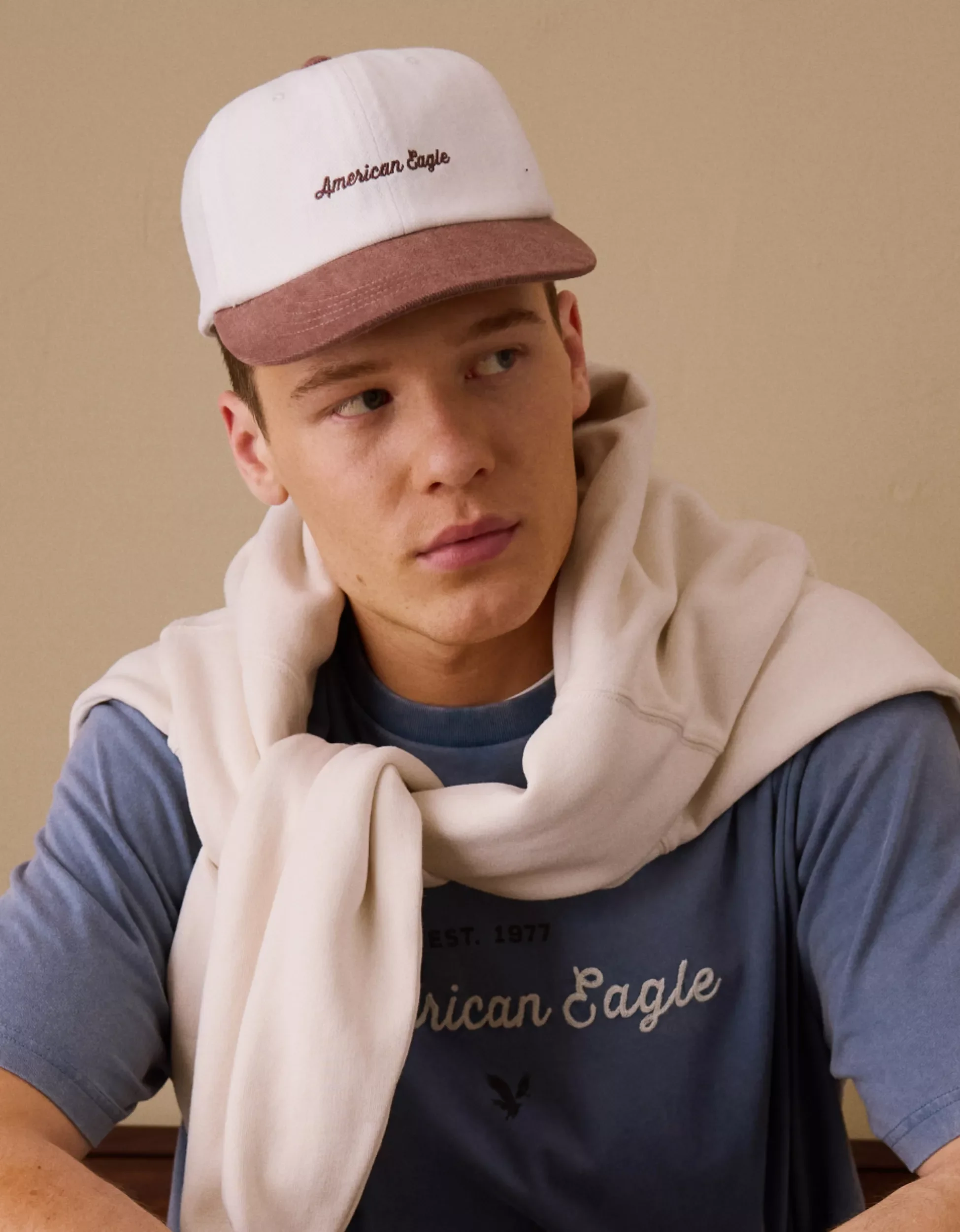
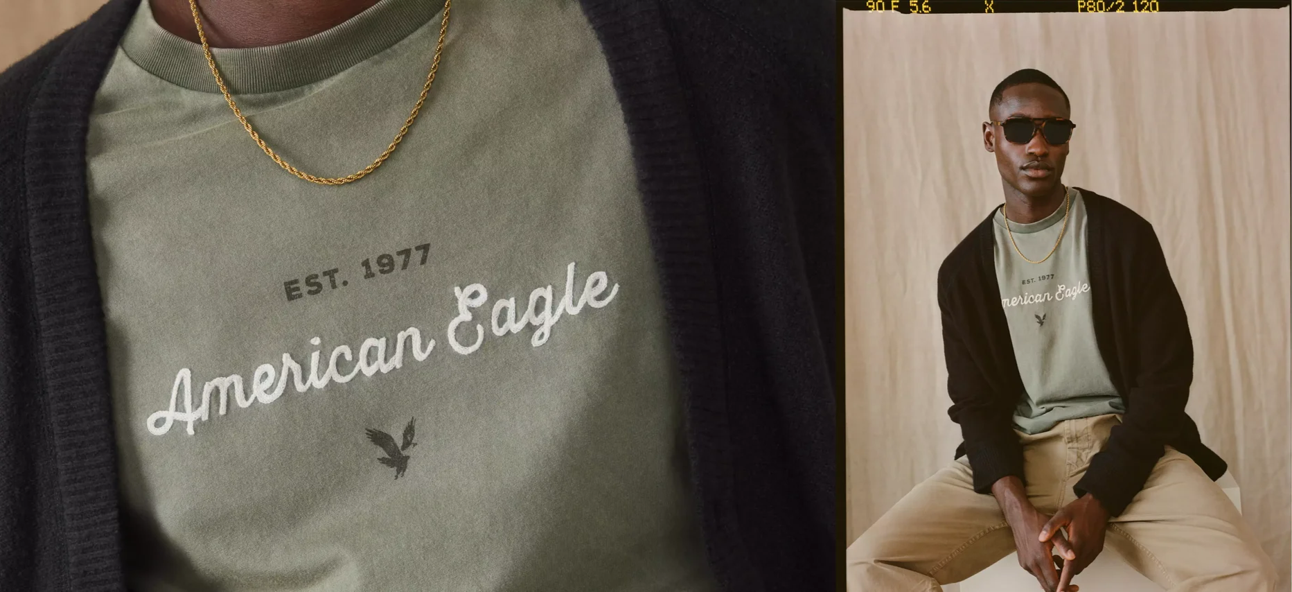
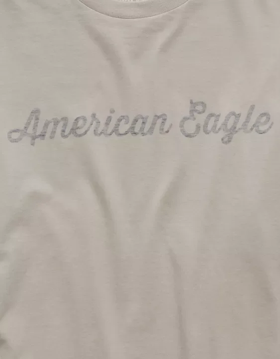
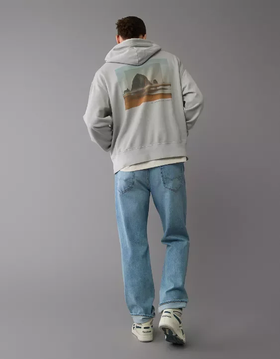
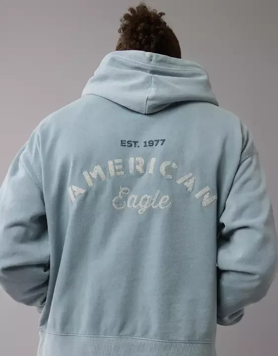
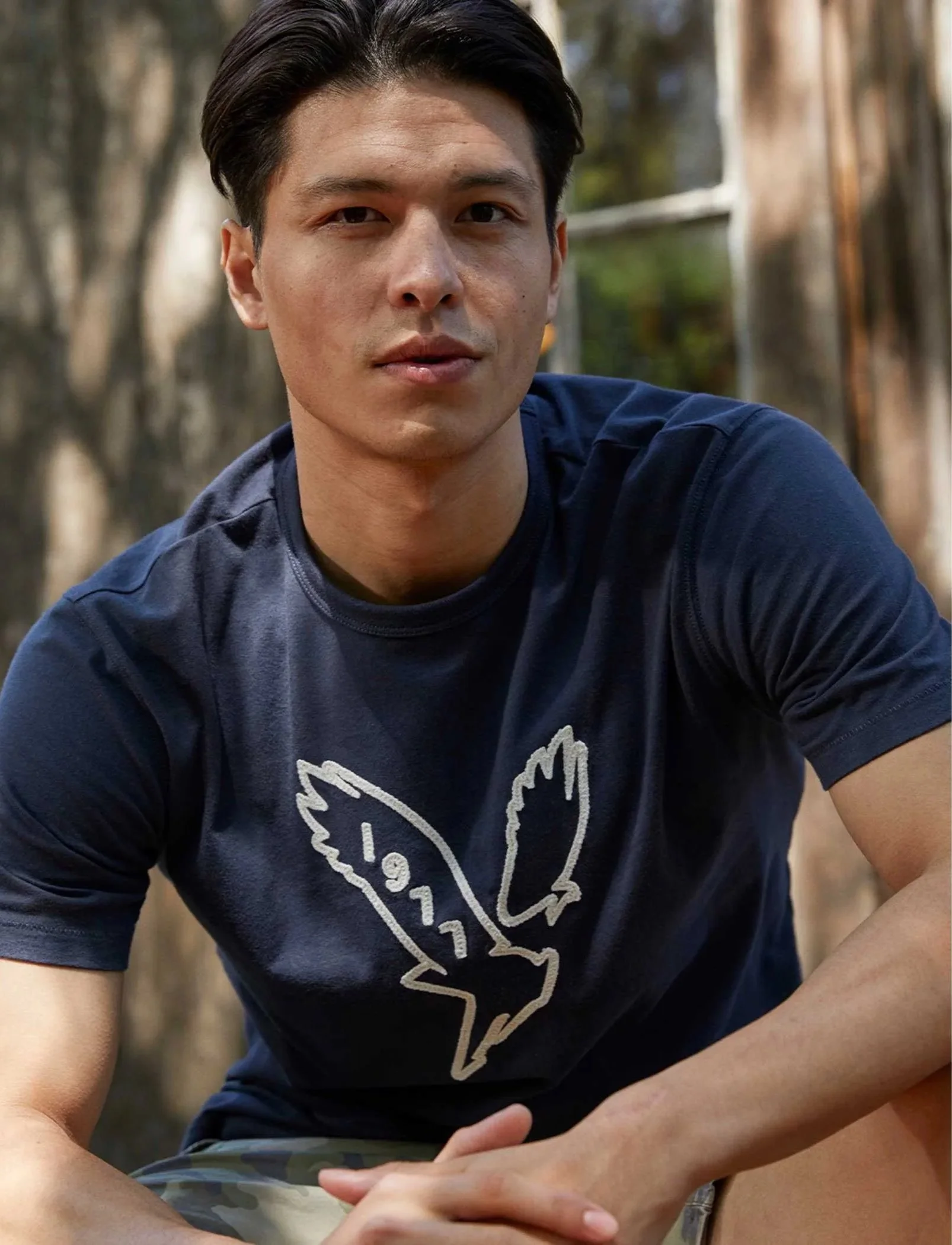
The AE Fall aesthetic was built around a cleaner, more elevated expression of American Eagle graphics. Working with the team, the season was designed, developed, and executed around a lived-in feel, with technique standards focused on chain stitch, chenille, reverse printing, tonal embroidery, photoreal imagery, SCALE VARIATION and soft tactile finishes.
Dusty color, soft contrast, and restrained placements helped guide the assortment. The result was an easy, textural graphic language that felt elevated but still familiar to the brand.
AMERICAN EAGLE BTS
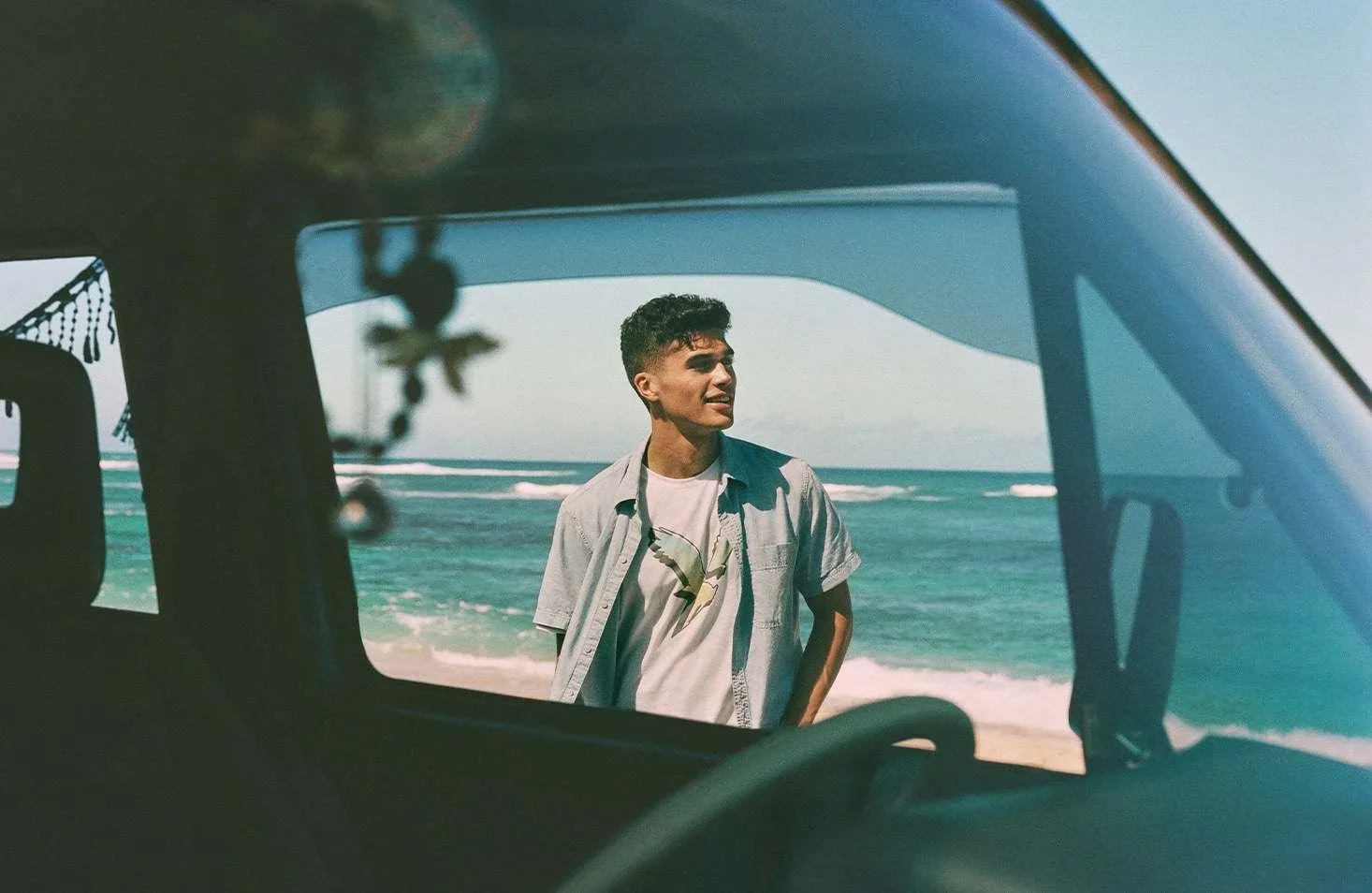
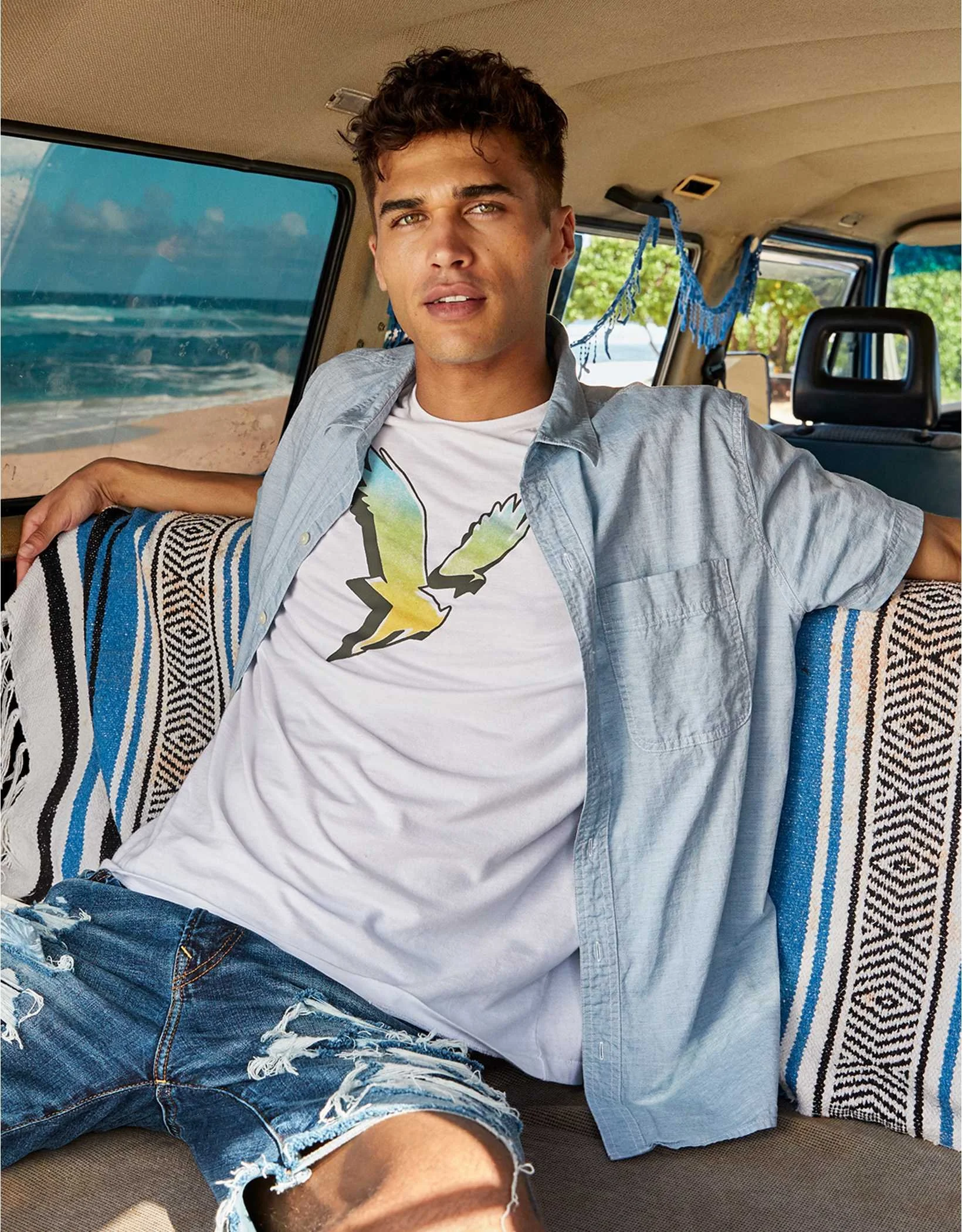
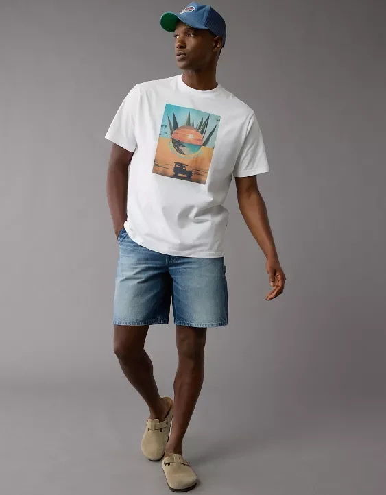
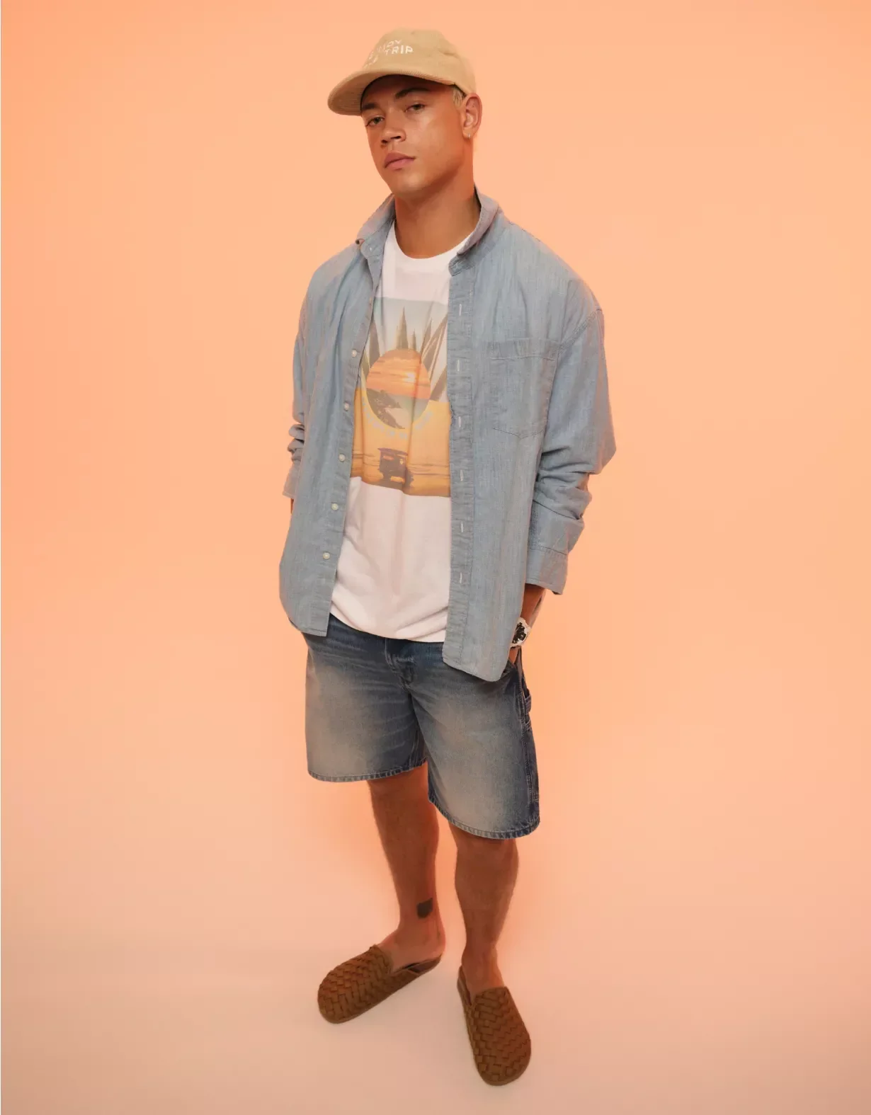
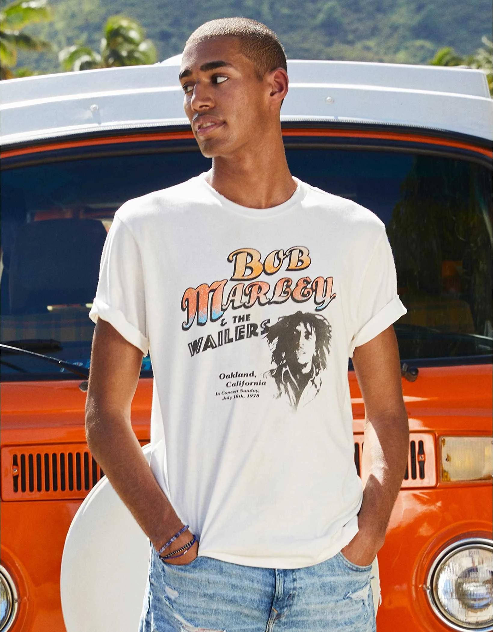
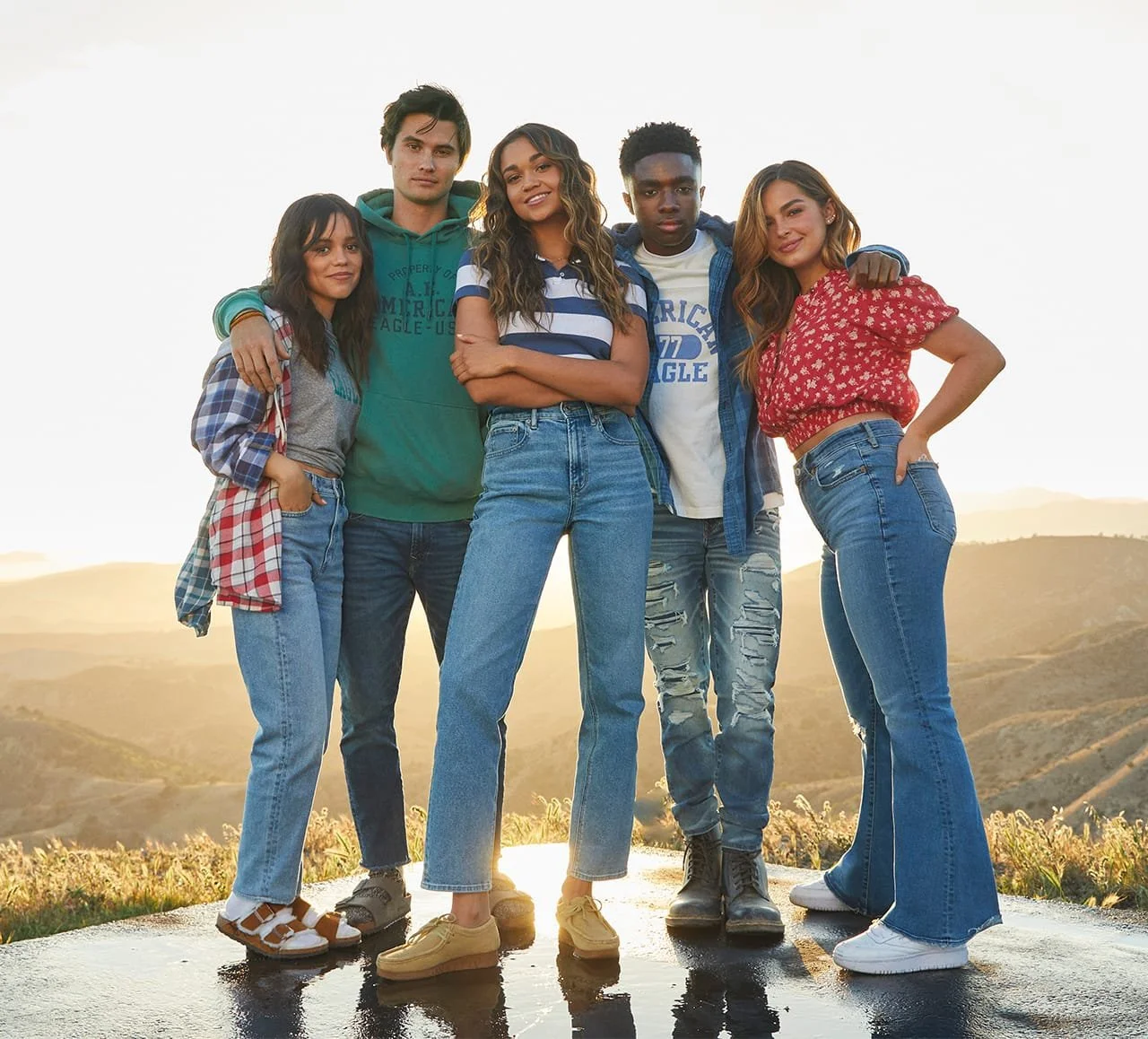
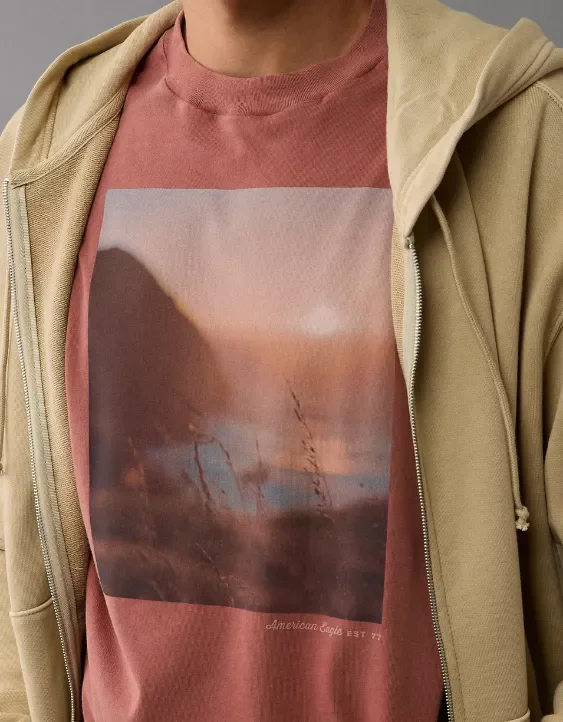
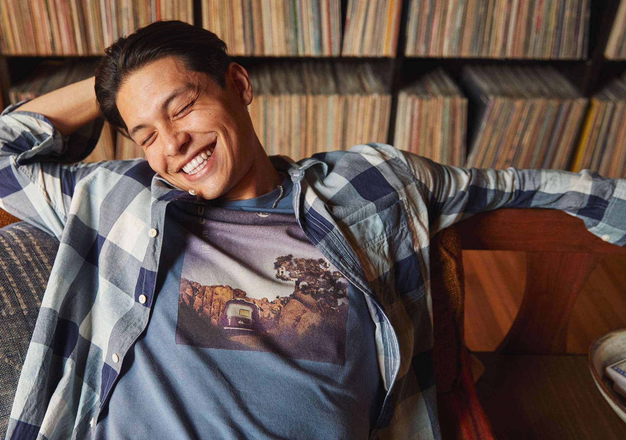
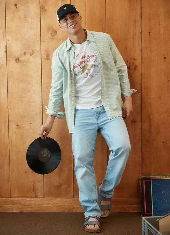
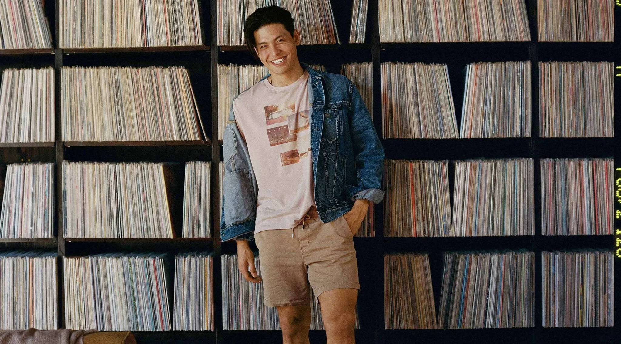
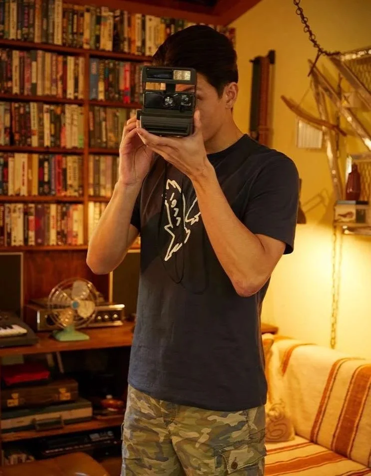
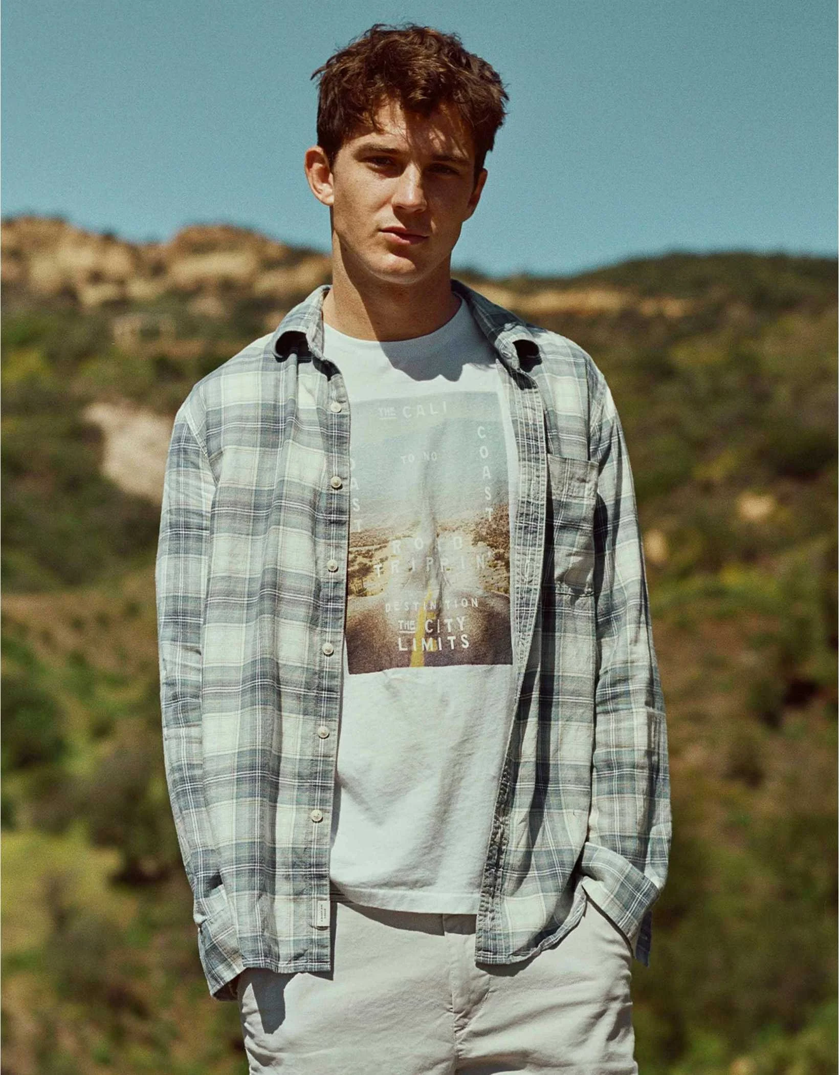
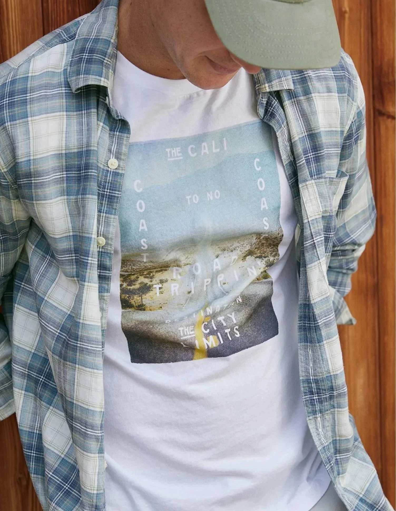
AE BTS was shaped around the feeling of a California road trip: Highway 1, music DISCOVERY, and the mix of indoor and outdoor moments that come with discovering somewhere new. The graphics pulled from that world through soft photo treatments, casual marks, road-trip references, and easy lifestyle-driven placements.
Working with the team, the season was built through clear graphic guardrails around color, scale, technique, and execution. The result was a relaxed visual language that felt nostalgic, sun-faded, and connected to the product without feeling overdesigned.
AMERICAN EAGLE HOL
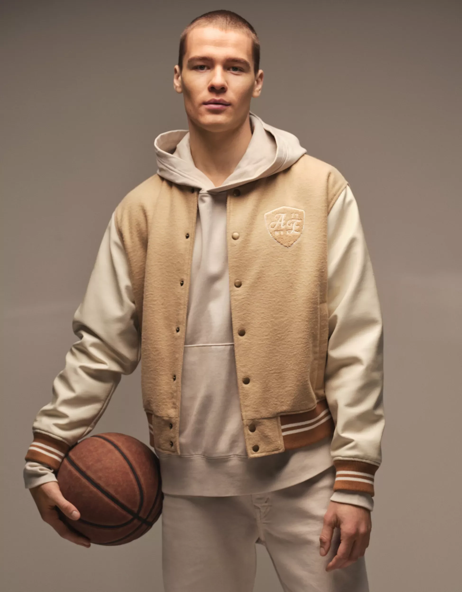
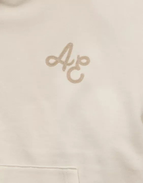
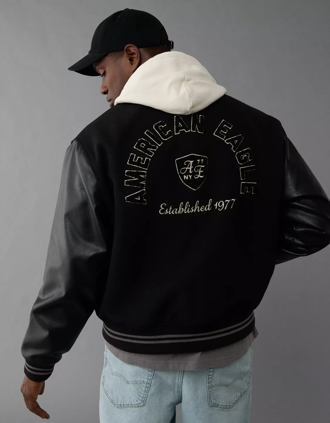
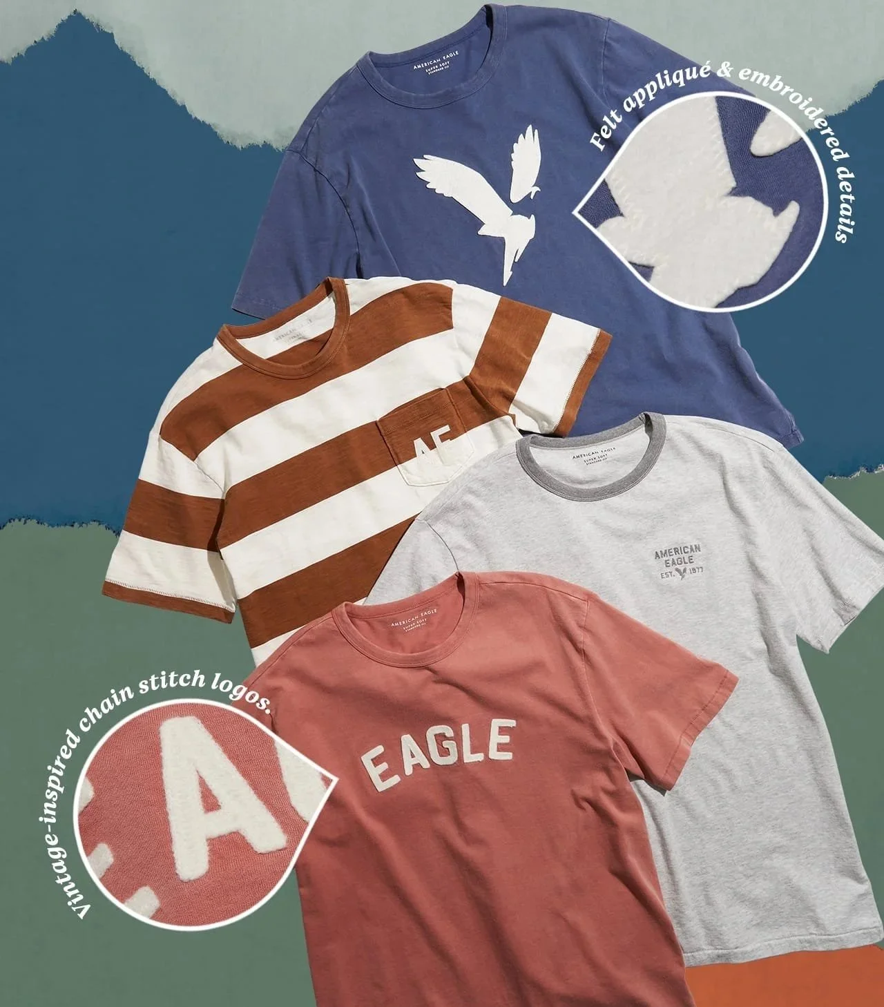
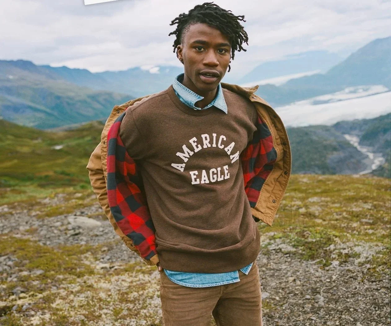
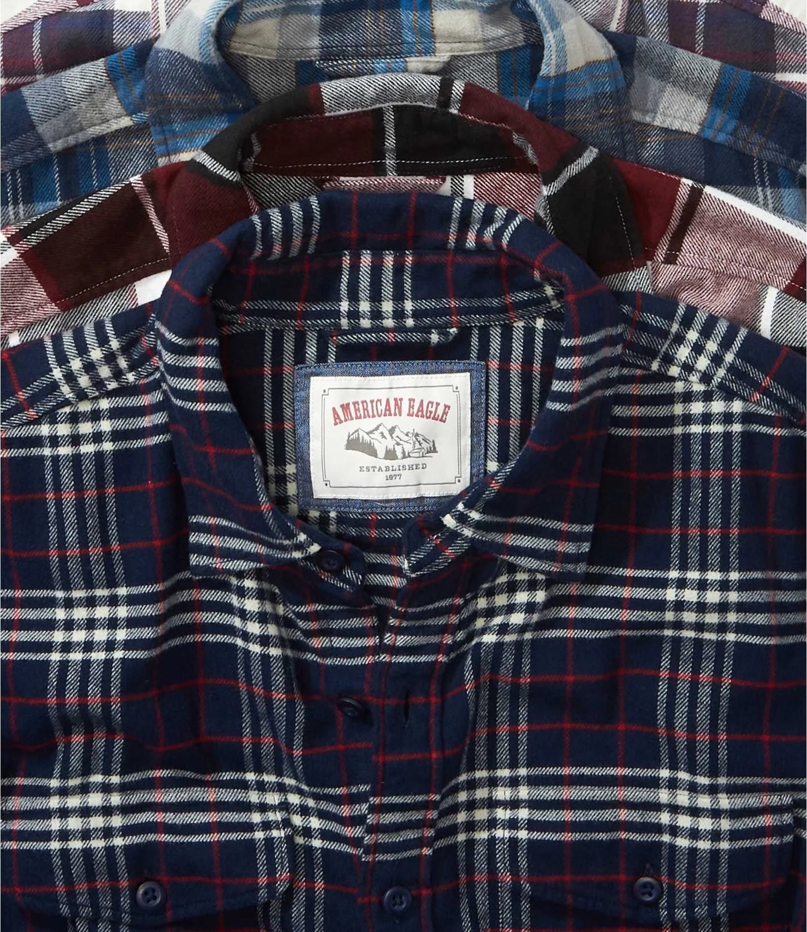
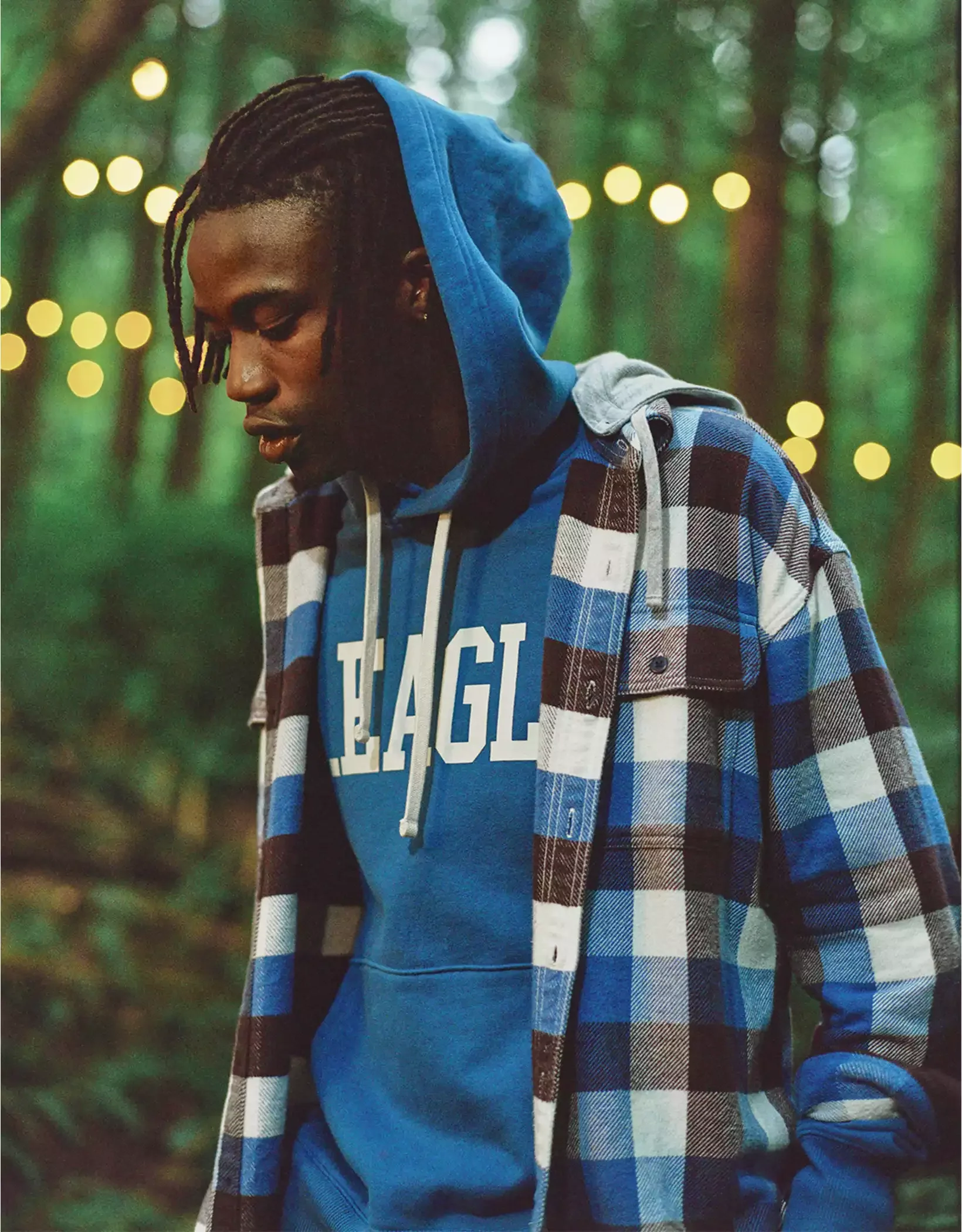
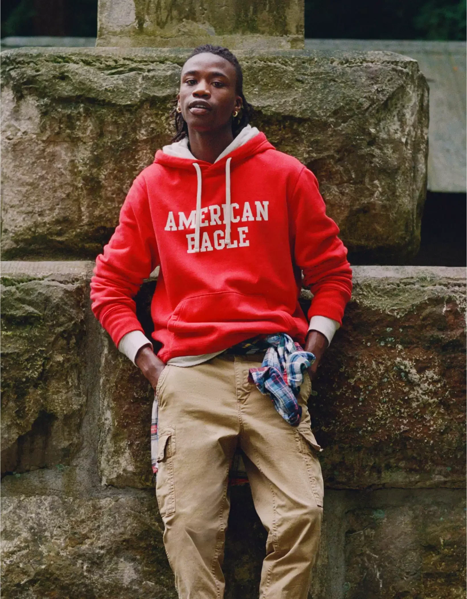
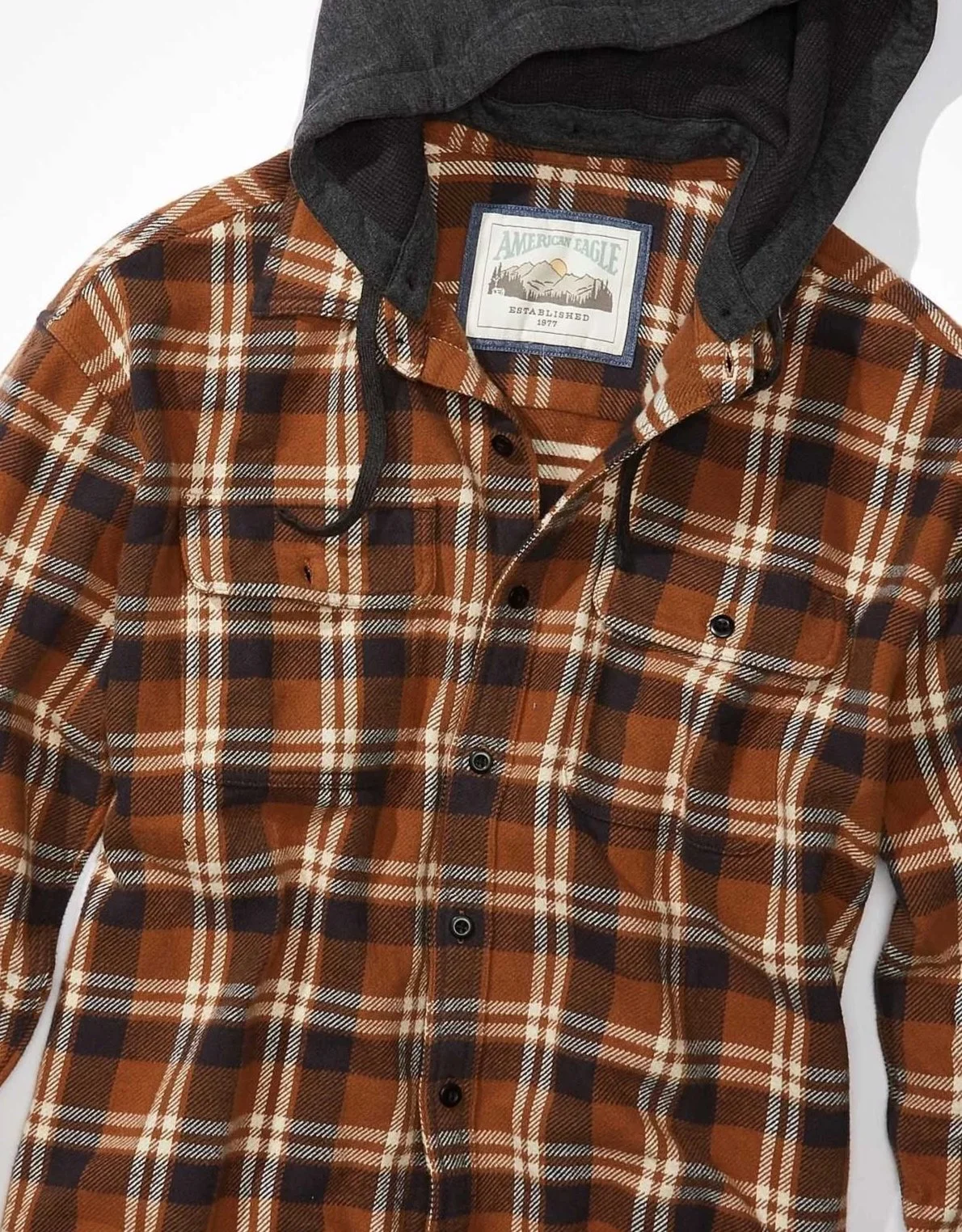
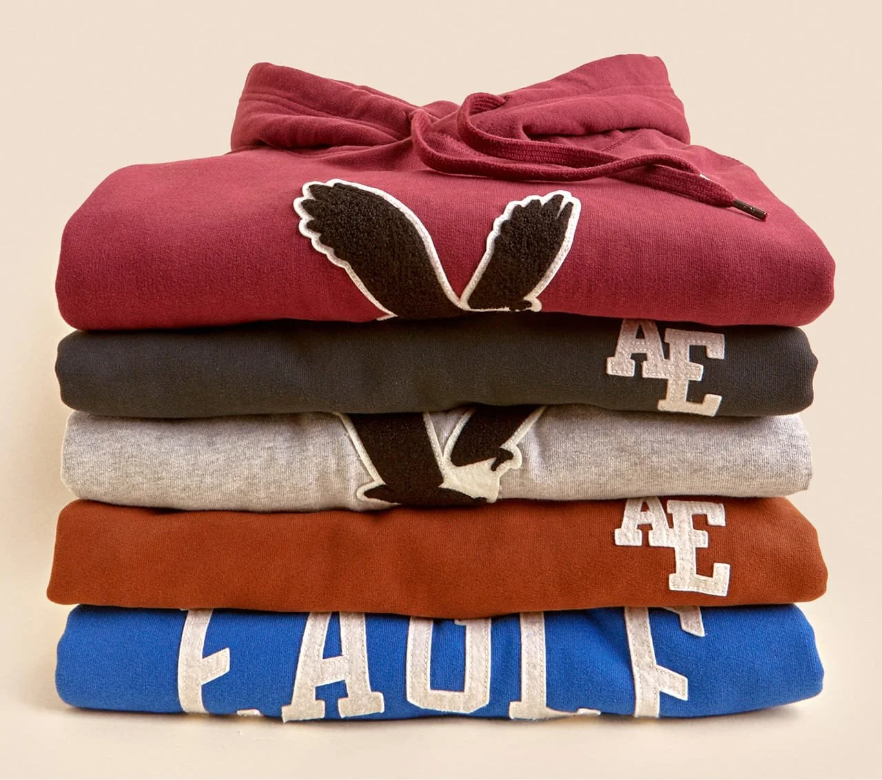
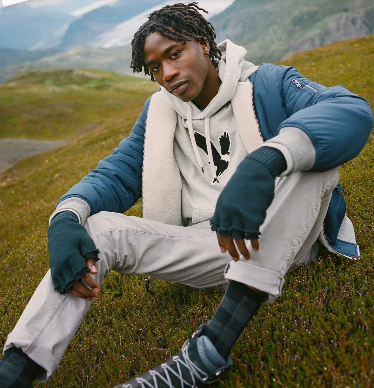
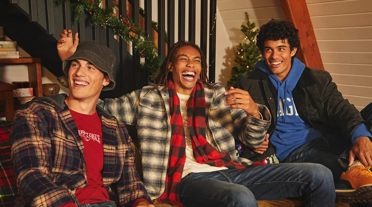
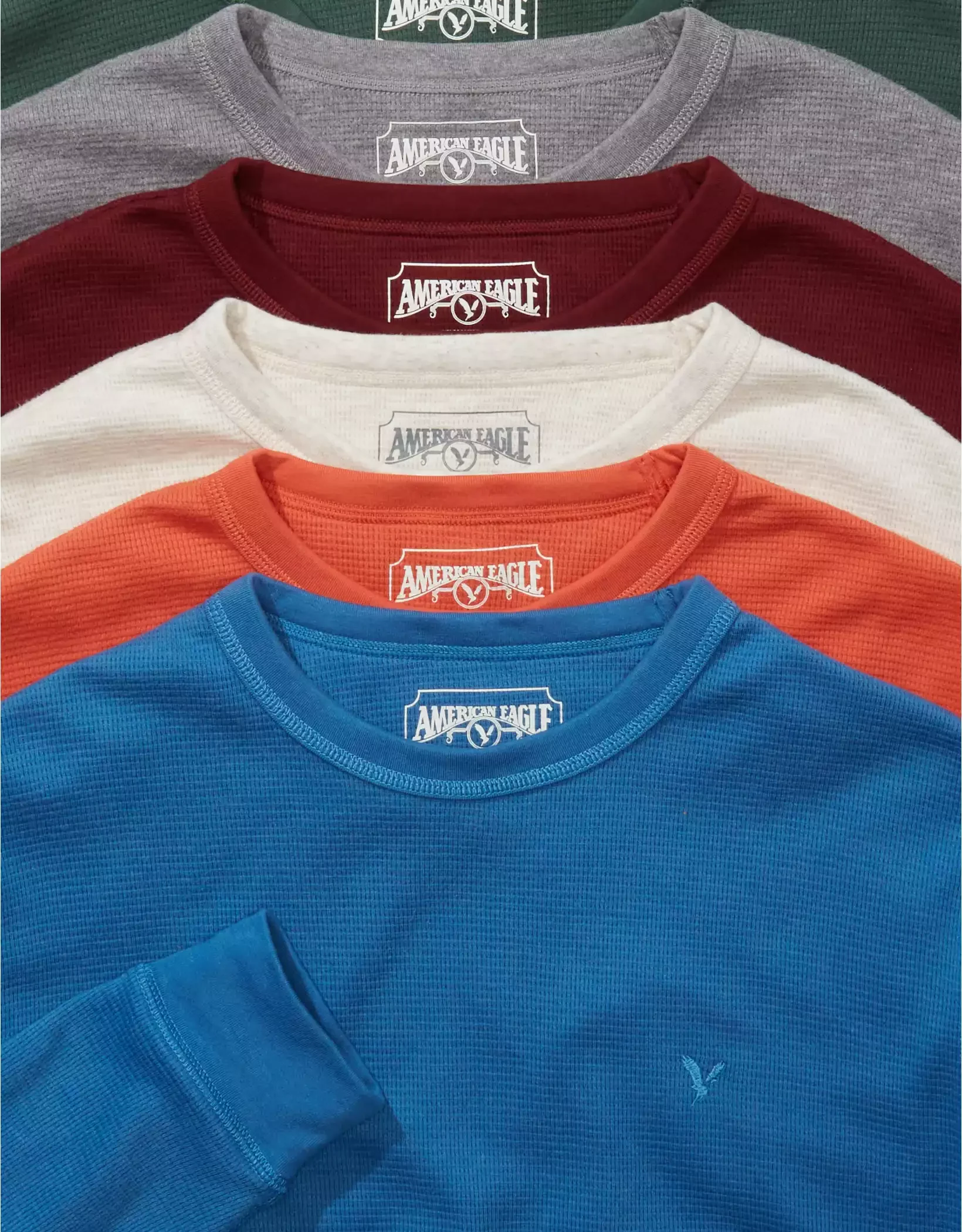
Holiday was built around a simple, elevated graphic system with a vintage varsity point of view. Working with the team, we developed the direction through curated techniques like chain stitch, felt patches, soft off-white appliqués, HERITAGE PRINTS and label systems that could live on product and support marketing imagery.
The goal was to give the assortment heritage, texture, and character without overcomplicating the graphics. Classic athletic references, outdoor cues, and soft tactile details came together in a way that felt familiar, seasonal, and quietly elevated.
AMERICAN EAGLE SP/SU
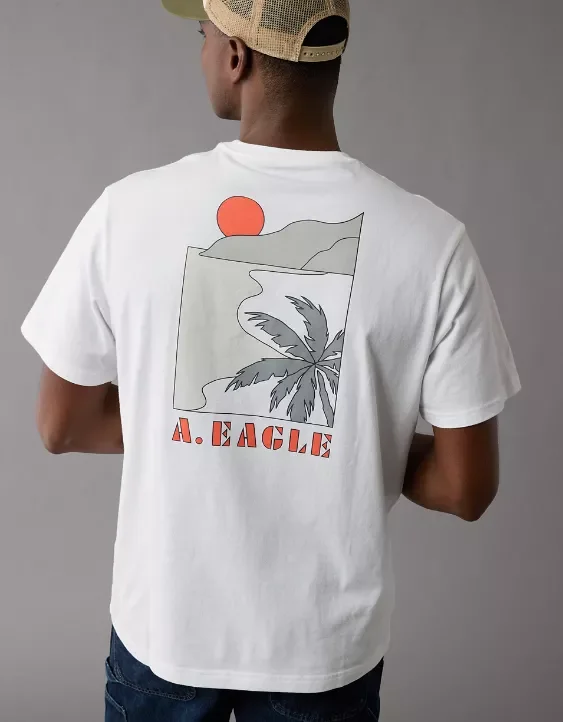
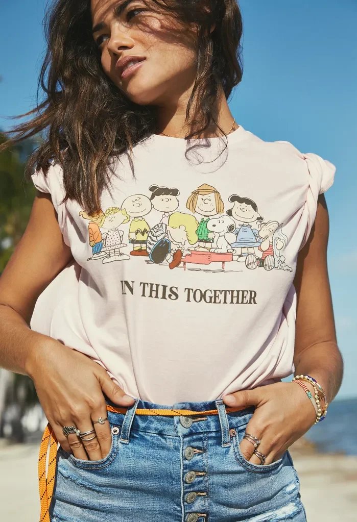
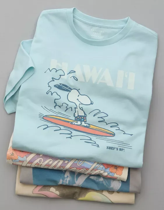
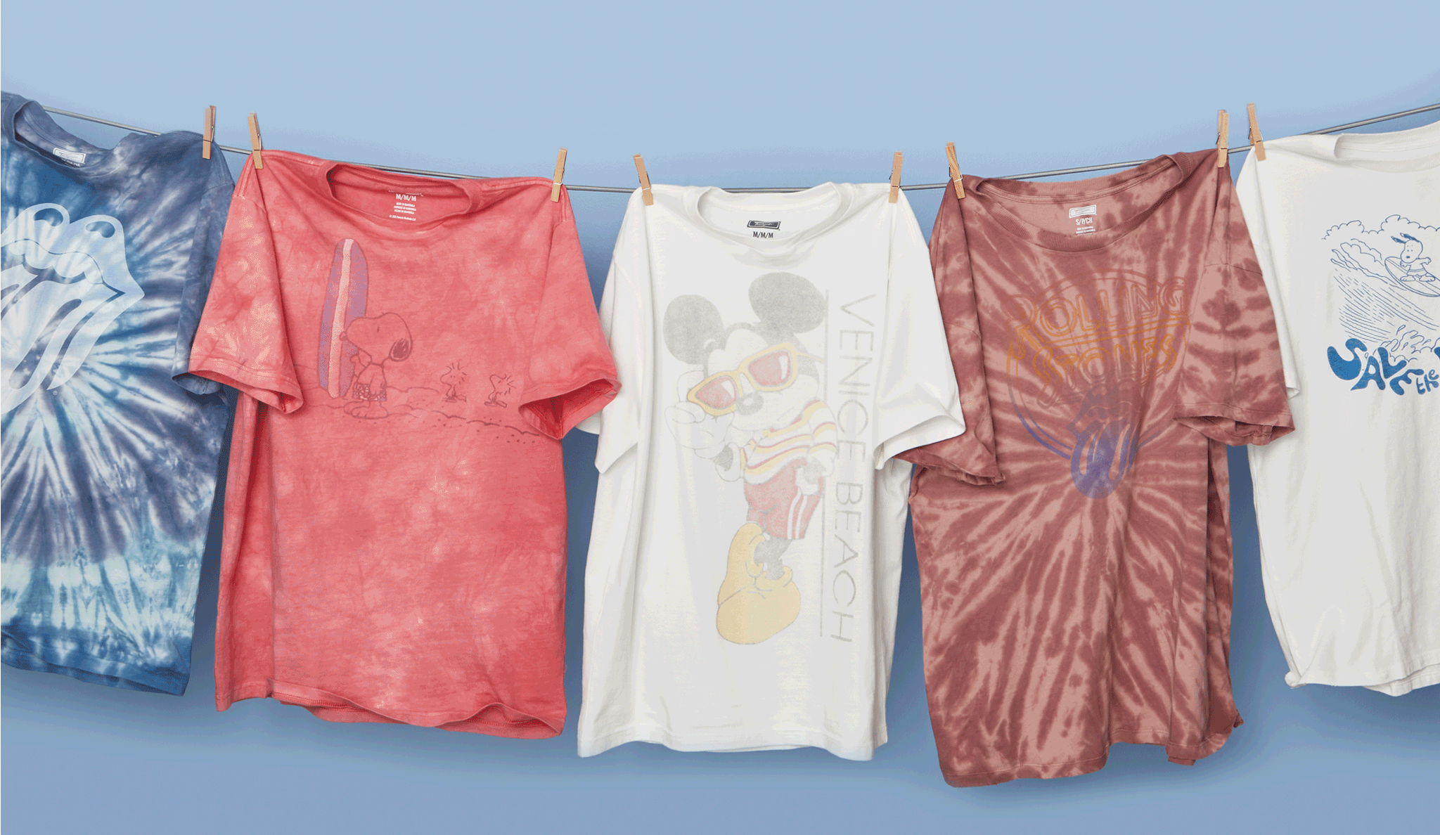
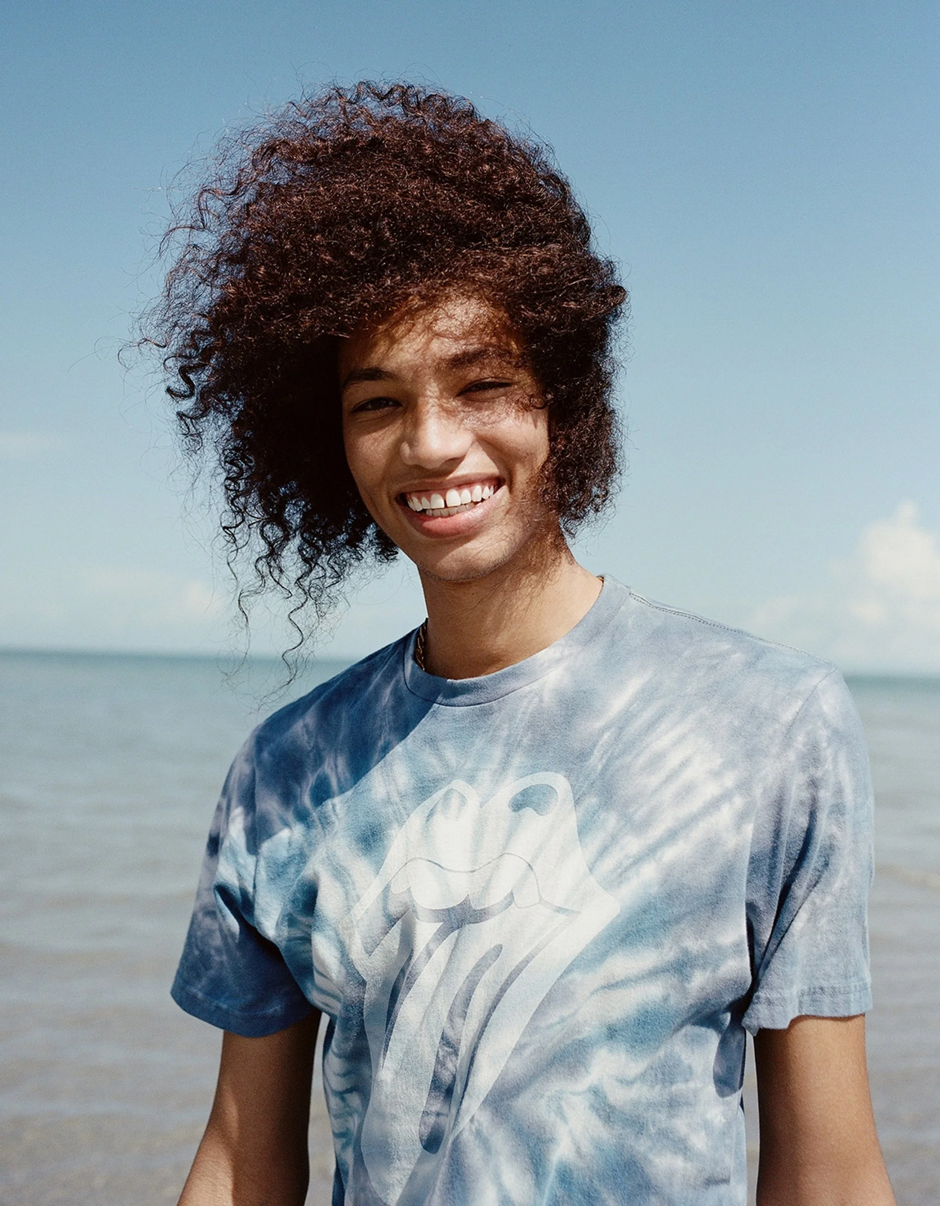
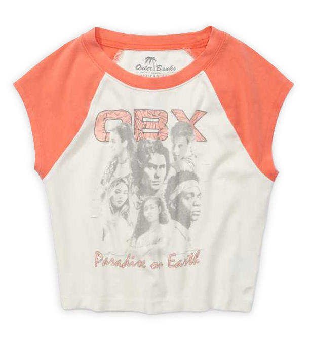
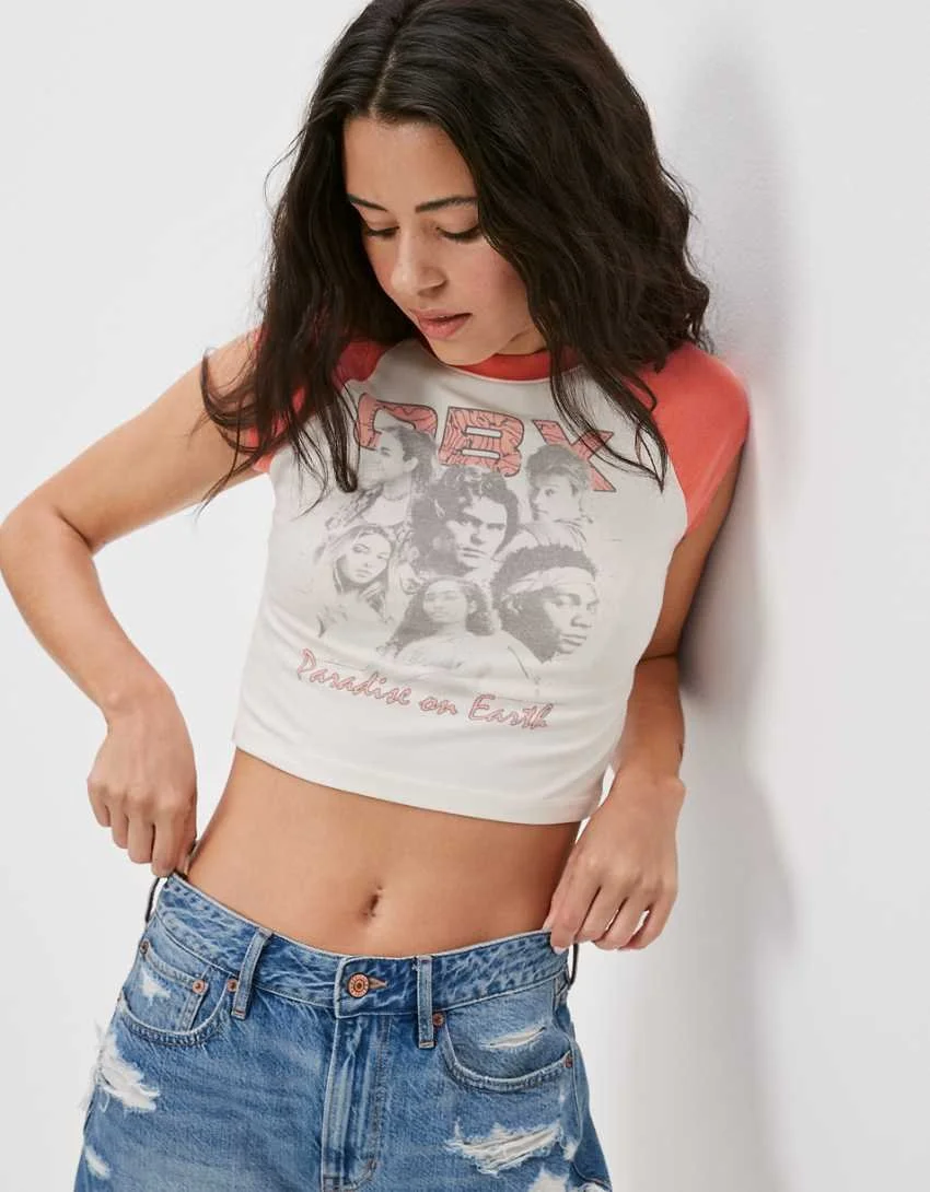
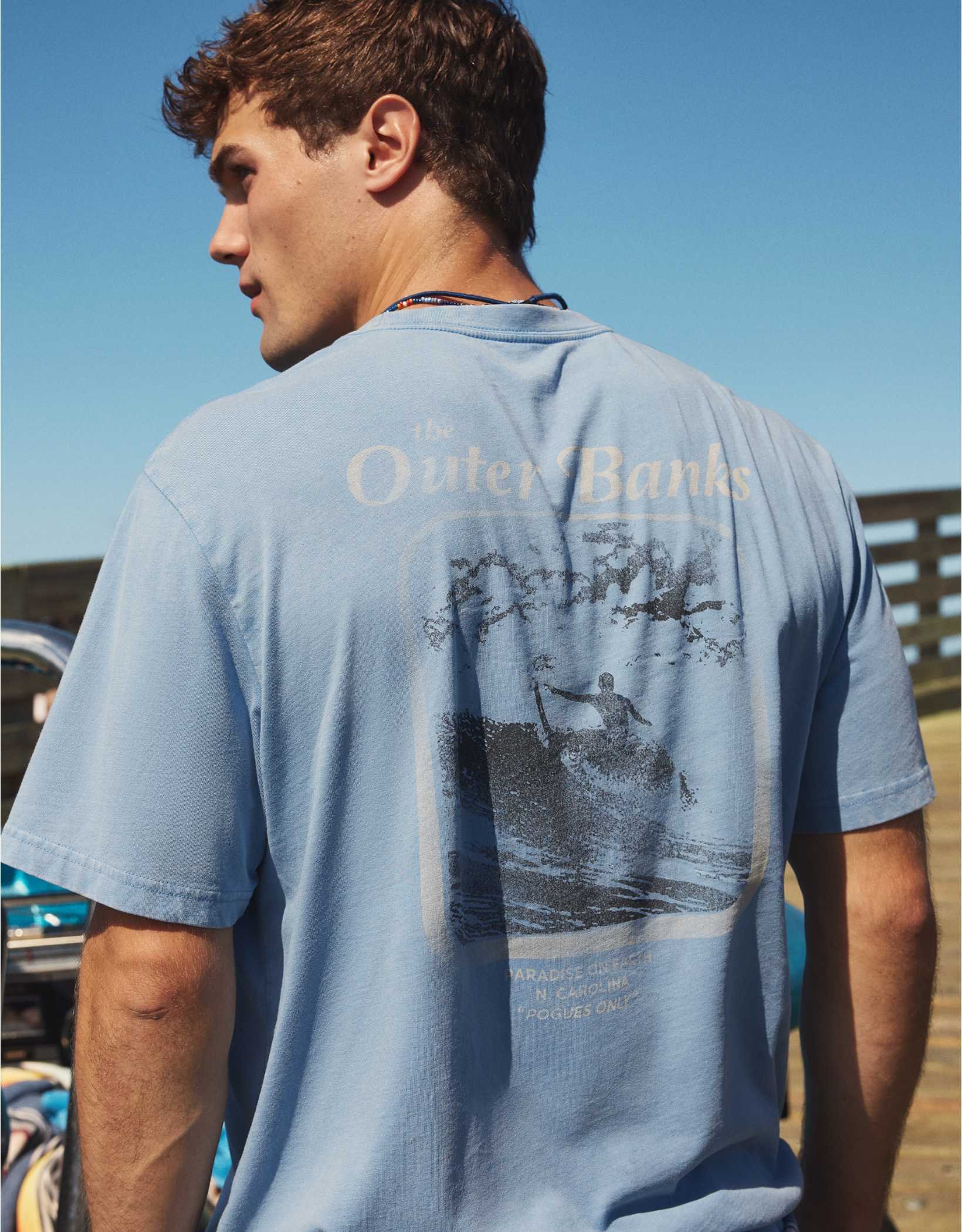
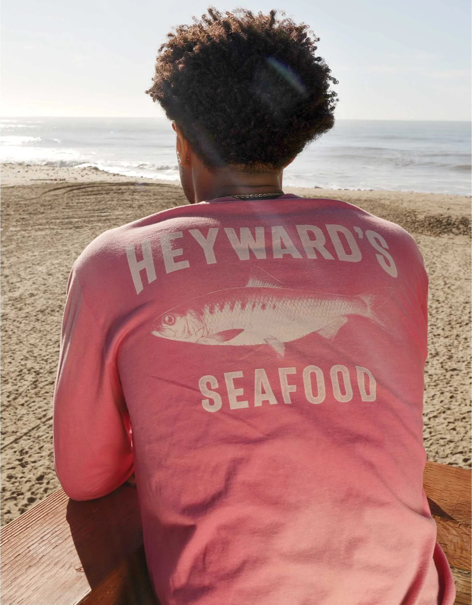
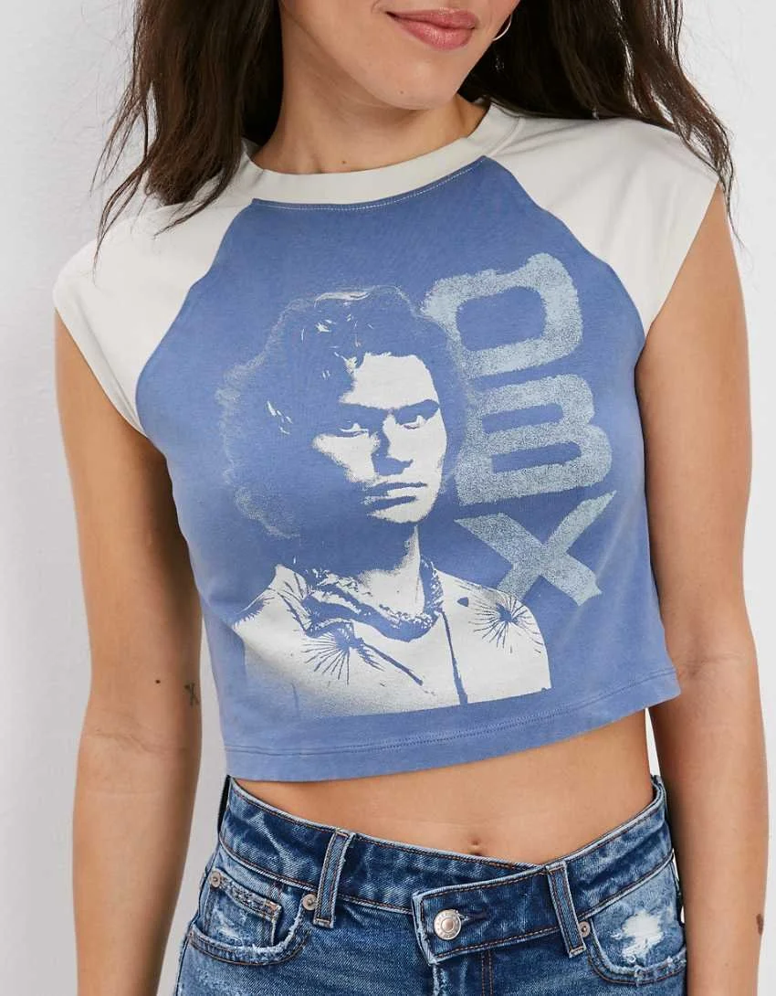
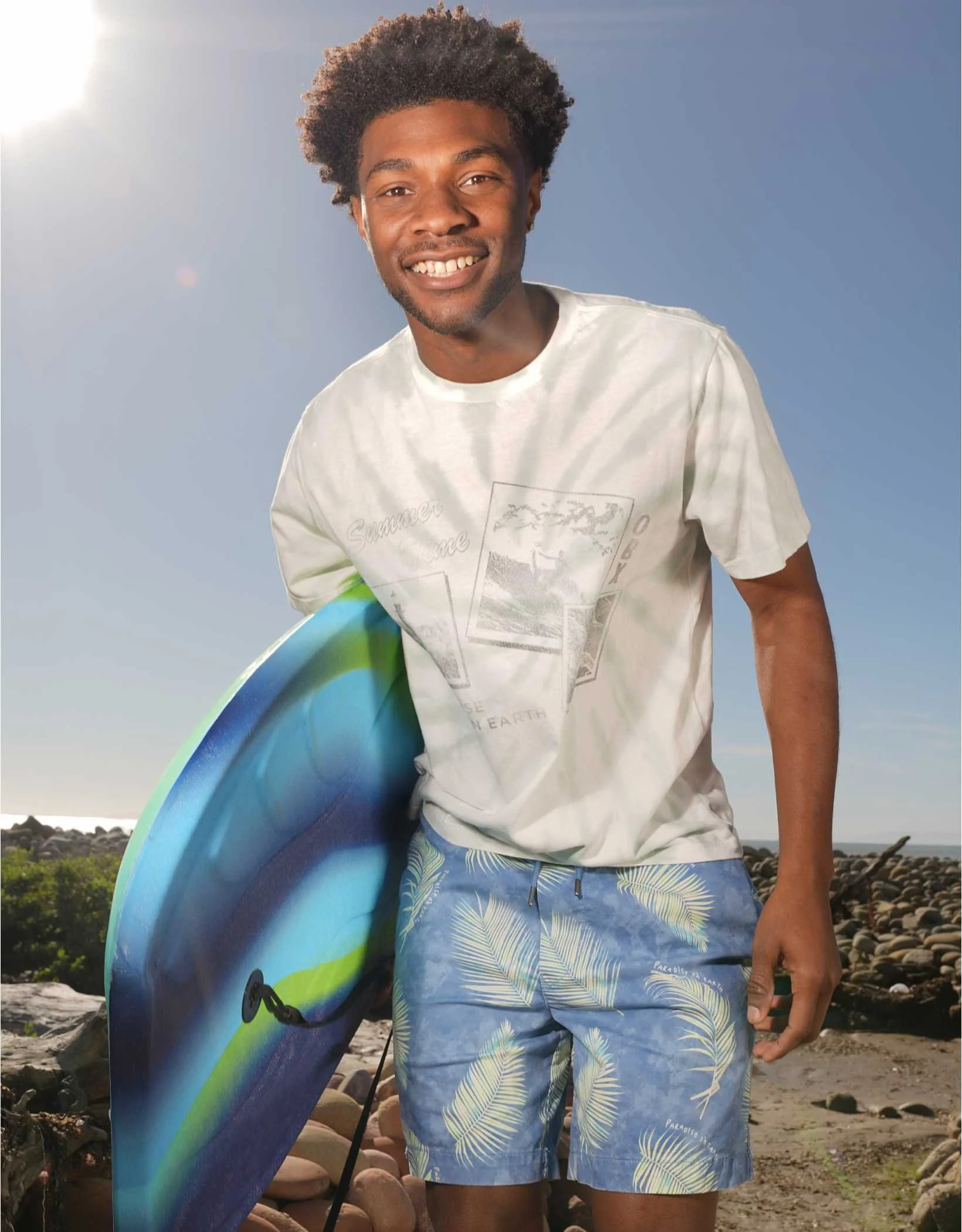
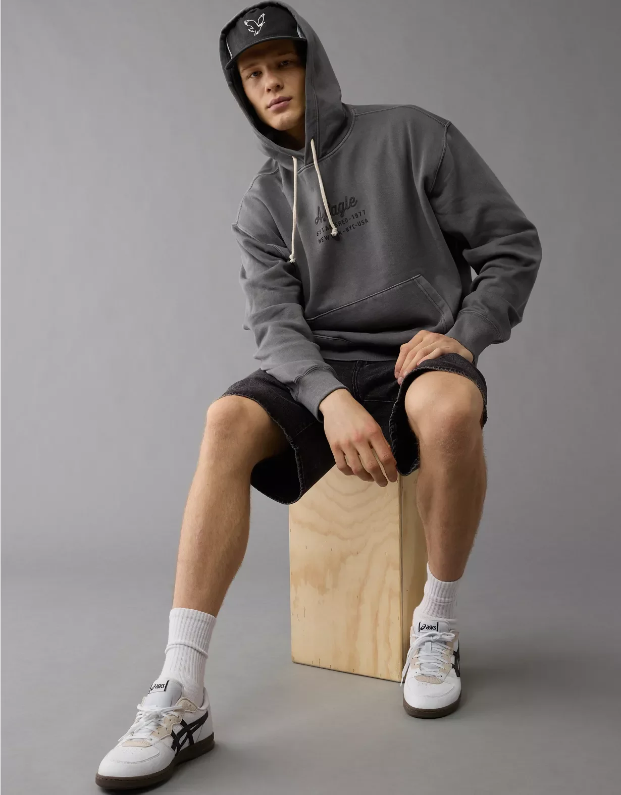
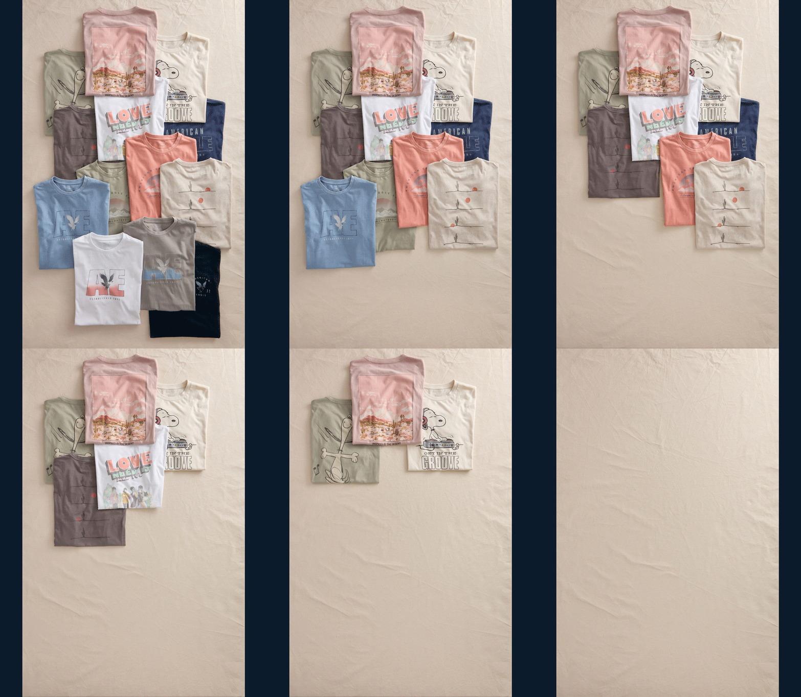
SP/SU was built as a broad seasonal graphic system, bringing together brand artwork, licensed characters, music, pop culture, and summer-driven references. Working with the team, the direction focused on creating consistency across a wide range of ideas through color, scale, placement, and print technique.
The season leaned into gradients, faded photoreals, soft lived-in prints, puff ink, mixed print methods, and dye effects to give the assortment depth and texture. The goal was to let each graphic carry its own personality while still feeling connected to one larger seasonal point of view.