AE 24/7
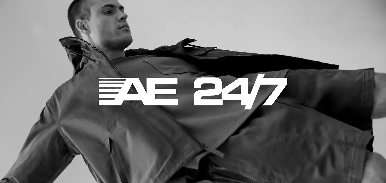
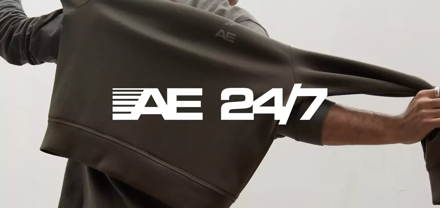
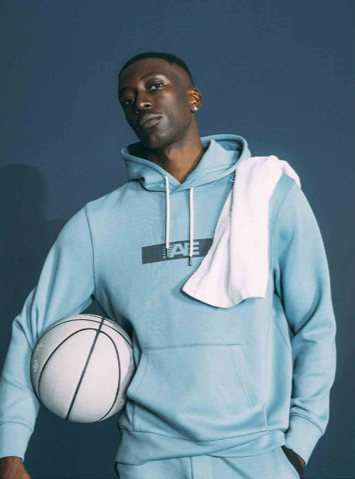
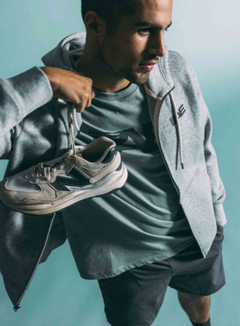
AE 24/7 needed an activewear identity that was immediate, flexible, and built to move across product. The core mark was developed by the team, with my role focused on art direction and building the broader visual system around it.
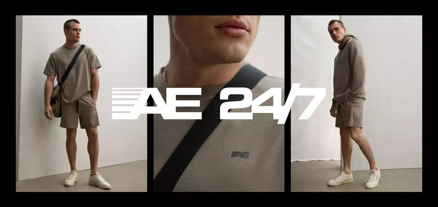
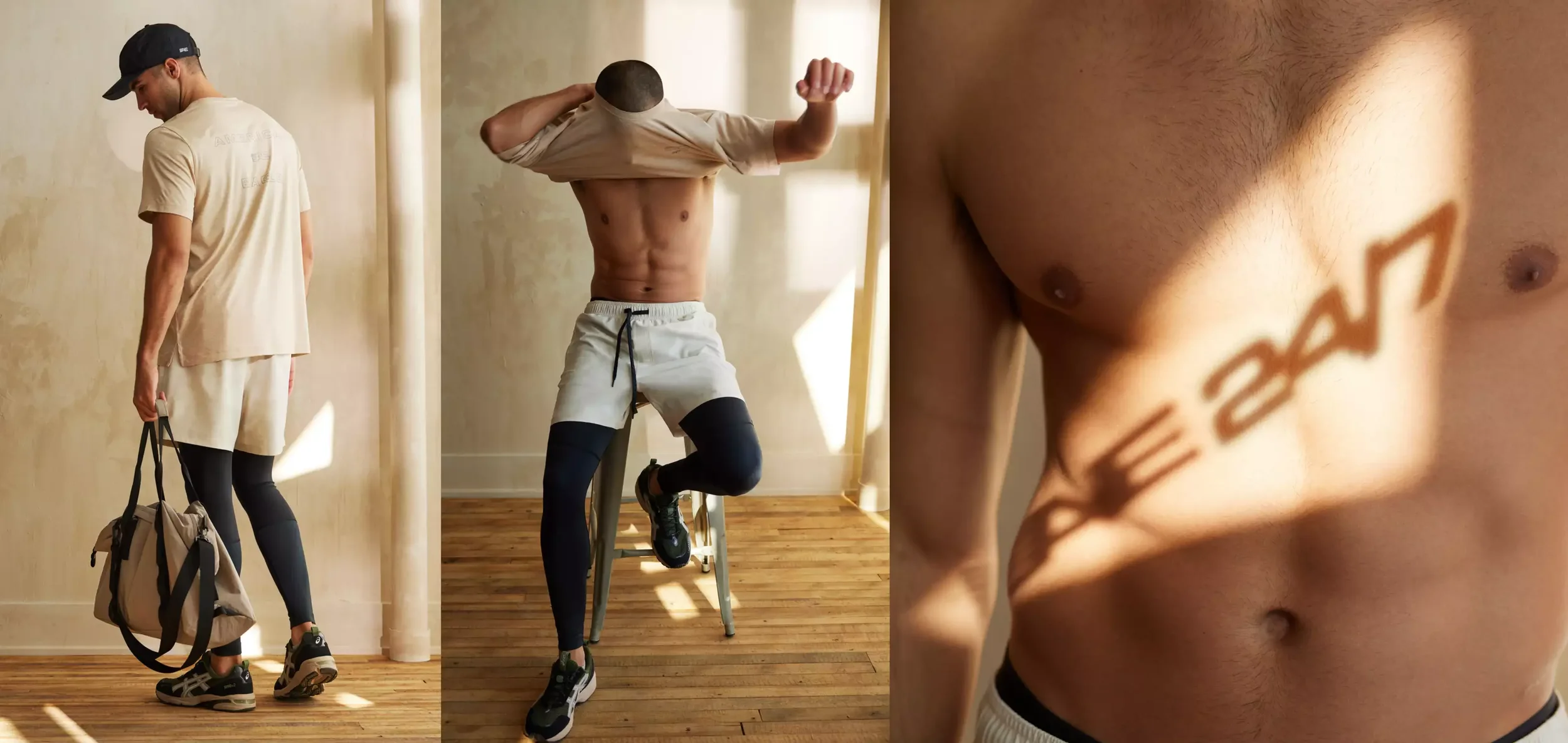
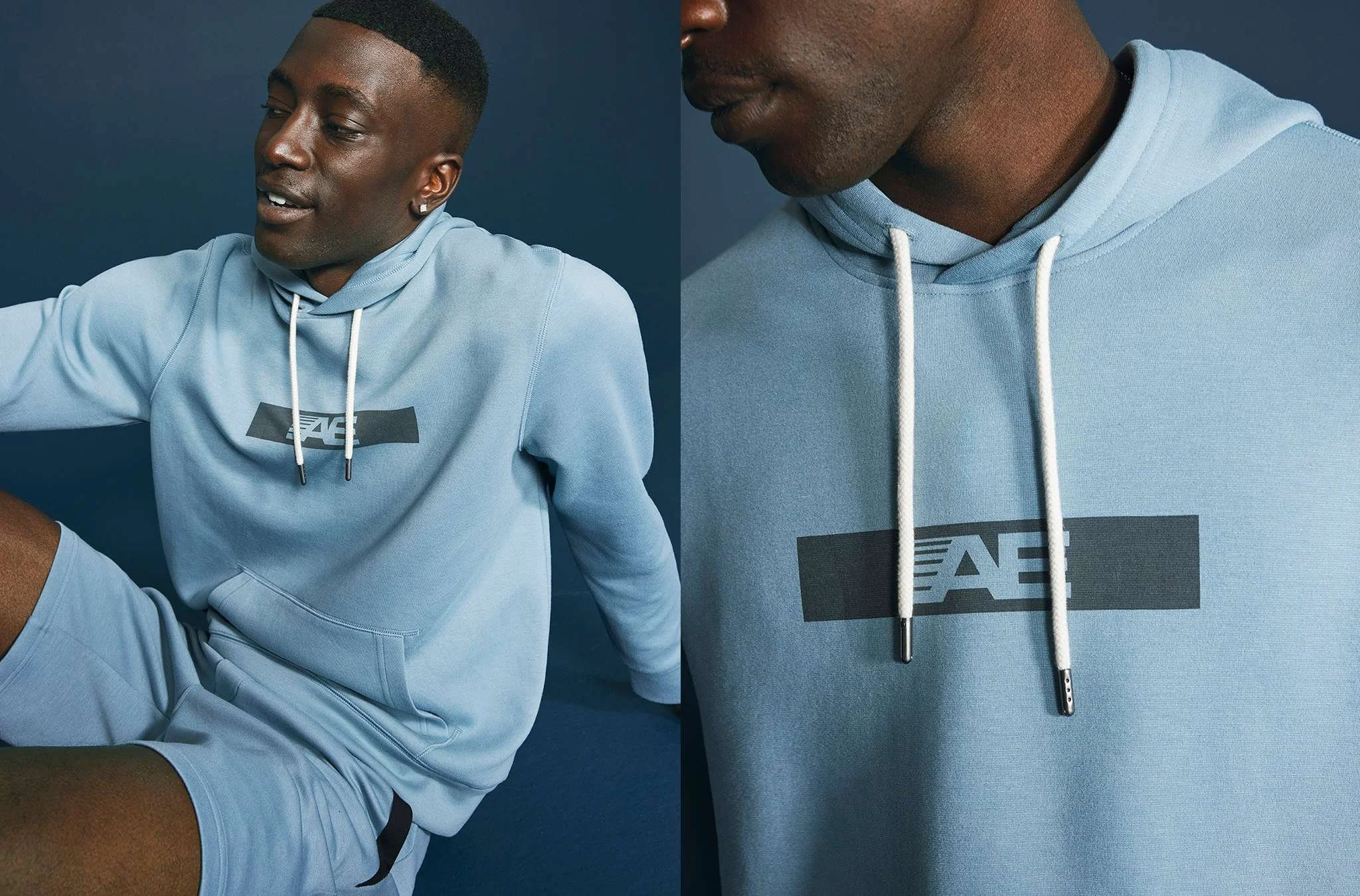
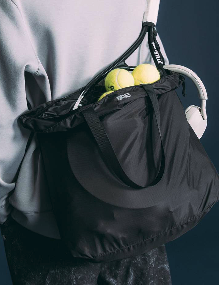
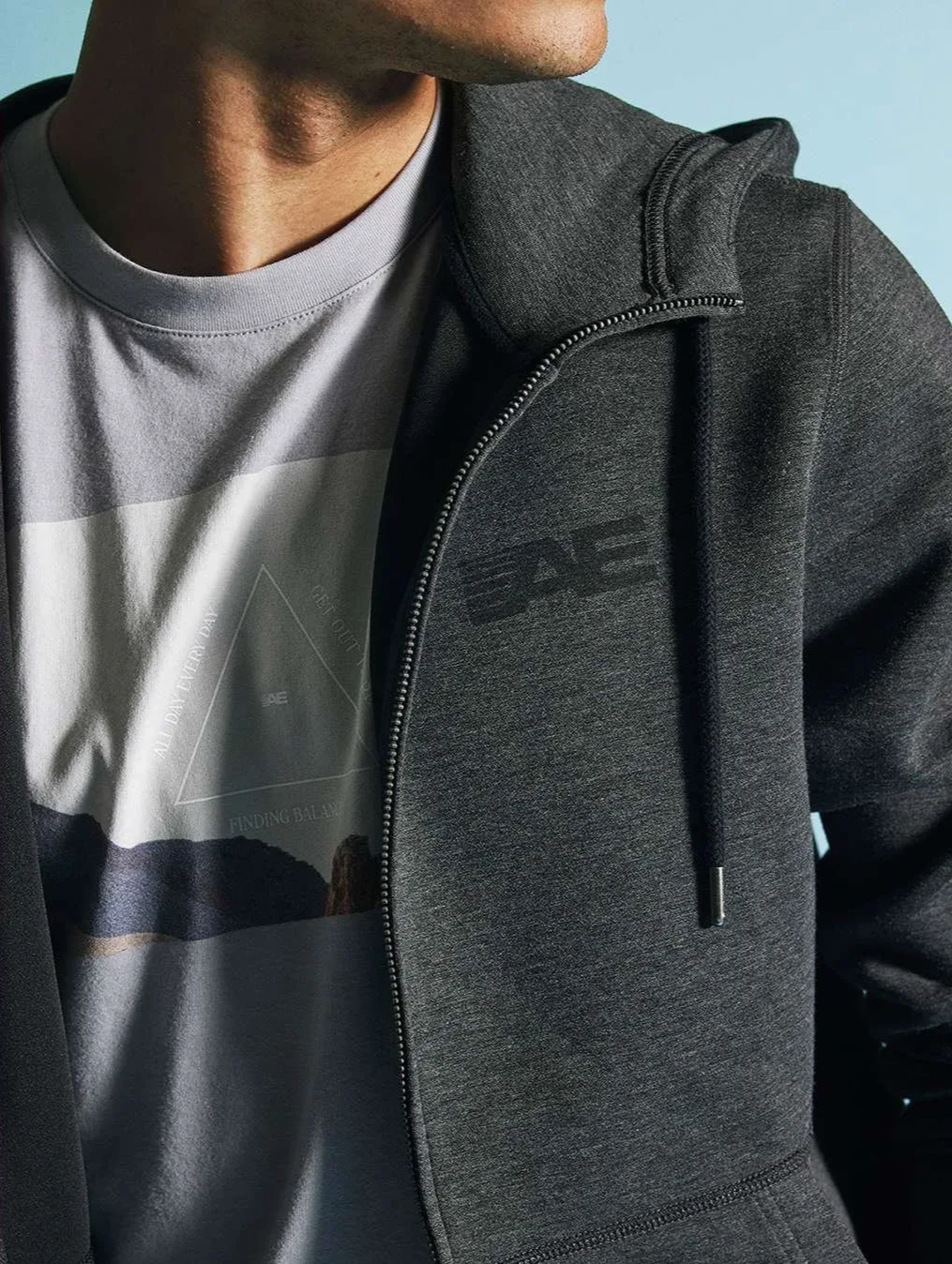
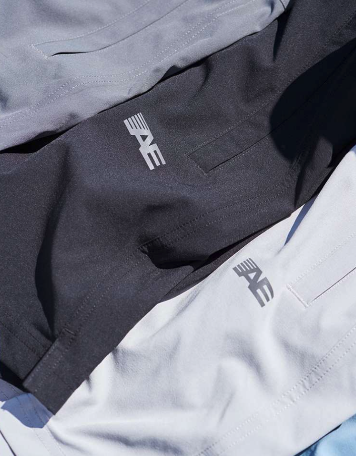
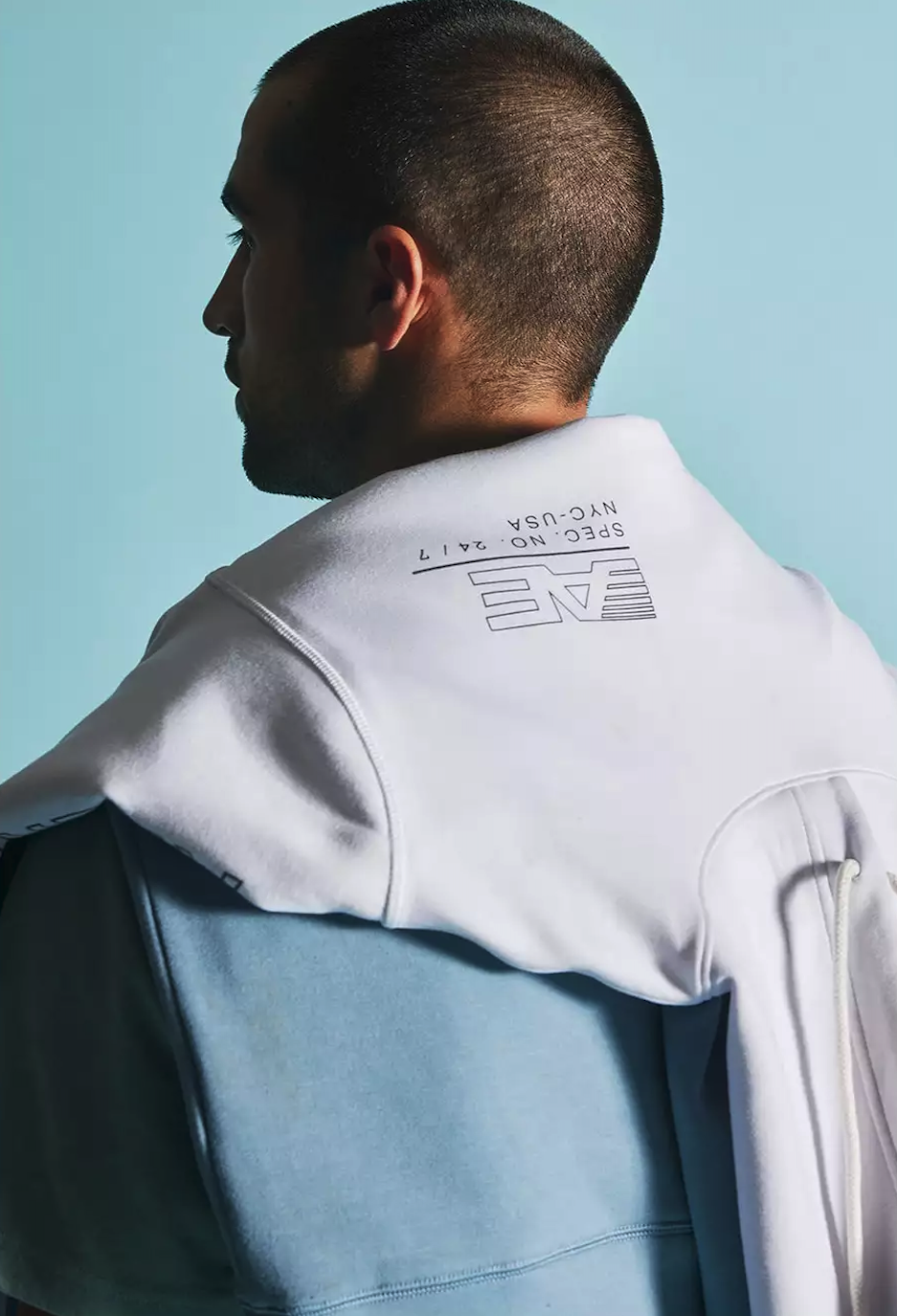
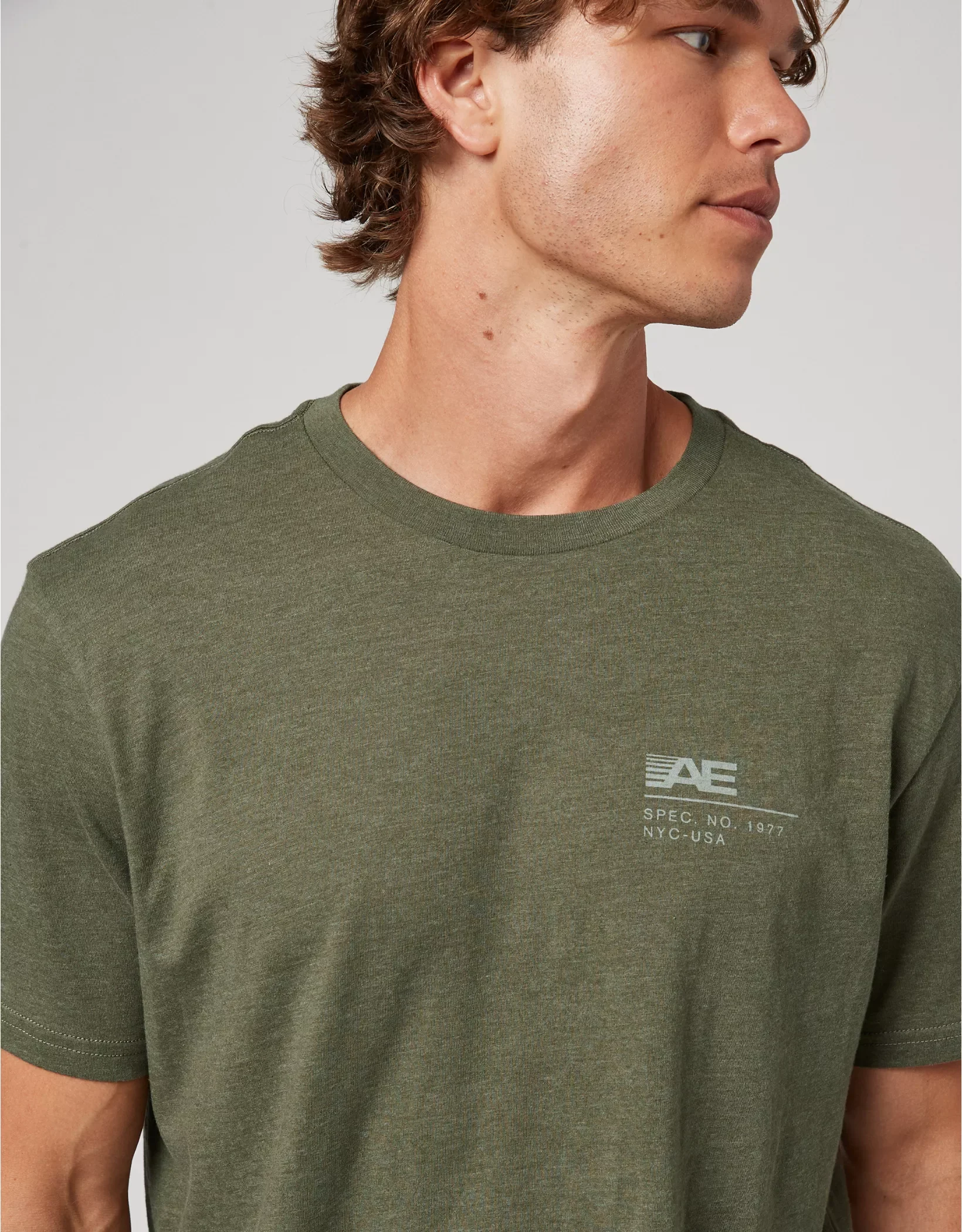
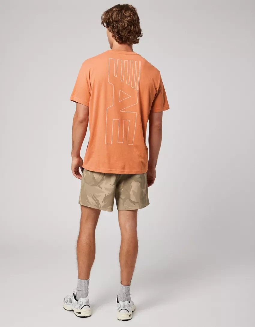
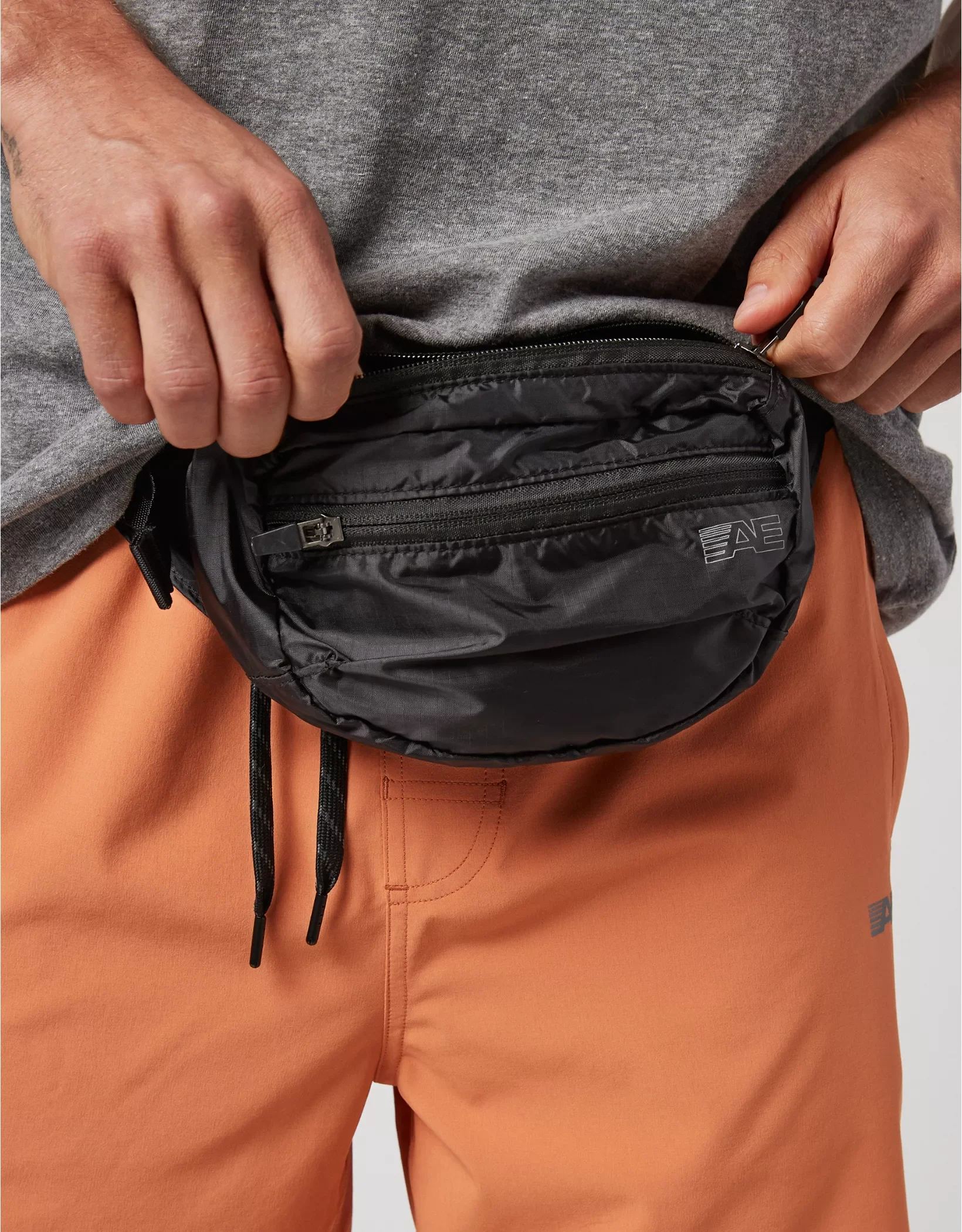
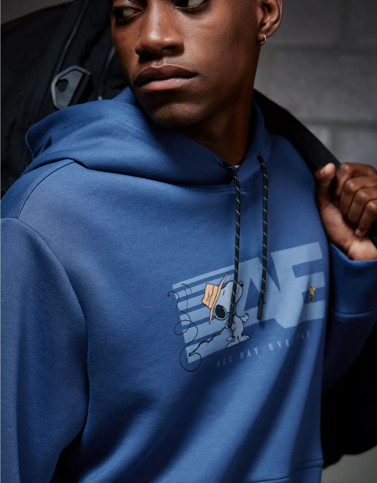
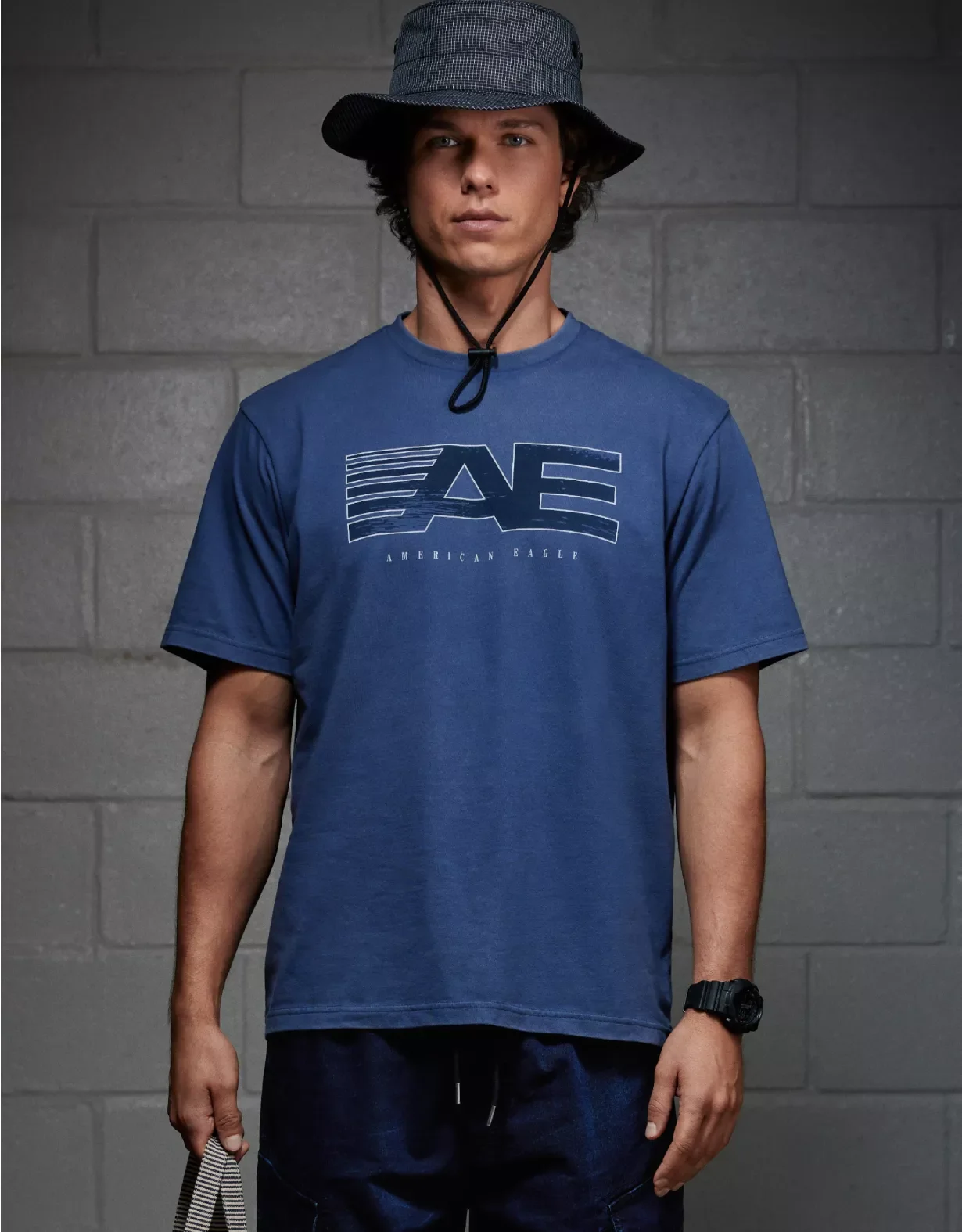
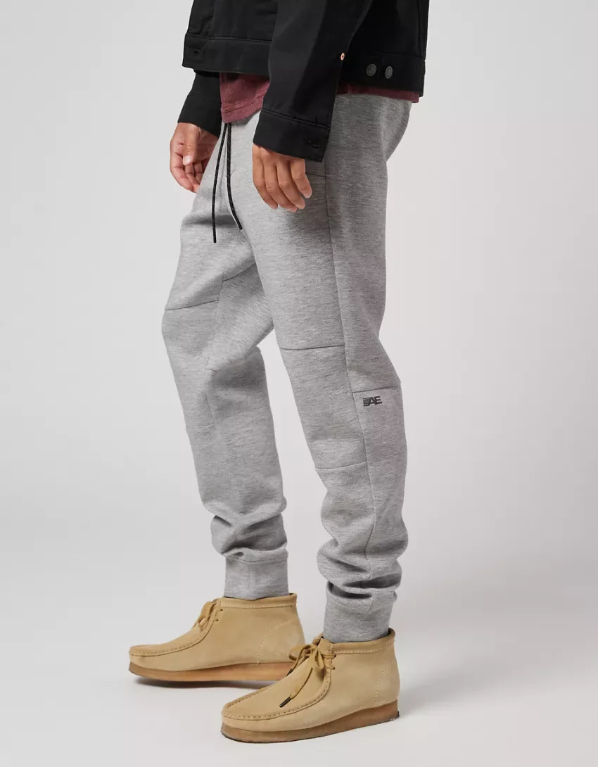
From there, the work became about application: how the mark lived across fleece, tees, shorts, bags, trims, packaging, on-product marketing, and campaign graphics. The AE slash mark functionS as the primary identifier, while the 24/7 extension gave the line a stronger brand voice when the full story needed to show up.

AE 24/7
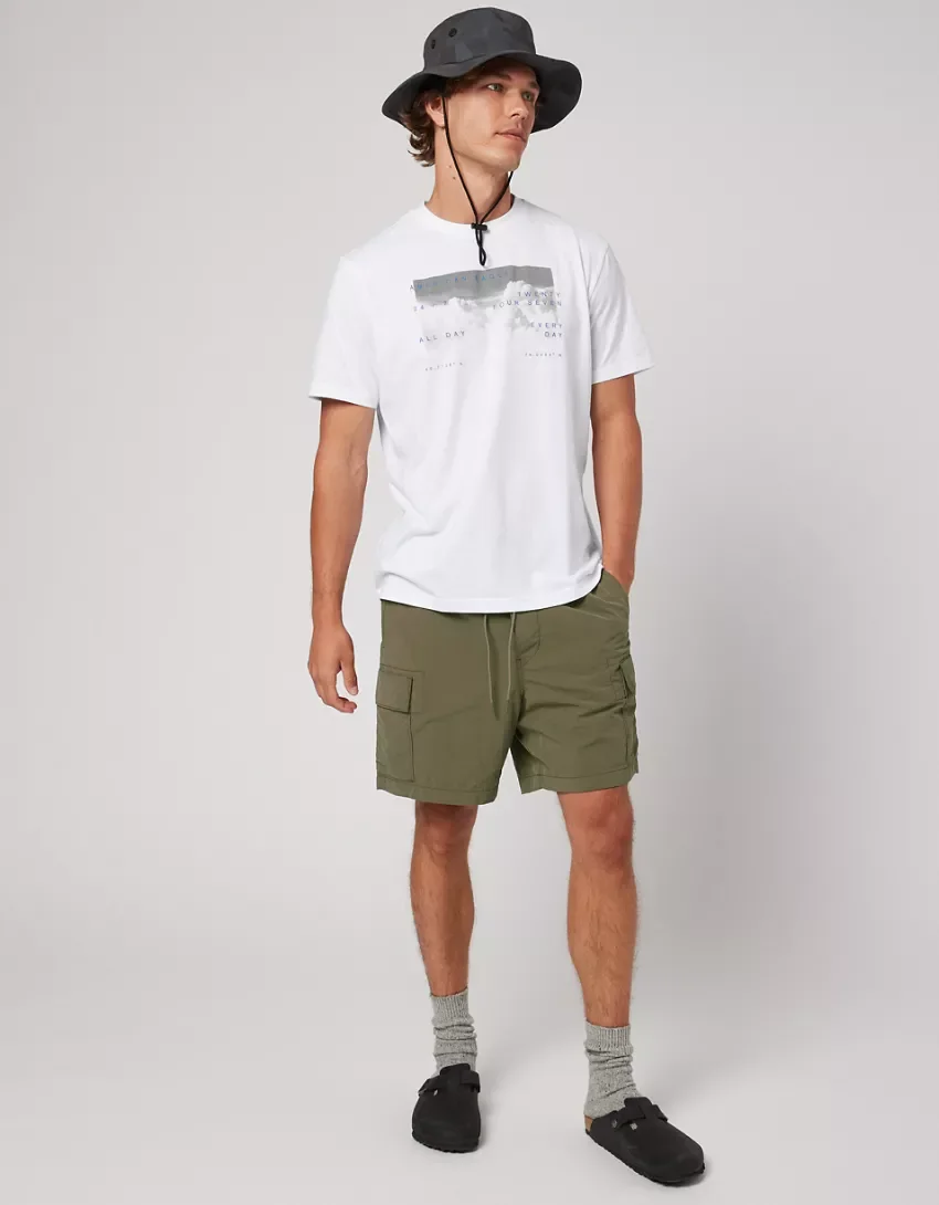
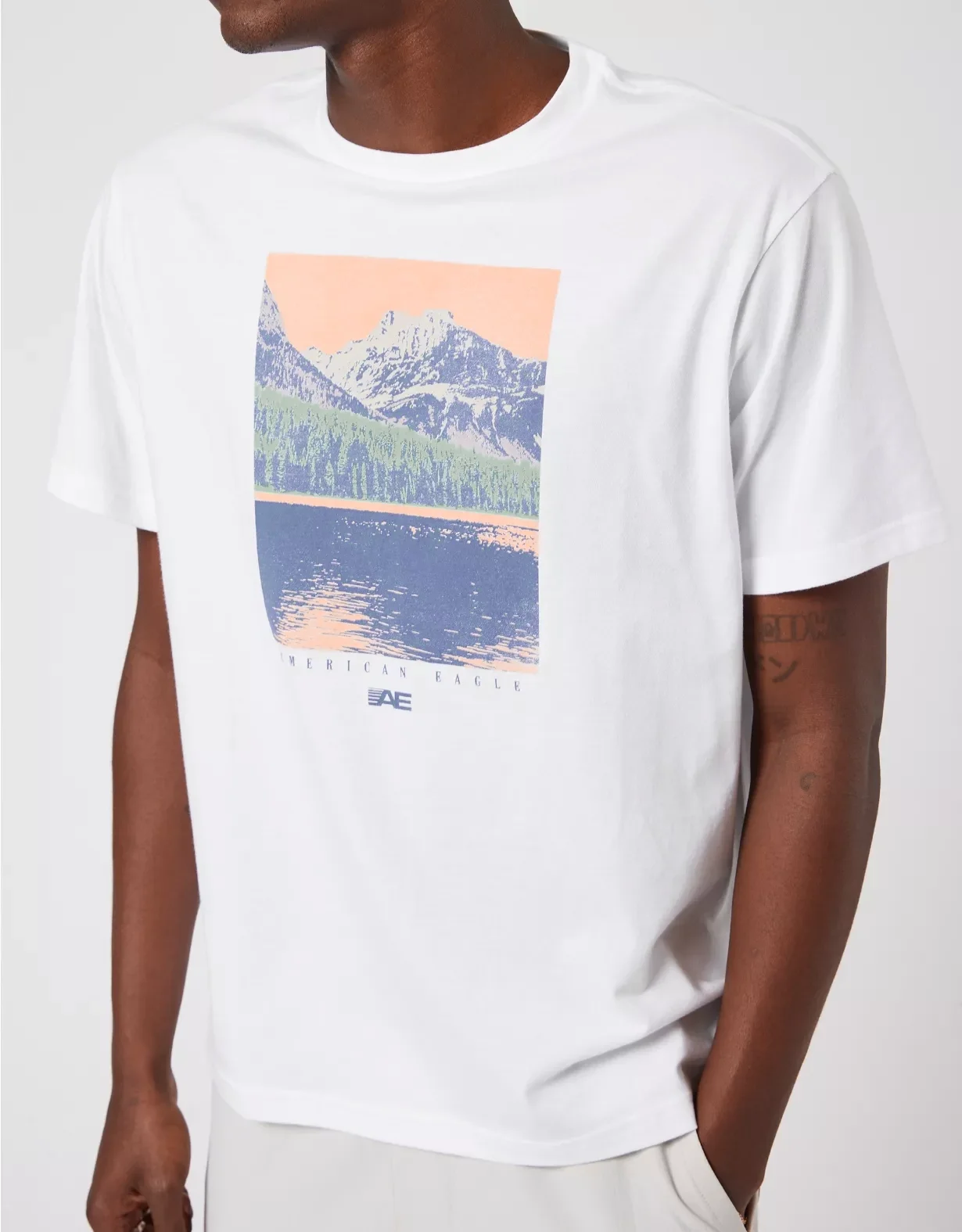
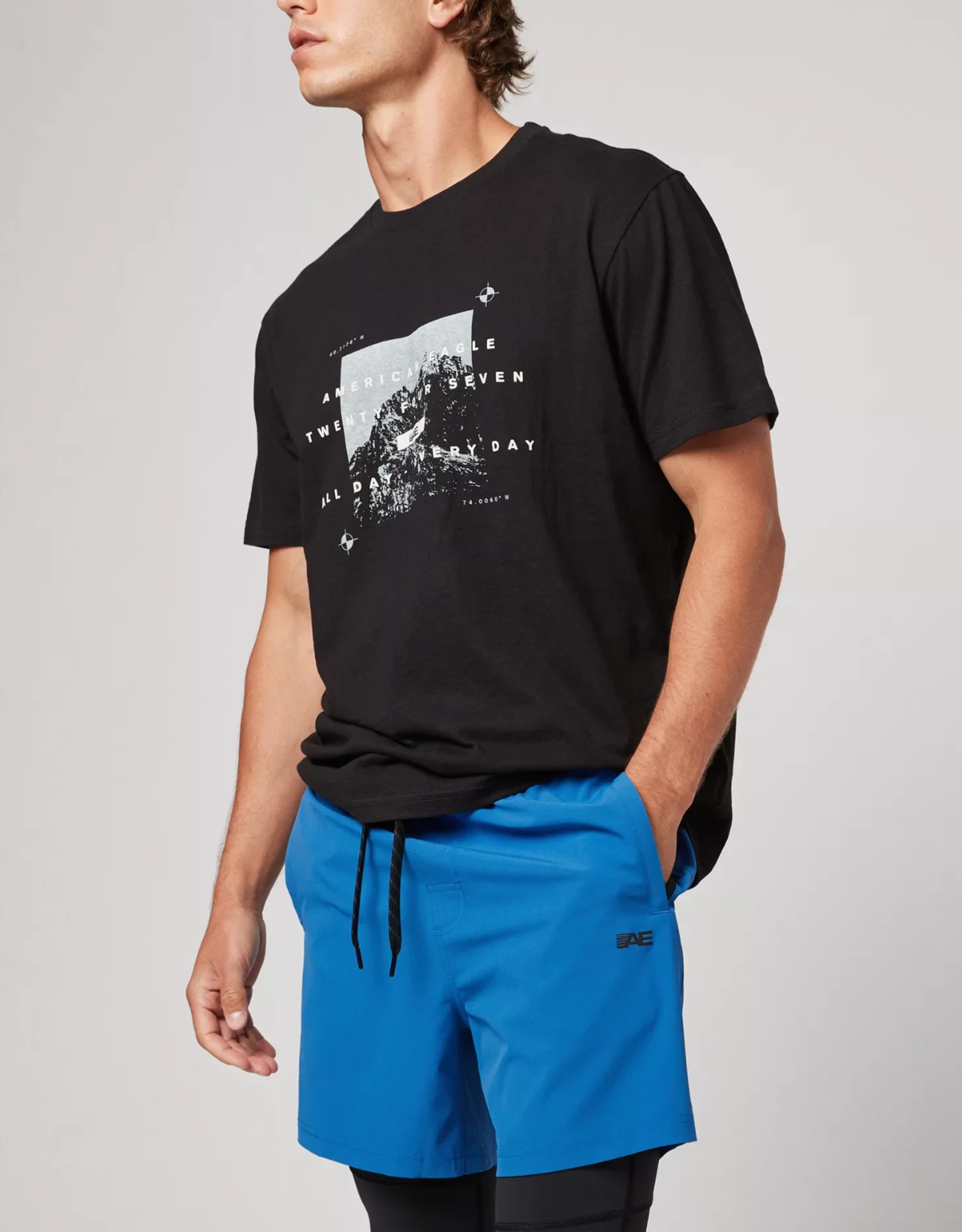
This season was shaped through an outdoor-technical lens. Working with the team, we developed the graphic style, design references, color palette, and product expressions through coordinates, elevation markers, technical drawings, photoreal scenic prints, and field-journal details.
The result was a graphic language that felt field-inspired, performance-informed, and versatile across multiple apparel pieces, including bags and outerwear.

AE 24/7
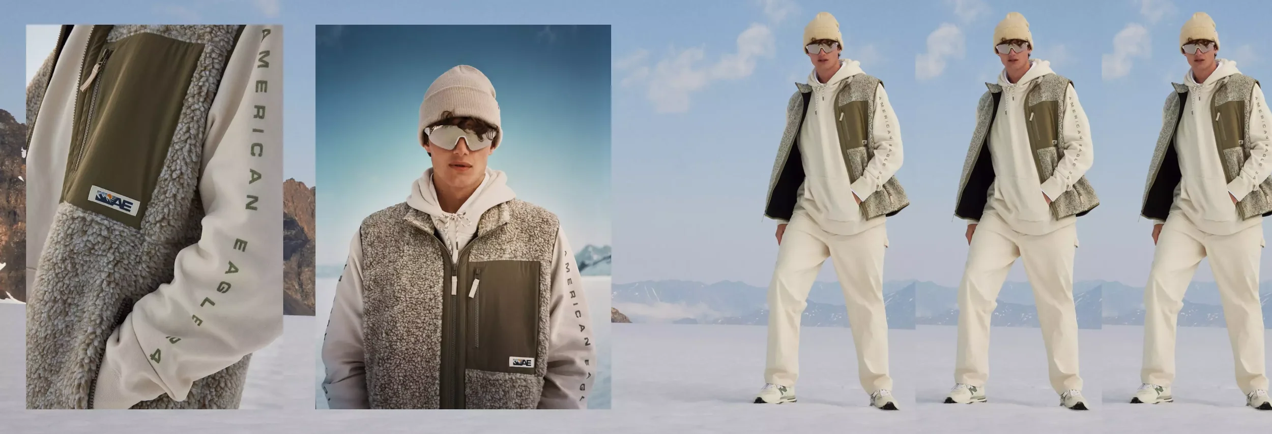
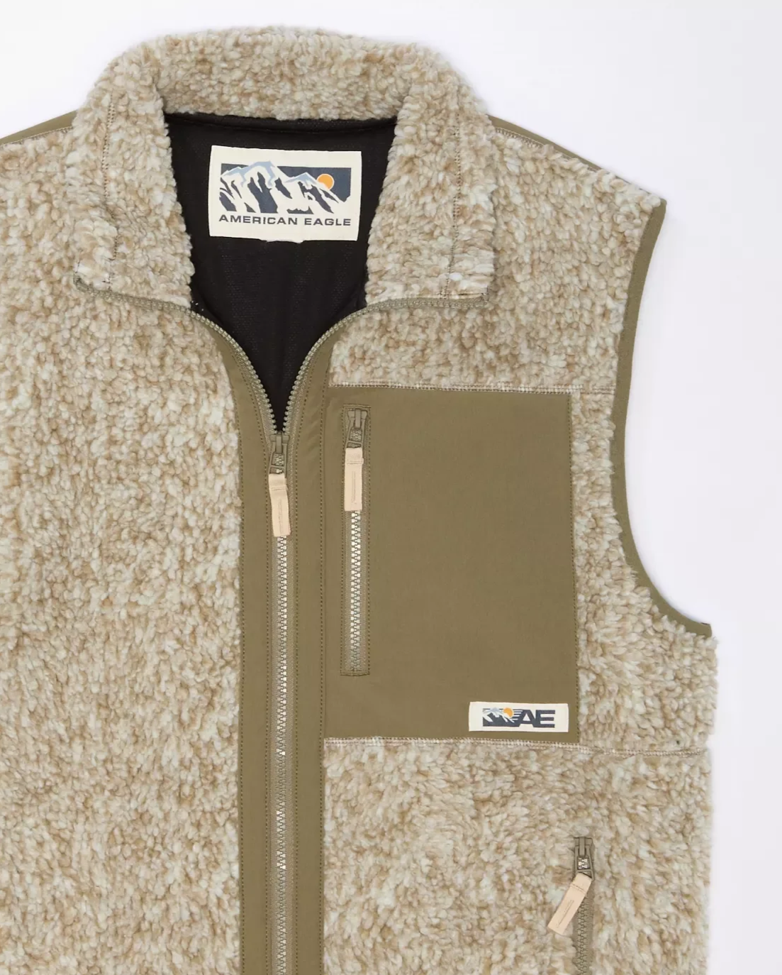
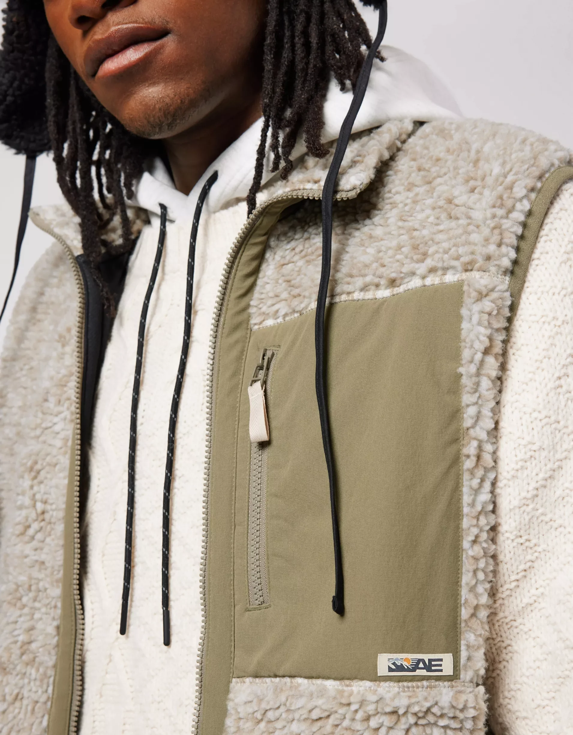
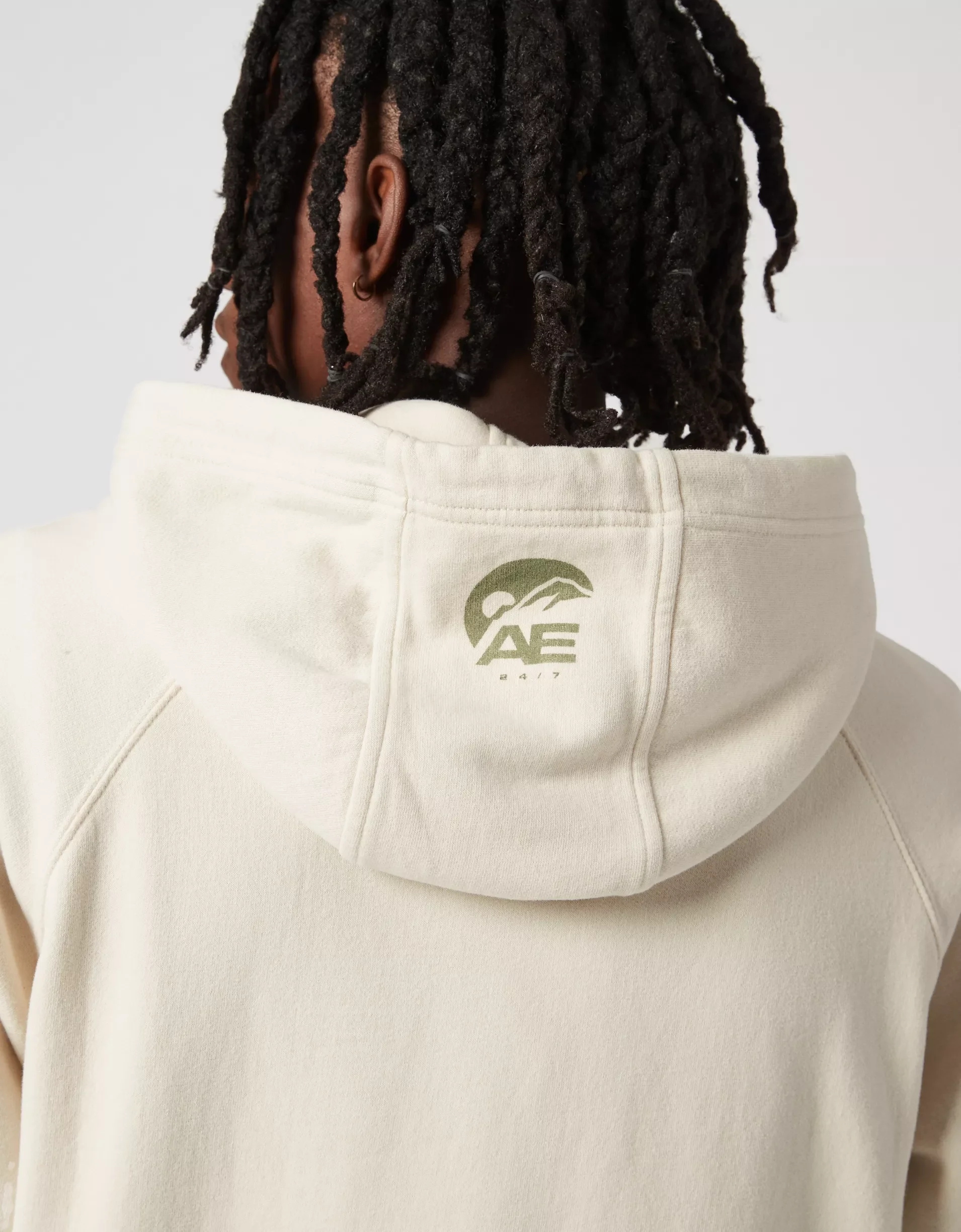
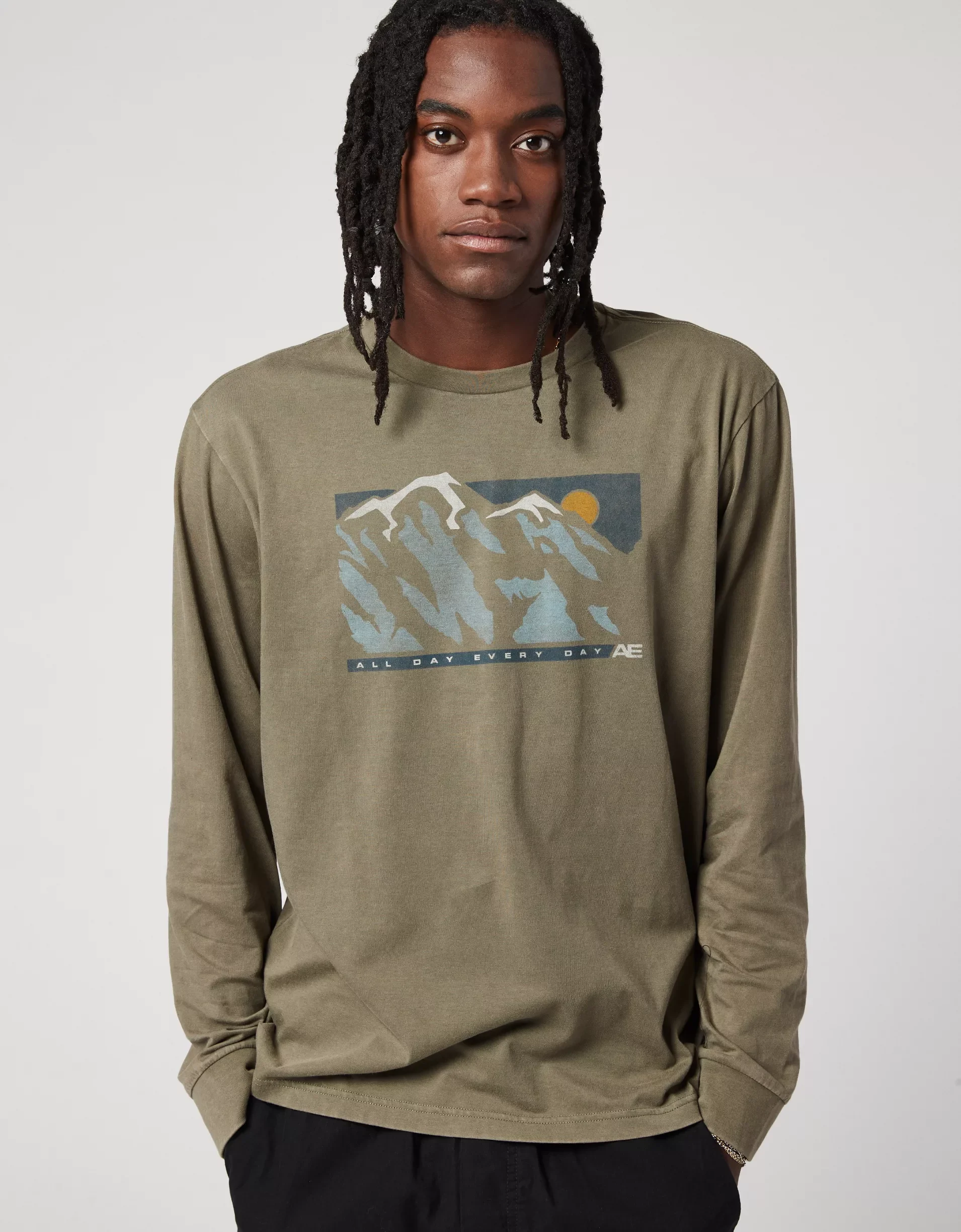
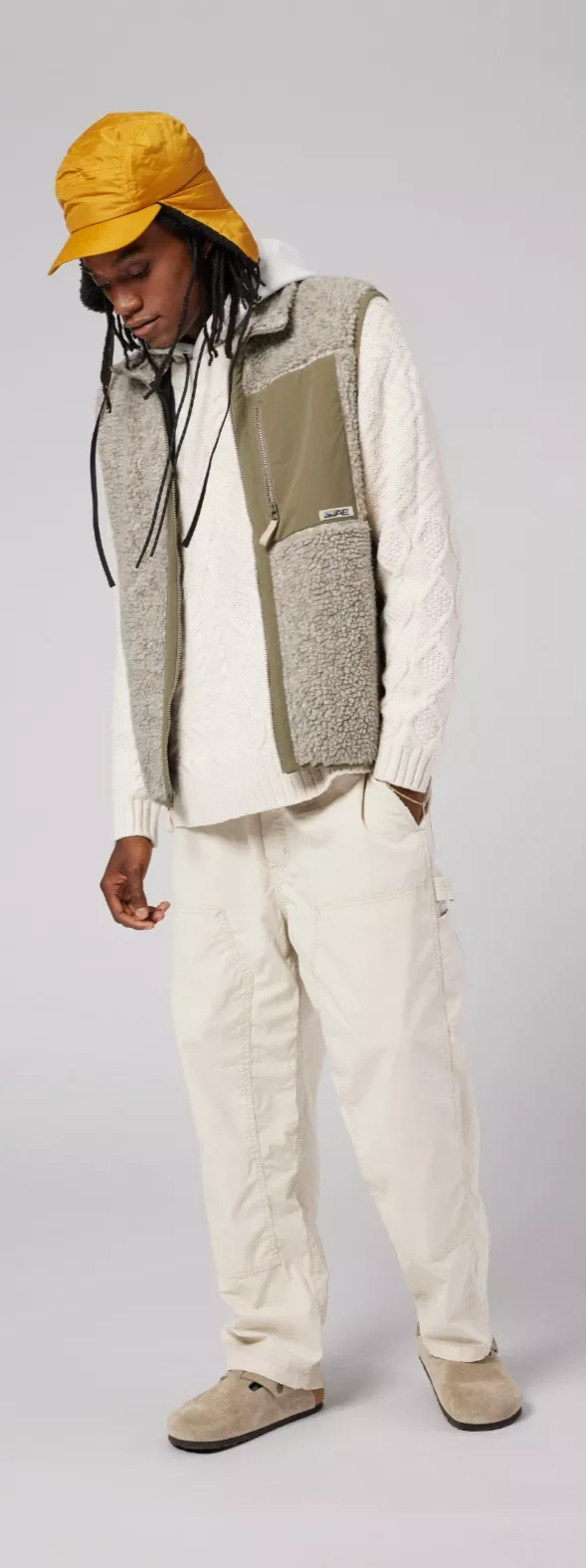
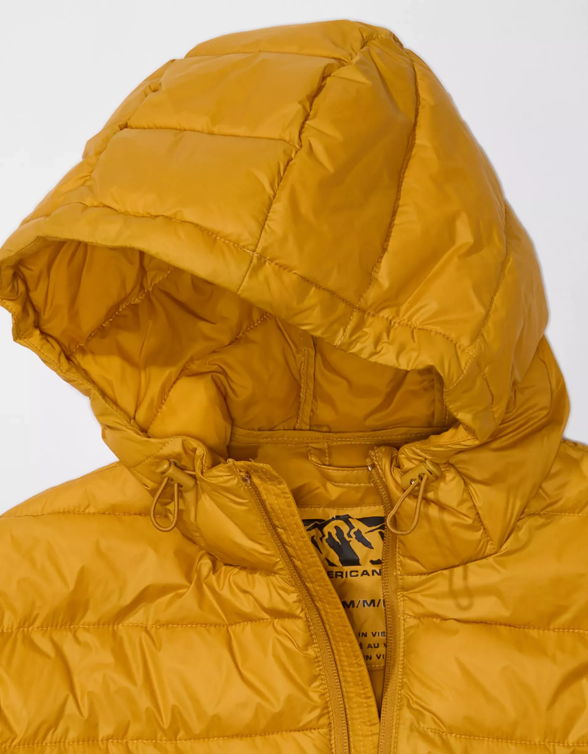
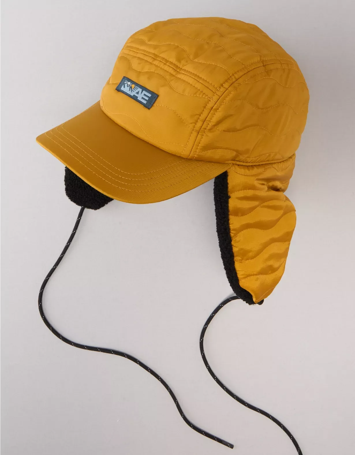
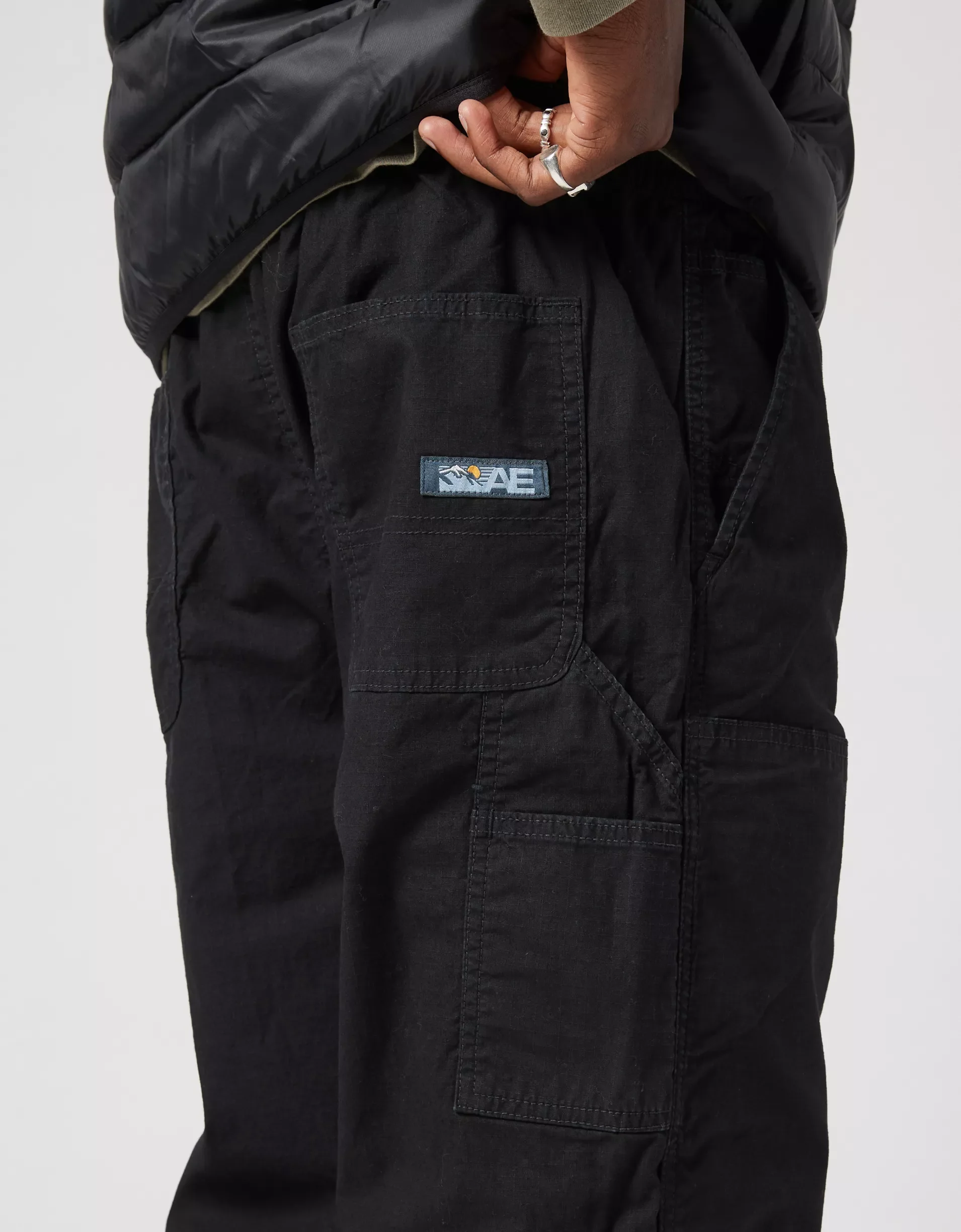
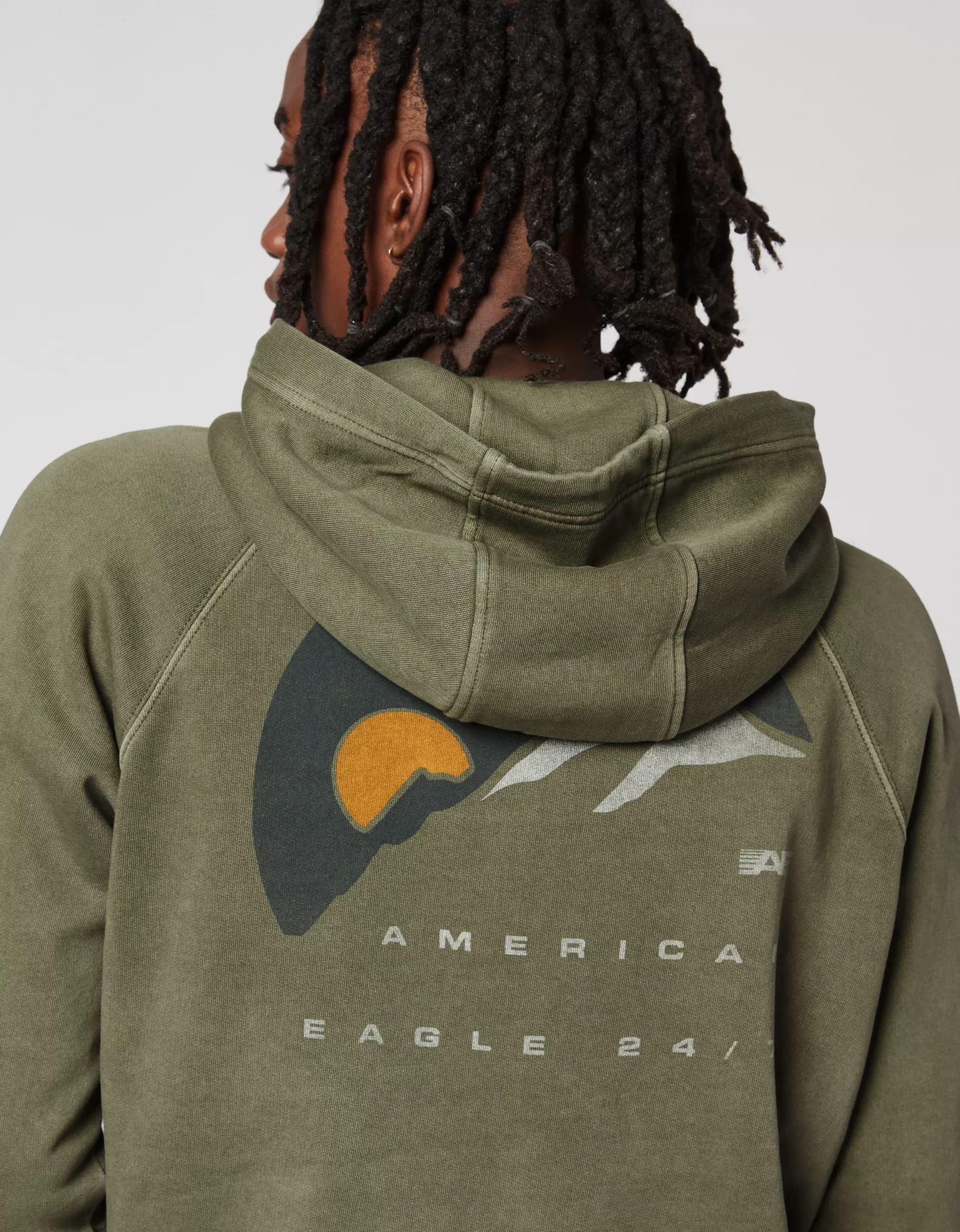
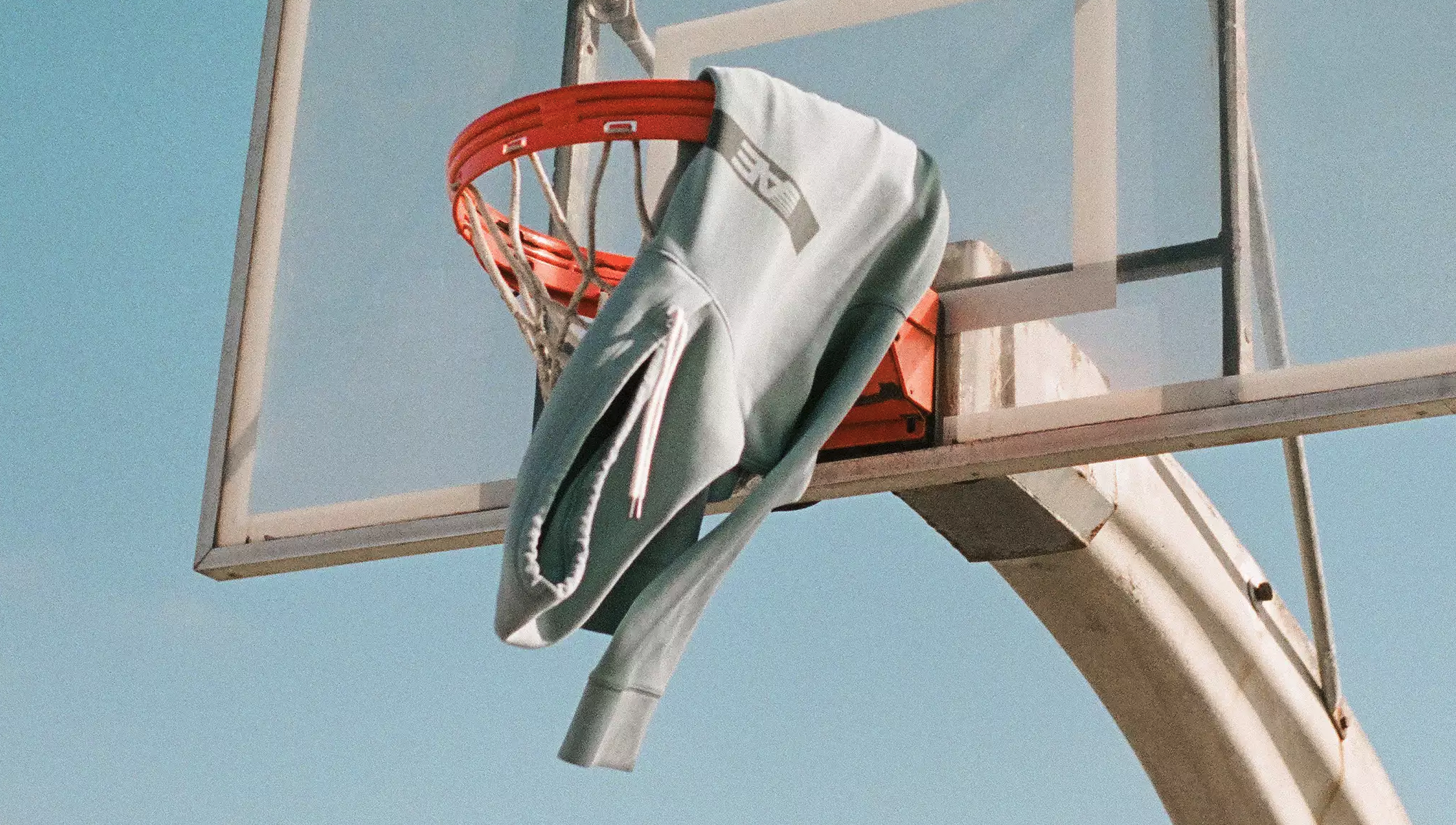
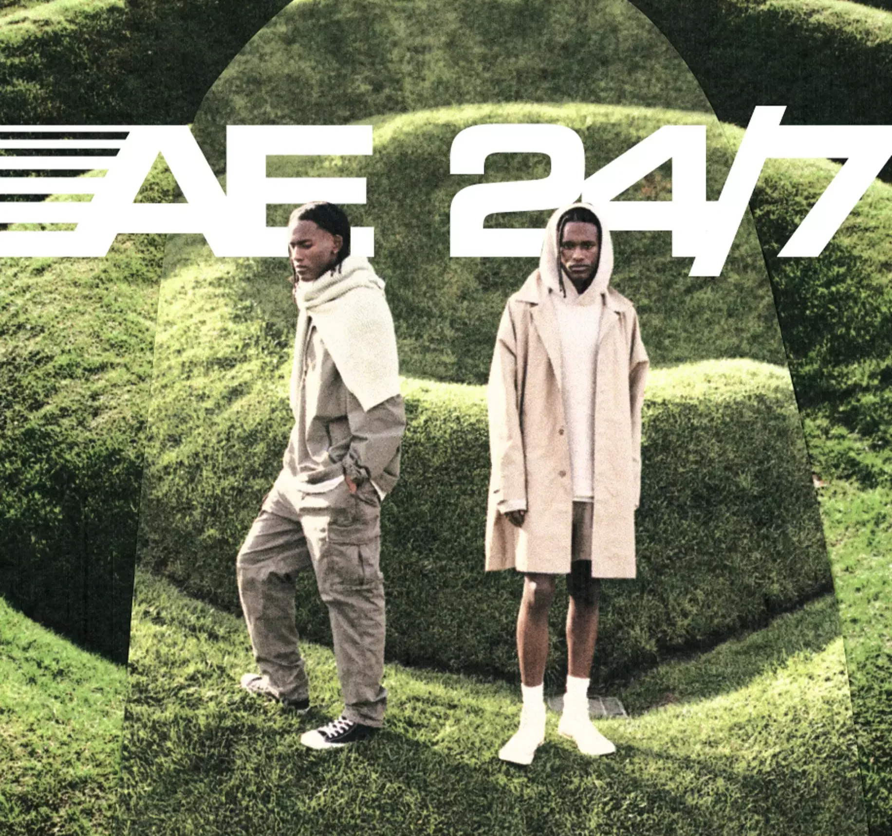
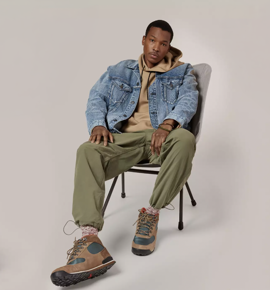
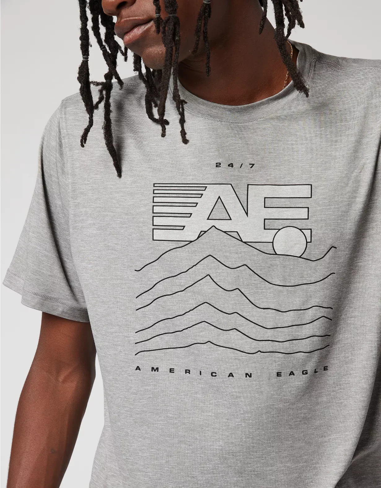
The winter seasonal collection was built around a modern-retro outdoor expression of AE 24/7. Graphics were developed across the assortment, with the mark expanding beyond a single logo hit through mountain graphics, sleeve treatments, woven labels, pocket placements, bags, fleece, and outerwear.
The goal was to keep the identity instantly recognizable while letting the product carry a seasonal point of view. Performance, utility, and lifestyle references came together through a graphic language that felt active, versatile, and connected across the full assortment.