BRANDING & IDENtITY intro
The identity work in this section represents a small selection from a much larger body of logos, icons, marks, and visual systems created over the past twenty years. Each example is shown with context, not just as a finished logo, but as part of a larger story around product, campaign, collaboration, launch, or brand evolution.
Some were built for high-visibility collaborations, others for corporate systems, packaging, sustainability programs, product launches, or personal projects. Together, they show how identity can carry tone, purpose, and direction beyond the mark itself.
AMERICAN EAGLE ICON
The AE eagle refresh was developed to honor the equity of the existing mark while creating something cleaner, more timeless, and more flexible. The goal was to evolve the corporate icon without losing its history, giving the brand a mark that could move between product, marketing, store environments, and larger brand moments.
The project also became an opportunity to bring the internal team into a high-level identity assignment. The result was a mark that respected the past while giving the brand a sharper, more usable icon for the future.


TRAILWATER REFREShERS
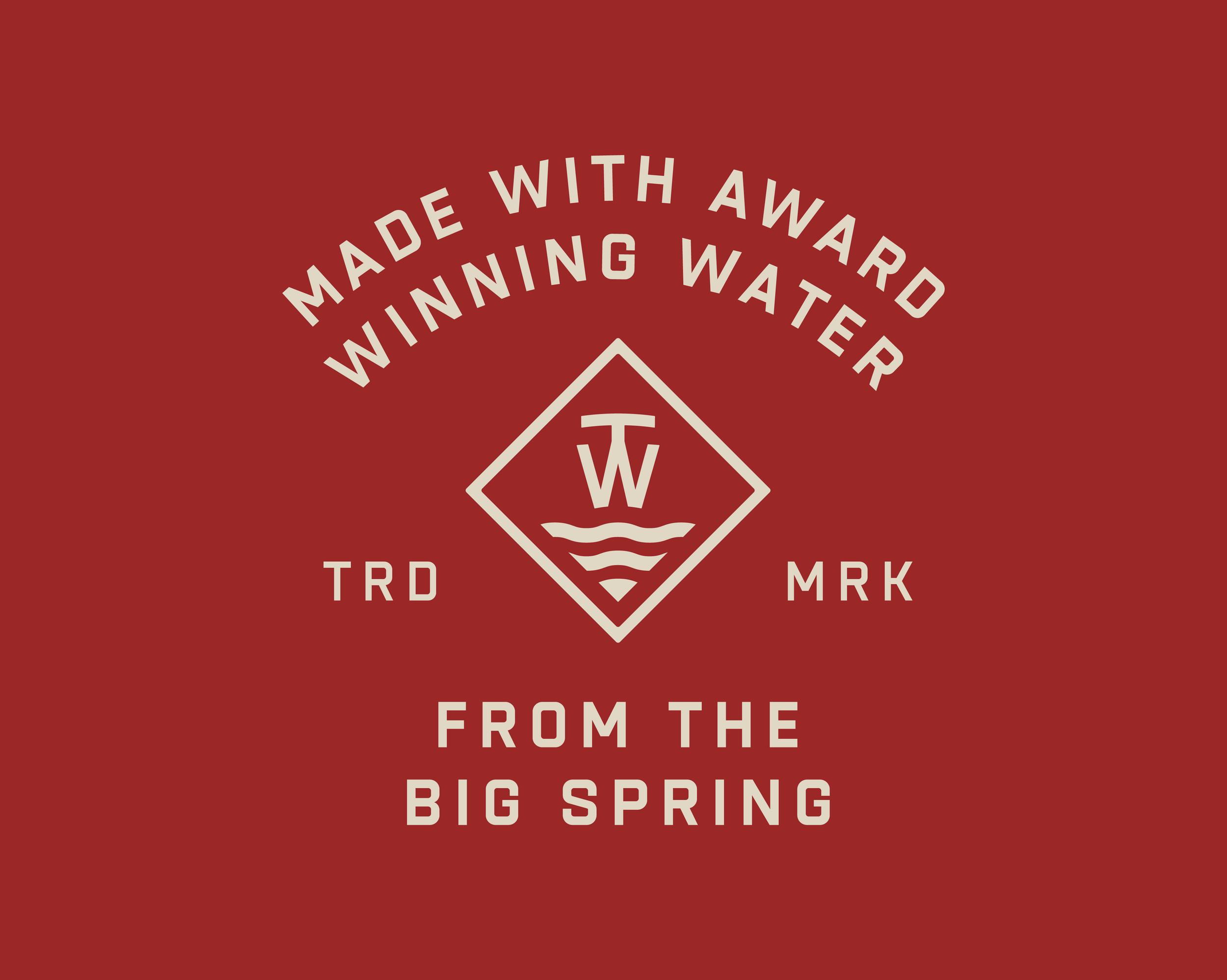
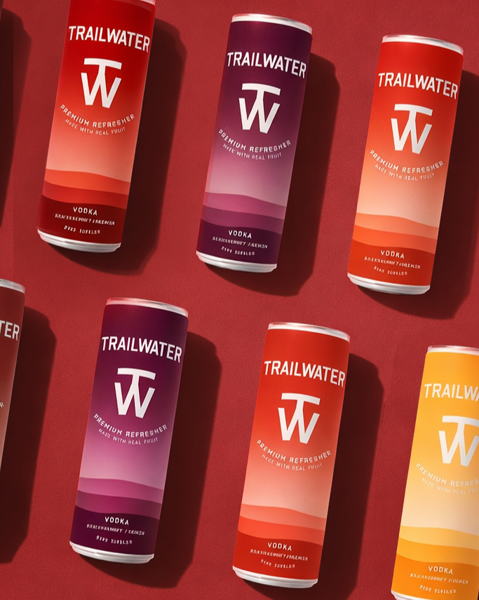
Trailwater was a full brand launch system created for a ready-to-drink vodka refresher from Big Spring Distillery. Developed with a longtime childhood friend, the work extended beyond the logo into iconography, packaging, product storytelling, and visual identity.
The result was a complete brand world built from the ground up, connecting the mark, can design, flavor system, water story, packaging language, and launch aesthetic through one cohesive direction.
HI.IM.HANK.
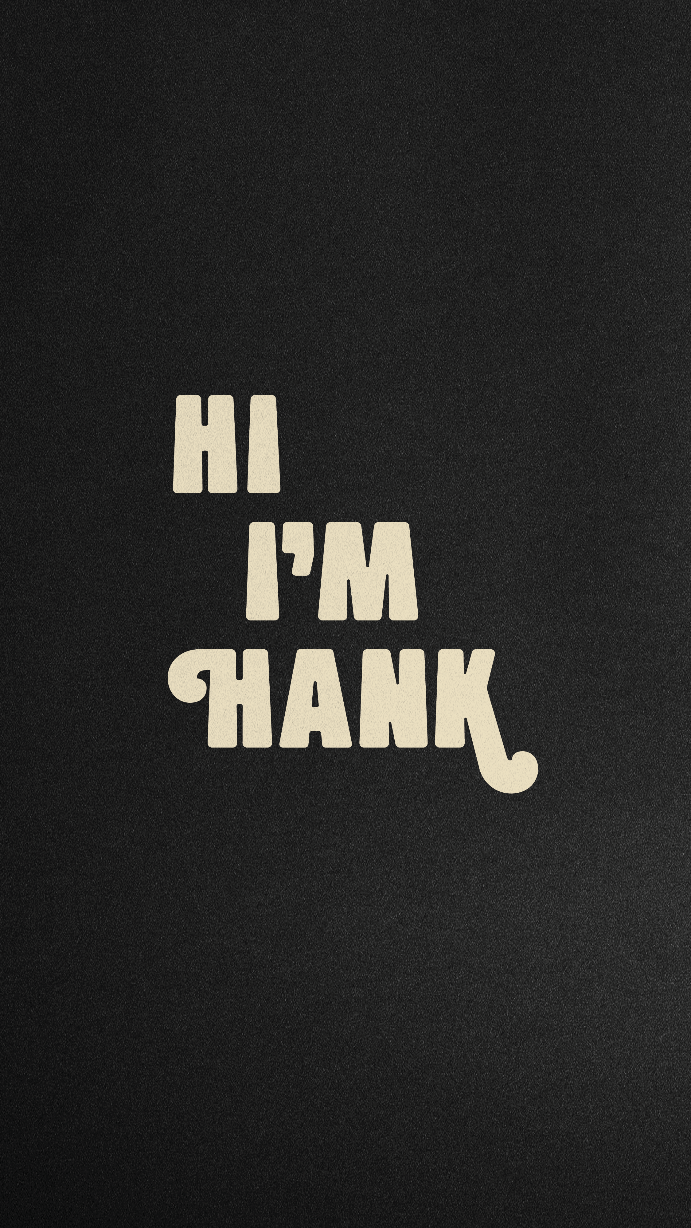
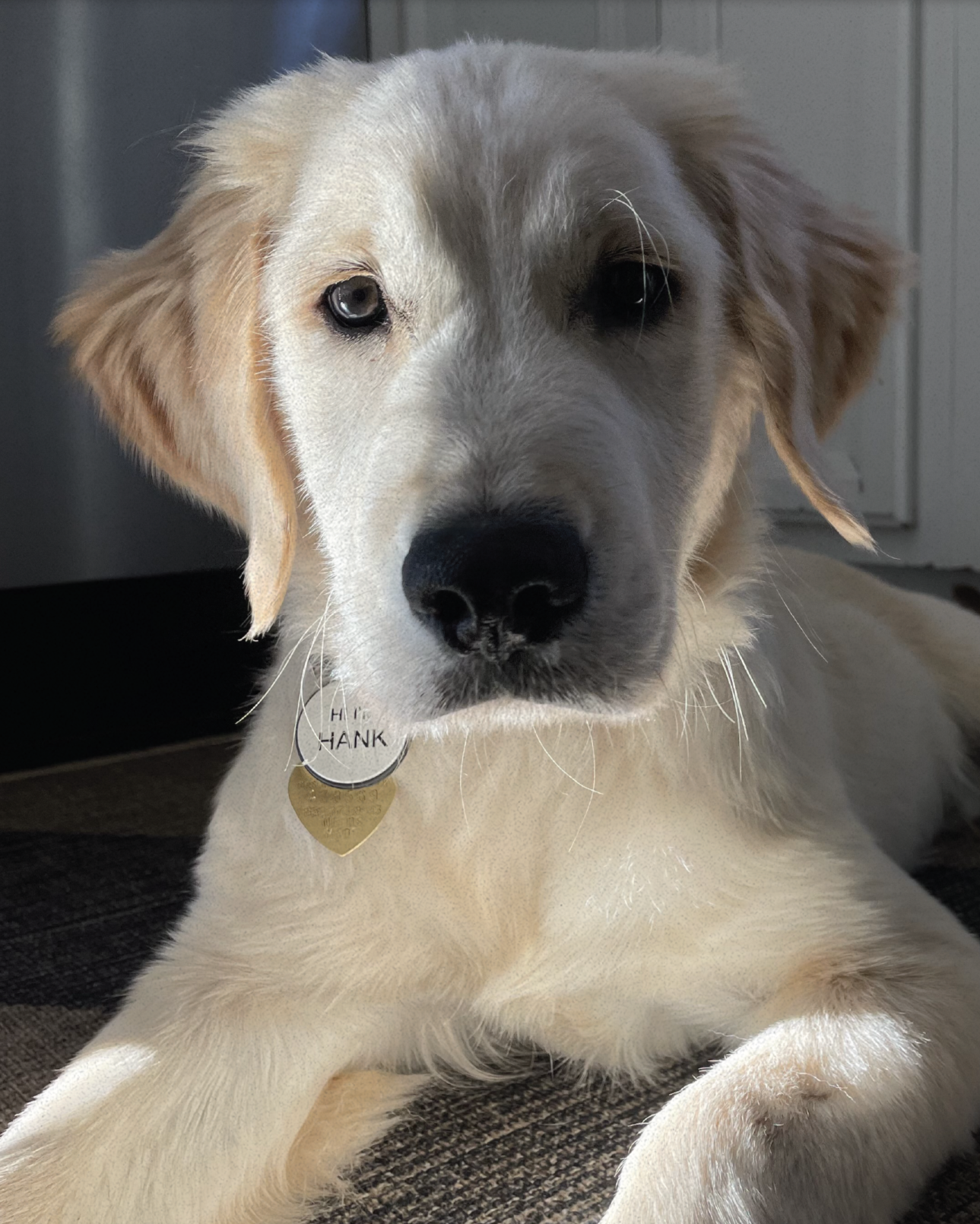
Hank brings a more personal and playful note to the section. Created for a Golden Retriever from Kentucky, the mark shows how identity work can still carry tone, character, and specificity even at a small scale. It is simple, memorable, and built around personality.
https://www.instagram.com/hi.im.hank/
AE X YOUNG MONEY
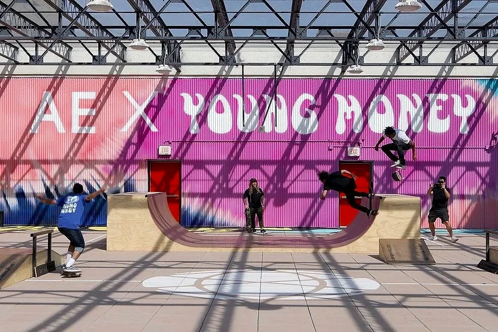
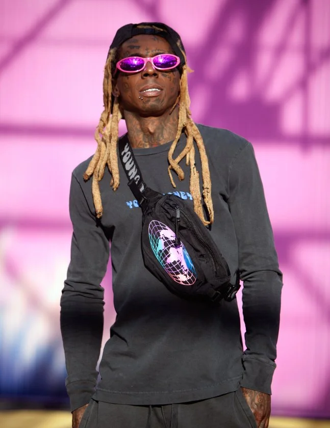
Created as the primary mark for the American Eagle x Young Money collaboration, this identity needed to capture the energy of the partnership and translate across product, graphics, launch materials, and event expression.
A custom tie-dye direction was also developed for the collection, becoming a visual thread across both product and marketing. Together, the mark and dye treatment helped set the tone for a larger cultural moment around the launch, including a major presence tied to Lollapalooza.
RE/AE
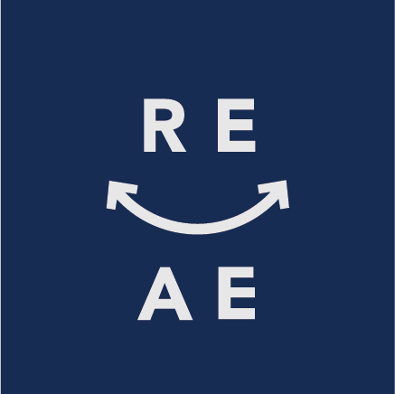
RE/AE was created as the identity for American Eagle’s digital resale shop, launched with thredUP as part of the brand’s Earth Day sustainability efforts. The program focused on curated vintage and secondhand AE product, extending the life of clothing through a circular shopping experience.
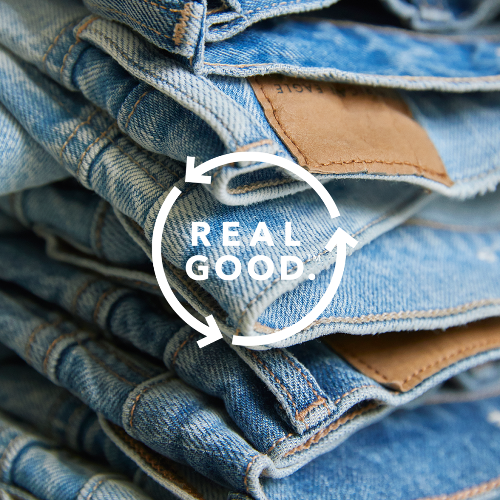
The mark built from AE’s Real Good visual language, using the same circular arrow system to connect sustainability, reuse, and better product practices. It gave the resale program its own playful identity while keeping it instantly tied to the larger AE brand world.