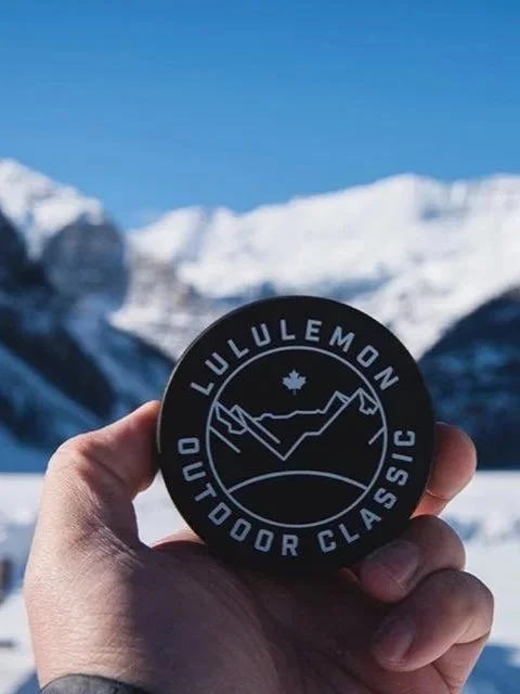
LULULEMON OUTDOOR CLASSIC
The Lululemon Outdoor Classic identity was developed around the event’s setting: an invitational pond hockey tournament framed by the mountains of Lake Louise. The logo translated that landscape into a simple graphic mark, using the mountain line, frozen pond, and subtle maple leaf detail to connect the event to place, sport, and Canadian heritage.
The direction needed to feel athletic without becoming overly branded, and specific without losing flexibility. The system carried across jerseys, pucks, signage, glassware, and event collateral, giving the tournament a visual identity that felt clean, memorable, and rooted in the outdoor experience.