PAUL LUC BAD SEED
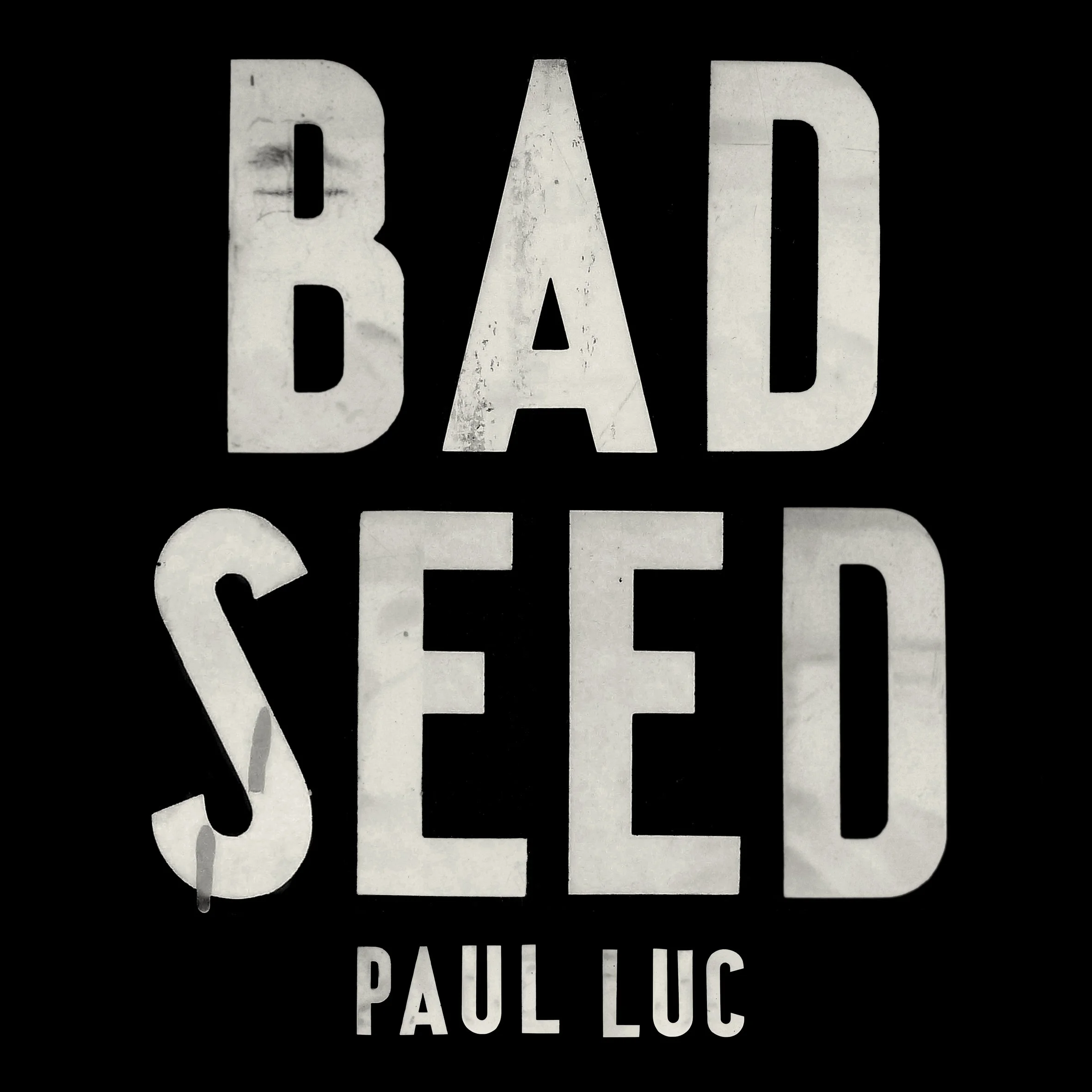
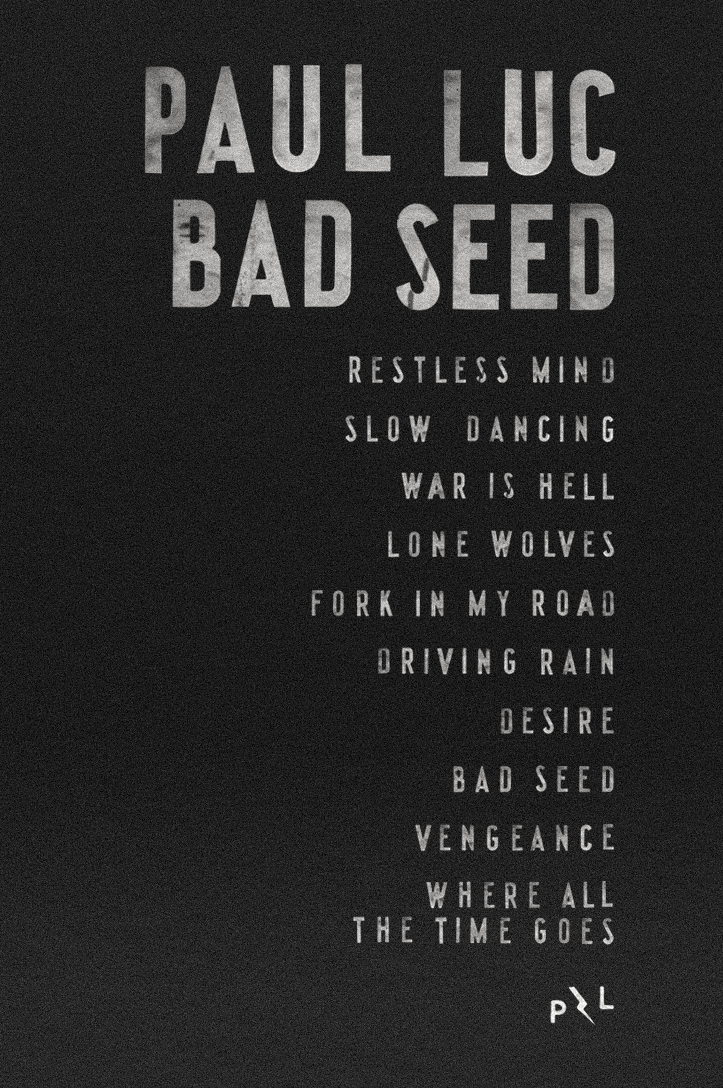
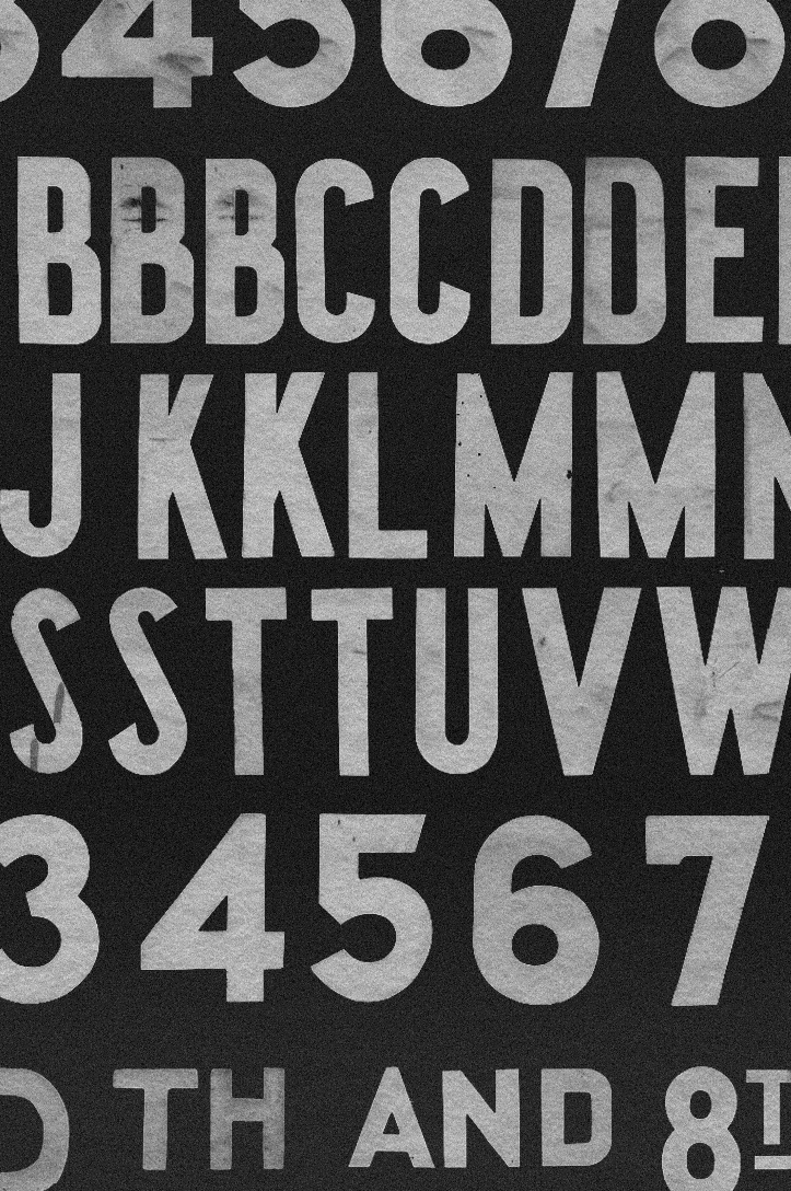
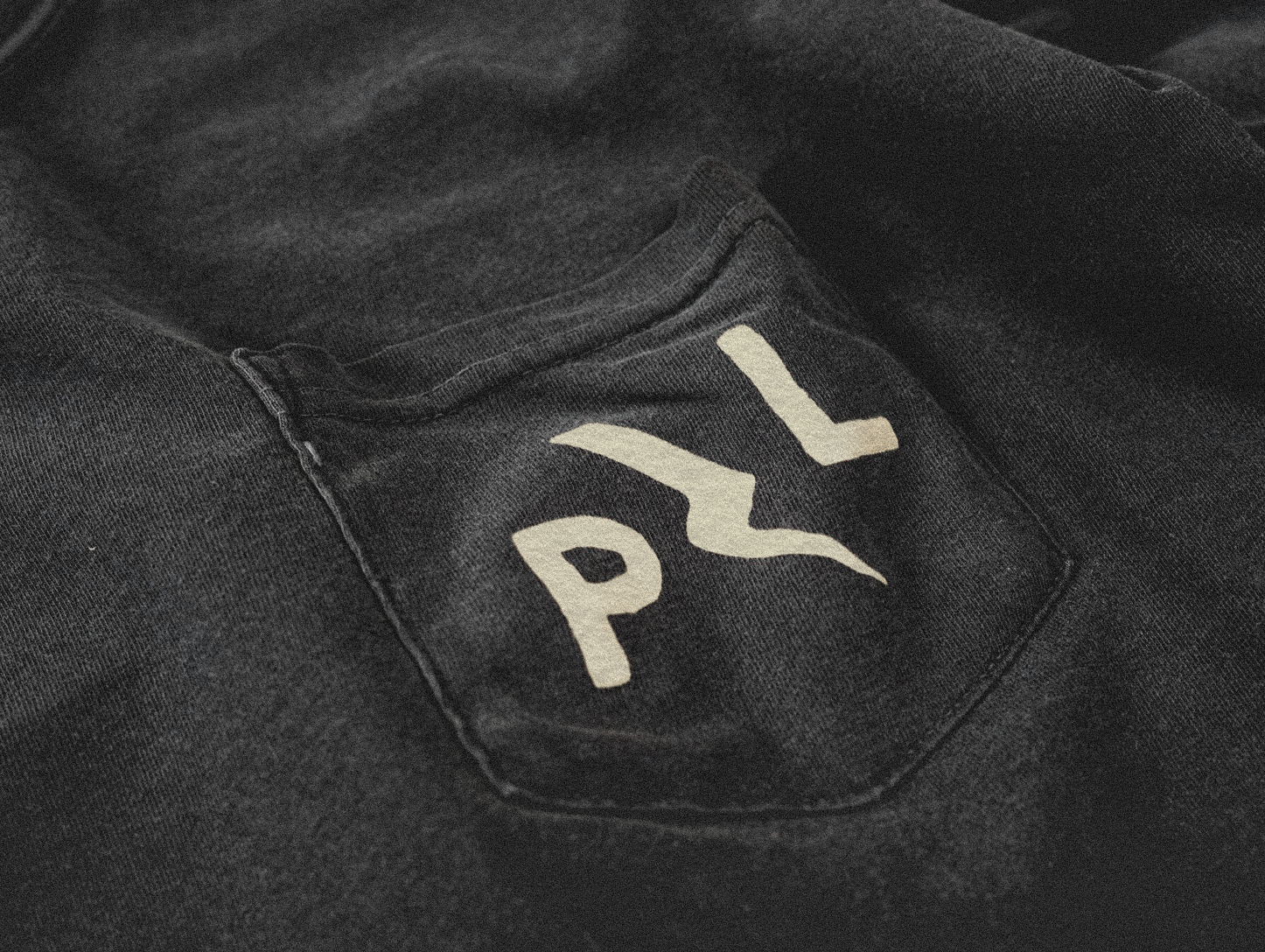
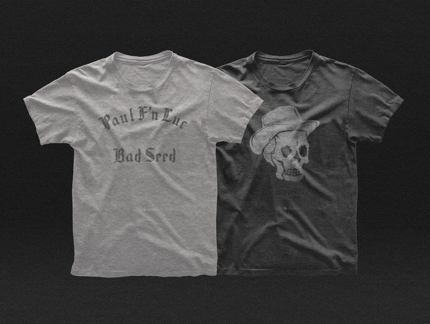
Paul Luc’s visual world has been shaped through an ongoing creative partnership across album artwork, packaging, merch, posters, stamps, social assets, and release graphics. For this set of branding assets, the visual language began with something real: a visit to the MTA archives to study and photograph vintage transit signs letter by letter, capturing the imperfections, wear, and beauty built up time.
That source material shaped the identity from the ground up. The letterforms, texture, spacing, and irregularities became a visual language that felt collected, weathered, and honest, giving the work the same sense of grit, HOMAGE and quiet meaning that runs through Paul’s music.
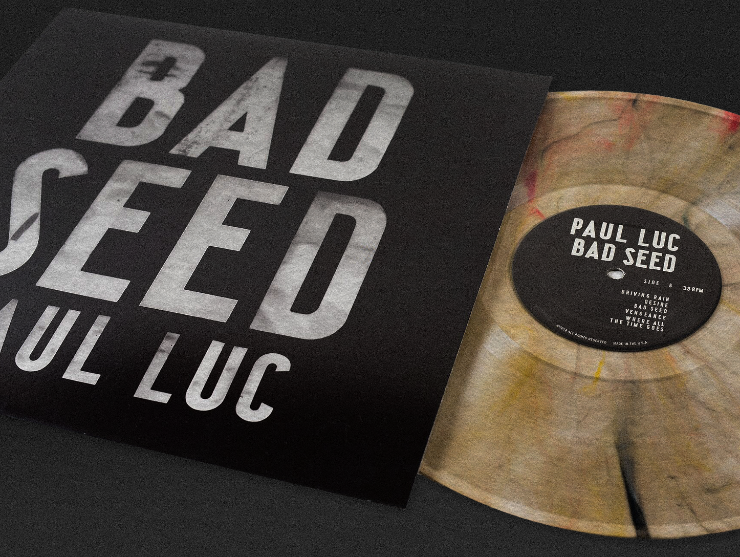
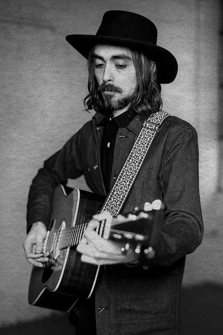
Sounds Like: Rust Belt folk from a Pittsburgh native who realized he’s better suited for singing blue-collar anthems than climbing the corporate ladder
For Fans of: Langhorne Slim, Cory Branan, Shakey Graves
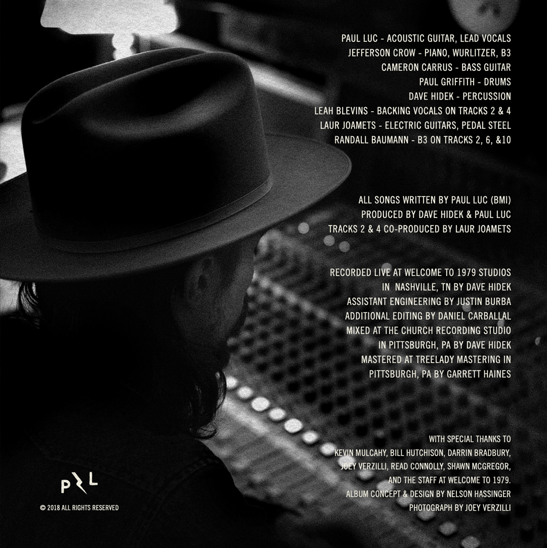
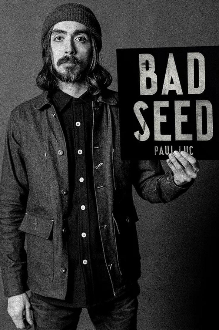
Why You Should Pay Attention: Paul Luc was on the fast track to corporate-executive status when according to him, he woke up one day and said, “Screw it, I’m out.” Ever since he’s been honing a straight-talking knack for killer, deep-thinking turns of phrase like “Spitting into the wind, it’s risky / I treat fate like I drink good whiskey / It doesn’t need any fussin’ or fixin’ / I just leave it the hell alone.” For his third album, Bad Seed (out February 9th), Luc booked a Nashville studio, gathered a group of then strangers, including former Sturgill Simpson band members Jefferson Crow and Laur Joamets, and hit “record” without rehearsing a single note. The resulting sound is just as raw and punchy as Luc’s words, which in this case find him taking a hard look in the mirror. He questions everything from his own battles with anxiety to the root of his deepest desires – basically asking, “Am I a good guy, or a bad seed?”
He Says: “I didn’t set out with any theme, but it just sort of surfaces with whatever state of mind you’re in. On any kind of curve or spectrum you’ve got outliers of people who are just saintly, and people who are truly psychotic, but the rest of us are somewhere in the middle of this mix of good and bad things that make us up. For me, Bad Seed was a number of songs that take a look at myself and where I’ve been, people I’ve been with, and asking whether or not I carried myself the right way.”
Hear for Yourself: Slightly off-kilter and supremely unsettled, “Restless Mind” opens the album with a testament to how anxiety can sabotage a relationship, propelled by acoustic guitar, whirring B3 organ and bluesy steel. C.P.

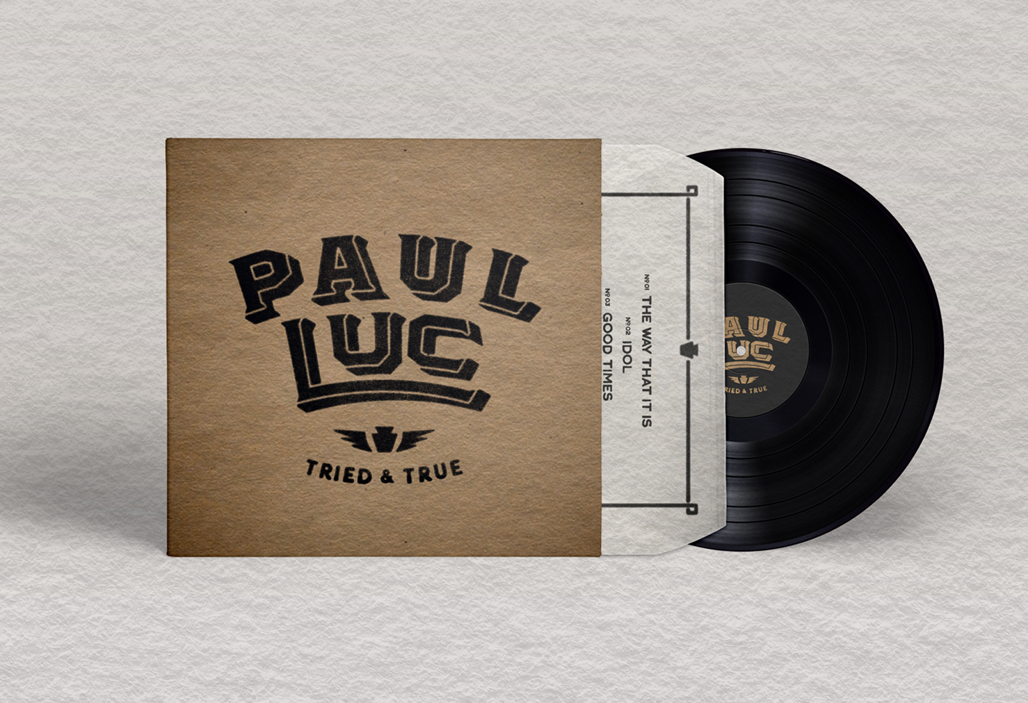
PAUL LUC TRIED & TRUE
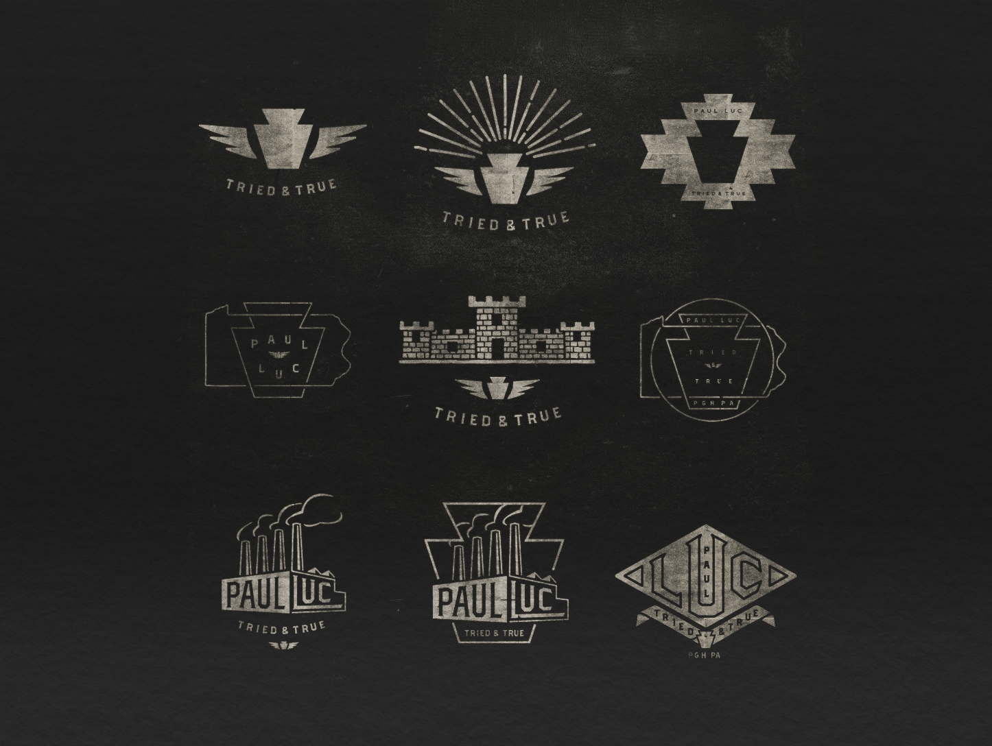
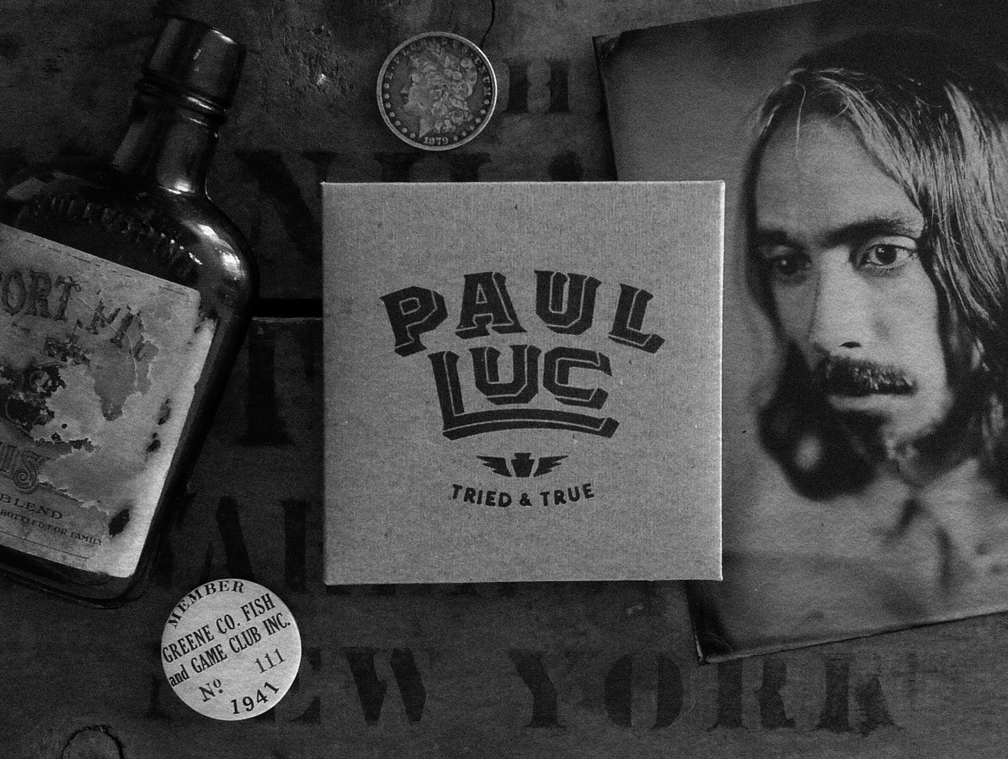
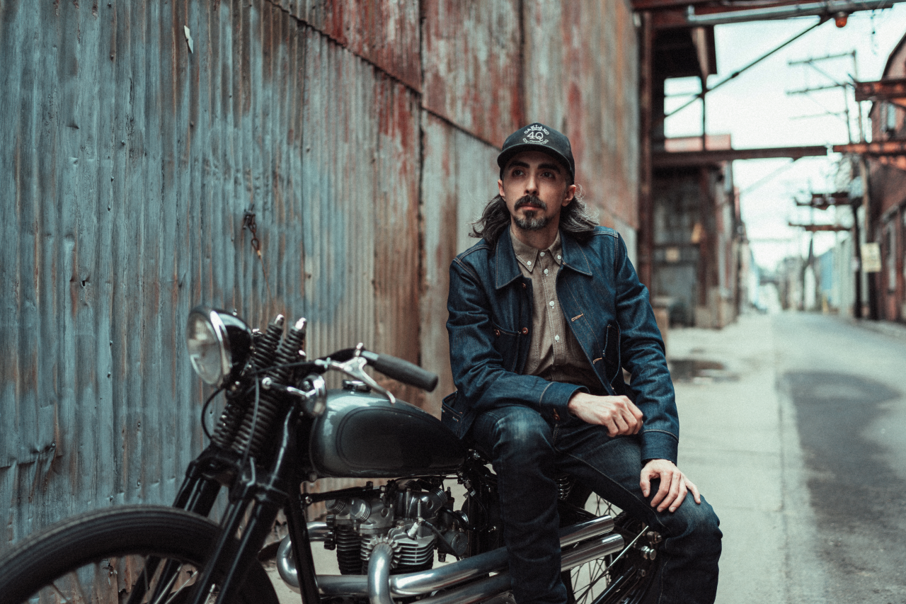
Tried & True was built around Paul Luc’s connection to Pittsburgh and the rough character of vintage Americana. The keystone became the anchor, tying together Pennsylvania, and the industrial history around the music, while winged shapes pulled from vintage moto and service-station AESTHETIC.
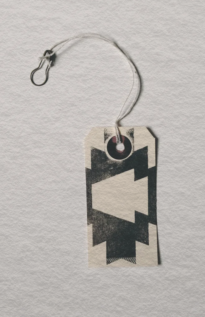
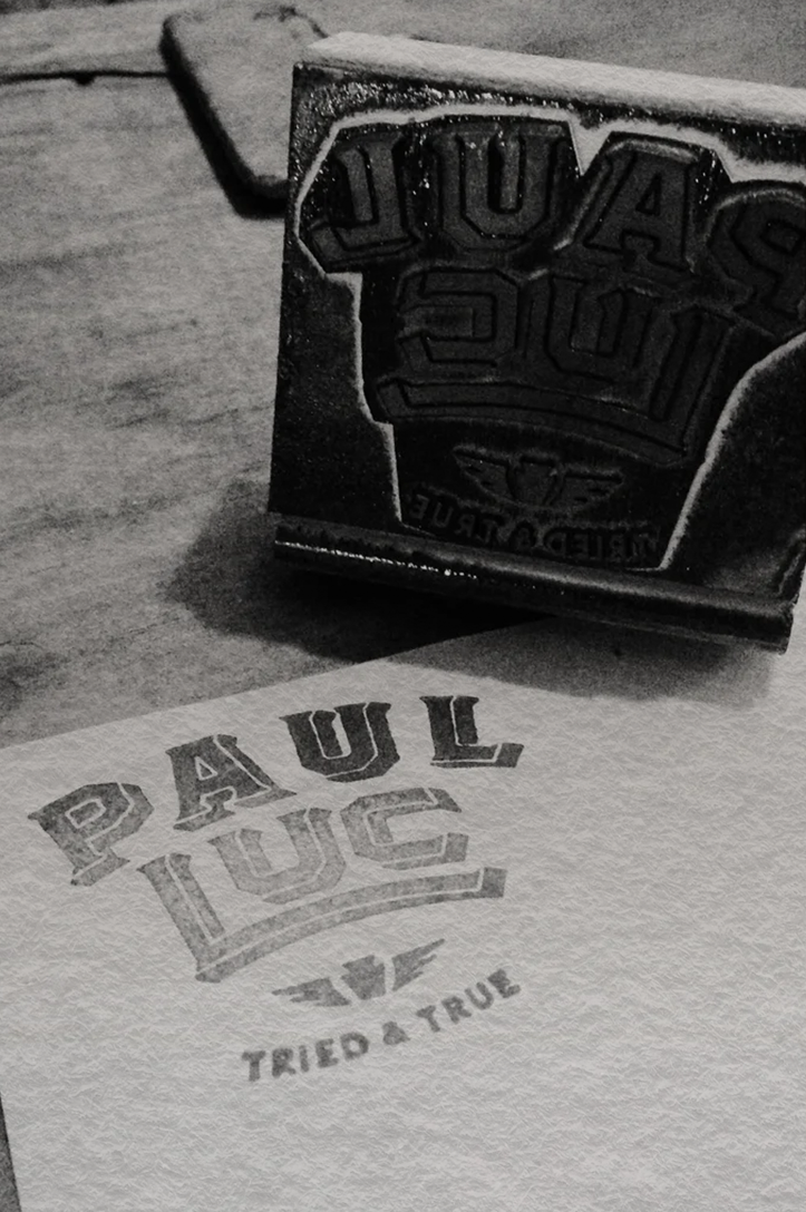
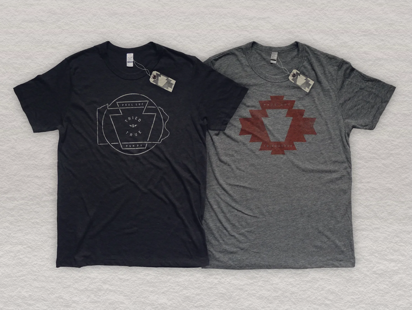
The creative carried across the album artwork, merch, hang tags, stamps, and photography. Steel-mill references, heritage lockups, ‘BURGH REFERENCES, worn textures, and imperfect marks gave the project a gritty visual language that felt personal to Paul and rooted in where the record came from.